function (train, test, cl, k = 1, l = 0, prob = FALSE, use.all = TRUE)
NULLSTA 9890 - Fundamentals of ML: I. Introduction to ML
\[\newcommand{\R}{\mathbb{R}} \newcommand{\E}{\mathbb{E}} \newcommand{\V}{\mathbb{V}} \newcommand{\P}{\mathbb{P}} \newcommand{\C}{\mathbb{C}} \newcommand{\K}{\mathbb{K}} \newcommand{\Ycal}{\mathcal{Y}} \newcommand{\Xcal}{\mathcal{X}} \newcommand{\Ccal}{\mathcal{C}} \newcommand{\Hcal}{\mathcal{H}} \newcommand{\Ncal}{\mathcal{N}} \newcommand{\Fcal}{\mathcal{F}} \newcommand{\Ocal}{\mathcal{O}} \newcommand{\Pcal}{\mathcal{P}} \newcommand{\Ucal}{\mathcal{U}} \newcommand{\Dcal}{\mathcal{D}} \newcommand{\bbeta}{\mathbf{\beta}} \newcommand{\bone}{\mathbf{1}} \newcommand{\bzero}{\mathbf{0}} \newcommand{\ba}{\mathbf{a}} \newcommand{\bb}{\mathbf{b}} \newcommand{\bc}{\mathbf{c}} \newcommand{\bu}{\mathbf{u}} \newcommand{\bv}{\mathbf{v}} \newcommand{\bw}{\mathbf{w}} \newcommand{\bx}{\mathbf{x}} \newcommand{\by}{\mathbf{y}} \newcommand{\bz}{\mathbf{z}} \newcommand{\bf}{\mathbf{f}} \newcommand{\bX}{\mathbf{X}} \newcommand{\bA}{\mathbf{A}} \newcommand{\bB}{\mathbf{B}} \newcommand{\bC}{\mathbf{C}} \newcommand{\bD}{\mathbf{D}} \newcommand{\bU}{\mathbf{U}} \newcommand{\bV}{\mathbf{V}} \newcommand{\bI}{\mathbf{I}} \newcommand{\bH}{\mathbf{H}} \newcommand{\bW}{\mathbf{W}} \newcommand{\bY}{\mathbf{Y}} \newcommand{\bK}{\mathbf{K}} \newcommand{\argmin}{\text{arg\,min}} \newcommand{\argmax}{\text{arg\,max}} \newcommand{\MSE}{\text{MSE}} \newcommand{\Tr}{\text{Tr}}\]
A Taxonomy of Machine Learning
Where classical statistics focuses on learning information about a population from a (representative) sample, Machine Learning focuses on out-of-sample prediction accuracy.
For example, given a large set of medical records, the natural instinct of a statistician is to find the indicators of cancer in order assess them via some sort of follow-on genetic study, while a ML practitioner will typically start by building a predictive algorithm to predict who will be diagnosed with cancer. The statistician will perform calculations with \(p\)-values, test statistics, and the like to make sure that any discovered relationship is accurate, while the ML practitioner will verify the performance by finding a new (hopefully similar) set of medical records to test algorithm performance.
Clearly, this difference is more one of style than substance: the statistician might see what features are important in the ML model to decide what to investigate, while the ML modeler will use statistical tools to make sure the model is finding something real and not just fitting to noise. In this course, the distinction may be even blurrier as our focus is statistical machine learning - that little niche right on the boundary between the two fields.
In brief, “statistics vs ML” is a bit of a meaningless distinction as both fields draw heavily from each other. I tend to say one is doing statistics whenever the end-goal is to better understand something about the real world (ie., the end product is knowledge), while one is doing ML whenever one is building a system to be used in an automated fashion (ie., the end product is software), but definitions vary.1
Types of Learning
In this course we will use the following taxonomy borrowed from the ML literature:
-
Supervised Learning: Tasks with a well-defined target variable (output) that we aim to predict
Examples:
- Given an image of a car running a red-light, read its license plate.
- Given attendance records, predict which students will not pass a course.
- Given a cancer patient’s medical records, predict whether a certain drug will have a beneficial impact on their health outcomes.
-
Unsupervised Learning: Given a whole set of variables, none of which is considered an output, learn useful underling structure.
Examples:
- Given a set of climate simulations, identify the general trends of a climate intervention.
- Given a set of students’ class schedules, group them into sets. (You might imagine these sets correspond to majors, but without that sort of “label” (output variable) this is only speculative, so we’re unsupervised)
- Given a social network, identify the most influential users.
There are other types of learning tasks: e.g. semi-supervised, online, reinforcement, but the Supervised/Unsupervised distinction is the main one we will use in this course.
Within Supervised Learning, we can further subdivide into two major categories:
Regression Problems: problems where the response (label) is a real-valued number
-
Classification Problems: problems where the response (label) is a category label.
- Binary classification: there are only two categories
- Multi-way or Multinomial classification: multiple categories
Linear Regression, which we will study more below, is the canonical example of a regression tool for supervised learning.
At this point, you can already foresee one of the (many) terminology inconsistencies will will encounter in this course: logistic regression is a tool for classification, not regression. As modern ML is the intersection of many distinct intellectual traditions, the terminology is rarely consistent.2
Types of Data
It is also worth thinking of the many types of data we might analyze: much of remarkable success of modern ML comes from an openness (and willingness) to analyze types of data historically ‘out of bounds’ (or, at least, not in the mainstream) for classical statistics.
Let’s divide this into two axes: i) organizational, what is the natural way to store and represent this data on a computer; and ii) modal, what “type” of thing is each individual datum. While these are useful questions to ask, these are not fixed within a single problem. For instance, if given a large text sample (such as doctor’s notes on a medical patient), it is possible to change this data from “sequence” data (things in a row) to “tabular” data, by simply counting the occurence of each word. This transformation is sometimes called a “bag-of-words” representation and it is lossy, but it can often still be good enough for many applications: e.g., if the notes have the word “cancer” appearing many times, it is a good guess that the patient should receive advanced cancer screening; while it is theoretically possible that the doctor wrote “no sign of cancer” after each visit, this is unlikely.
This example highlights two ways of arranging data:
- Tabular Data: this is your classic “spreadsheet”-style data, with rows representing separate observations and columns corresponding to well-defined features. (In STA 9750, you may have heard this referred to as a “data frame”.)
- Sequence Data: this is data presented as an organized sequence of ‘tokens’, where the ordering has meaning. Examples of sequence data include natural language (words as tokens), DNA sequence (the four amino acids as tokens), and certain representations of computer signals (0/1 binary). Sequence data is typically characterized by inconsistent length (sentences can be short or long) as opposed to tabular data where we represent observations with fixed-length vectors.
Other data structures may include image data (data represented on a 2D grid), 3D imaging data (as often occuring in medical imaging), video data (image data with an additional time dimension), functional data (where we observe a ‘function’ on a continuous domain, e.g., an audio recording), or even shape data (e.g., inferring the malignancy of a strange growth on your skin from its shape).
Within these organizational patterns, we can also categorize data by the modality of each datum. We spoke a bit about continuous and binary data above (in the context of regression and classification), but you may also see ordinal data (rankings, not corresponding to specific values, like survey responses to “do you strongly agree, agree, slightly agree, etc.-type questions) and categorical data (where there is a finite set of possible unranked answers). Within categorical data, it is often useful to further distinguish low-cardinality and high-cardinality problems: low-cardinality refer to situations where there are relatively few possible categories (”summer/fall/winter/spring”); high-cardinality problems are those where the set of values is so impractically large that you can’t handle each value separately. It is typical to model text data, such as LLMs, as a high-cardinality problem because, while there is technically a finite set of possible output words from an LLM, the problem of guessing the next LLM output doesn’t bear too much practical resemblence with a standard yes/no classification.
In this course, we focus on tabular real-valued data, but we will discuss extensions to other data where appropriate.
Test and Training Error
As we think about measuring a model’s predictive performance, it becomes increasingly important to distinguish between in-sample and out-of-sample performance, also called training (in-sample) and testing (out-of-sample) performance.
In previous courses, you likely have assessed model fit by seeing how well your model fits the data it was trained on: statistics like \(R^2\), SSE, SSR in regression or \(F\)-tests for model comparison do just this. As you have used them, they are primarily useful for comparison of similar models, e.g., OLS with different numbers of predictor variables. But it’s worth reflecting on this process a bit more: don’t the model with more predictors always fit the data better? If so, why don’t we always just include all of our predictors?
Of course, as you know, the answer is that we want to avoid “overfitting.” Just because a model fit the data a bit better doesn’t mean it is actually better. If you need 1,000 variables to get a 0.1% reduction in MSE, do you really believe those features are doing much? No!
You likely have a sense that a feature needs to “earn its keep” to be worth including in a model. Statisticians have formalized this idea very well in some contexts: quantities like degrees of freedom or adjusted \(R^2\) attemps to measure whether a variable provides a statistically significant improvement in performance. These calculations typically rely on subtle calculations involving nice properties of the multivariate normal distribution and ordinary least squares, or things that can be (asymptotically) considered essentially equivalent.
In this class, we don’t want to make those sorts of strong distributional and modeling assumptions. So what can we do instead? Well, if we want to see if Model A predicts more accurately than Model B on new data, why don’t we just do that? Let’s get some new data and compare the MSEs of Model A and Model B: whichever one does better is the one that does better.3
This is a pretty obvious idea, so it’s worth asking why it’s not the baseline and why statisticians bothered with all the degrees of freedom business to start with. As always, you have to know your history: statistics comes from a lineage of scientific experimentation where data is limited and often quite expensive to get. If you are running a medical trial, you can’t just toss a few hundred extra participants in - this costs money! If you are doing an agricultural experiment, it may take several years to see whether a new seed type actually has higher yield than the previous version. It’s also not clear how one should separate data into training and test sets: if you are studying, e.g., friendship dynamics on Facebook, you don’t have an (obvious) “second Facebook” that you can use to assess model accuracy.
By contrast, CS-tradition Machine Learning comes from a world of “internet-scale” where data is plentiful, cheap, and is continuously being collected.4 Not all problems fall in this regime but, as we will see, enough do that it’s worth thinking about what we should do in this scenario. Excitingly, if we don’t demand a full and exhaustive mathematical characterization of a method before we actually apply it, we can begin to explore much more complex and interesting models.
Advice
A good rule of thumb for applied statistical and data science work: begin by asking yourself what you would do if you had access to the whole population (or an infinitely large sample) and then adapt that answer to the limited data you actually have. You always want to make sure you are asking the right question, even if you are only able to give an approximate finite-data answer, rather than giving an ‘optimal’ answer to a question you don’t actually care about.
So, for the first two units of this course, we will put this idea front and center: we will fit our models to a training set and then see how well they perform on a test set. Our goal is to not to find find models which perform well on the test set per se: we really want to find models that perform well on the all future data, not just one test set. But this training/test split will certainly get us going in the right direction.
Looking ahead, let’s note some of the key questions we will come back to again and again:
- If we don’t have an explicit test set, where can we get one? Can we ‘fake it to make it’?
- What types of models have small “test-training” gap, i.e. do about as well on the test and training sets, and what models have a large gap?
Pause for Reflection
Take the time to make sure you deeply understand what “overfitting” means. When we talk about overfitting, we typically assume that there is a “correct” estimate and that the correct estimate is “best”. But if we fit better than best, what is really going on?
Generalization and Model Complexity
So far, we have two useful concepts:
- Training Set (the data we used to select our model)
- Test Set (the new data we used to assess our model)
The performance of a model on these two sets is, unsurprisingly, known as training error and test error, respectively. With these in hand, we introduce a third quantity that gives us a trivial, but surprisingly useful, inequality:
\[\text{Test Error} = \text{Training Error} + \text{Generalization Gap}\]
Here, the “Generalization Gap” is defined as the difference between the training error and the test error.5 Essentially, the Generalization Gap measures the “optimism” bias obtained by measuring accuracy on the original training data. If the Generalization Gap is large, the model will look much better on the training data then when we actually go to put it into practice. Conversely, if the Generalization Gap is small, the performance we estimate from the training data will continue when we deploy our model.
This is a all a bit circular, but it lets us break our overarching goal (small test error) into two parts:
- We want a model with small training error; and
- We want a model with small generalization gap.
We can only be guaranteed that we’ll have a small test error when these both of these are true. Again - and just to be clear - having a small training error is important, but it is only necessary and not sufficient to have a small test error.
We can simply observe training error, so much of our theoretical analysis focuses on understanding the generalization gap. For now, let’s think about the generalization gap of plain linear regression (OLS). It is not hard to show (and we might show in class next week) that, if the OLS model is true, the expected training MSE is:
\[\E[\text{Training MSE}] = \E\left[\frac{1}{n}\sum_{i=1}^n(y_i - \sum_{j=1}^p x_{ij}\hat{\beta}_j)^2\right] = \frac{\sigma^2(n-p)}{n} = \sigma^2\left(1-\frac{p}{n}\right)\]
Here \(\sigma^2\) is the ‘noise variance’ of the OLS model. (We will review the OLS model in much more detail next week.)
This is somewhat remarkable: if we knew the exact true model \(\beta_*\), our MSE would be \(\sigma^2\), but our training MSE is less than that. How can we do better than the optimal and exactly correct model? Overfitting - our OLS fits our training data a bit ‘too well’ and it manages to capture the true signal and the noise. Whatever noise is in the data doesn’t extend into (generalize to) the test set, so we get a bit of overfitting.
Even a simple model like OLS is vulnerable to overfitting. It isn’t too big in this context and our formula above actually lets us see how it behaves:
- As \(n\to\infty\), the amount of overfitting goes down. This is of course the behavior we want: as we get more data, we should stop fitting noise and only fit signal.
- As \(p \to n\), the amount of overfitting goes up. That is, as we add more features (covariates) to our regression, we expect more over fitting. When we supply OLS with more ‘degrees of freedom’, some of those wind up fitting noise.
The \(n\to\infty\) behavior shouldn’t surprise you: the theme of “more data yields better estimation and smaller error” is ubiquitous in statistics. The behavior as \(p\) increases may not be something you have seen before. Later in this course, we will actually ask what happens if \(p > n\). Clearly, our formula from above can’t hold as it predicts negative MSE! But we’ll get to that later…
As \(p\) gets larger, OLS is more prone to overfitting. It turns out that this is not a special property of OLS - basically all methods will have this property to one degree or another. While there are many ways to justify this, perhaps the simplest is a story about “complexity”: with more features, and hence more coefficients, OLS becomes a more complex model and more able to fit both the signal and the noise in the training data. Clearly, complexity is not necessarily bad - we want to be able to capture all of the signal in our data - but it is dangerous.
This complexity story is one we will follow through the rest of this course. A more complex model is one which is able to fit its training data easily. Mathematically, we actually measure complexity by seeing how well a model fits pure noise: if it doesn’t fit it well at all (because there is no signal!), we can usually assume it won’t overfit on signal + noise. But if it fits pure noise perfectly, it has by definition overfit the training data.
I like to think of complexity as “superstitious” or “gullibility”: the model will believe (fit to) anything we tell it (training data), whether it is true (signal) or not (noise).
We don’t want a model that is too complex, but we also don’t want a model that is too simple. If it can’t fit signal, it is essentially useless. In our metaphor, an overly simple (low complexity) model is like a person who simply doesn’t believe anything at all: they are never tricked, but they also can’t really understand the world.
Model Families and Estimation
Of course, the story we have told so far skims over a fundamental idea: model fitting. If we are given a set of parameters,-or, more generally, a prediction function–we might be able to discuss how well they fit (or overfit) the data, but that’s not really the situation we often find ourselves in. In practice, we have some data and are asked to come up with the predictor function ourselves. How can we do this?
Well, this is a machine learning course, so it’s a reasonable starting assumption that we want our predictor to be implemented on a (finite-sized) computer. Taking a reasonable upper bound for the size of the computer’s memory, say 32 GB, this restricts us to an enormous, but technically finite, set of possible models.6 Ignoring resource constraints, we could in theory try out all of these models and pick the one that fits our data “best”.
Obviously, this has some practical problems about runtime (and our power bill), but there’s also the very real possibility that there’s not a single “best” fit. We can address both of these possibilities by restricting our attention to a much smaller universe of prediction functions than “all possible programs”. For example, we might restrict our attention to univariate linear regression models, parameterized by a single slope (one “double” value, or 64 bits) and a single intercept (64 bits again). This gives us 128 bits total, so “only” \(2^{128}\) possible lines to check.
This is obviously still deeply impractical, but this restriction allows us to use much smarter algorithms than simply “try everything”. The mathematical concept that lets us find the “best” predictor efficiently is called convexity and we will study it later in this course. Furthermore, this set of “all possible lines” is small enough that there will almost always be a single “best” line, so our problem of finding the best predictor within the class of simple linear regression models is well-posed.
So restriction to a set of possible models does (at least) two useful things for us:
- It gives us a fighting-chance of finding the best possible model in that category
- It makes it possible to have one (or at least a small-ish number) of best possible models
This restriction does even more for us: it can be used to control the size of the generalization gap we talked about above. When we start with our “big” class of all possible programs, it’s clear that there are trillions of programs that will fit our training data perfectly but can go totally wild when exposed to new data.7 When we instead focus on linear regression, there is an “upper limit” of terribleness. If our model was doing reasonably well in the past and our training data resembles our test data, we can feel reasonably confident things won’t go off the rails at test time.
This final idea is statistical complexity: if we pick a “reasonable” set of models, we will be able to argue that the generalization gap is not too big. So building an ML system is really a two stage process:
- We need to select a class of models that is interesting enough to reasonably capture our training data, but not so complex that it could have a huge generalization gap.
- We use smart algorithms to pick the best model within the model class.
While we won’t rigorously characterize the complexity of model classes in this course, it’s still helpful to be familiar with the concept in a “know it when you see it” way.8
Overture
Before we turn to the first model class we’ll consider in this class, let’s take a quite look ahead and what we’ll be covering for the next few weeks:
-
Week 02: Linear Algebra Foundations. We will first review some of the basic linear algebra used throughout this course. Linear algebra is essential to machine learning in several respects:
- Tabular data is organized as a matrix, the fundamental object of study in linear algebra.
- Linear methods (e.g., OLS) are a useful baseline for many different problems.
- Most computational math is built from linear algebra tools. Even non-linear problems are typically solved by repeatedly applying linear algebra techniques to linear approximations (think Taylor series).
Week 03: Accuracy and Loss in ML. Next, we’ll take a deep dive into what it means for a ML system to perform well. While familiar measures like MSE might make sense in some contexts, their applicability is much less clear when applied to things like LLMs. A key theme here will be metrical determinism,9 the idea that once we settle on what our actual goal is and the way we will be measuring it, the best procedure is often automatically determined. We will also explore the popular MSE loss in more detail, showing how it can be broken into several easily-interpretable terms and relating these terms to model complexity.
Week 04: Optimization & Simulation in ML. Our last week of foundations will consider the role of computers in ML. We will discuss ways of finding that “best fit” predictor in a given class (mathematical optimization) and the uses and limits of simulation studies as a way of understanding the usefulness of ML models.
Week 05: Regularization & Shrinkage. As we begin our study of supervised learning, we will briefly introduce the idea of statistical shrinkage, the idea of willingly accepting a small systematic error to eliminate the possibility of large random errors. We will explore this in the classic context of mean estimation before applying shrinkage ideas to more interesting prediction problems.
Week 06: Penalized Regression. We will apply shrinkage to our beloved OLS using two fundamental forms of shrinkage: \(\ell_1\) and \(\ell_2^2\)-penalization. While mathematically similar, these induce very different behaviors in OLS estimates. We will particularly focus on the role of sparsity and model selection in high-dimensional problems.
Week 07: Generative Classifiers. We will next turn to classification problems, with a focus on generative (probability-based) classifiers. This (hopefully) coincides with Baruch’s “Ethics Week” so we will also discuss the perils of (societal) bias in classification contexts.
Week 08: Discriminative Classifiers & Non-Linear Methods. We will explore another tradition of classification problems based on geometry (not probability). These models play particularly nicely with non-linear decision boundaries, so we will also introduce methods for turning linear methods into non-linear predictors. (Note that these can be applied to both regression and classification problems.)
Week 09: Trees & Ensemble Methods. Finally, we will consider ensemble learning, the practice of building predictors out of several simpler predictors. Ensembling is particularly powerful when applied to flexible but simple models, like decision trees, and this will let us introduce two of the most widely-used “fire and forget” ML models: random forests and
xgboost.Week 10: Introduction to Unsupervised Learning. After finishing our discussion of supervised learning, we will turn to the unsupervised context. Unsupervised learning poses extra challenges around validation and performance measurement, so we will begin with a discussion of the aims (and limits) of unsupervised learning.
Week 11: Clustering. We will cover the important unsupervised task of finding “typical” or “representative” simple structure in data distributions. In certain cases, we can “simplify” data into these patterns, providing methods of dimension reduction. Special emphasis will be placed on the most important statistical dimension reduction technique, PCA.
Week 12: Dimension Reduction & Manifold Learning. TODO
Week 13: Generative Models. TODO
Nearest Neighbor Methods
Let us now take a quick detour into a flexible family of models and see how performance relates to the complexity story. Specifically, let’s look at how complexity plays out for a very simple classifier, \(K\)-Nearest Neighbors (KNN). KNN formalizes the intuition of “similar inputs -> similar outputs.” KNN looks at the \(K\) most similar points in its training data (“nearest neighbors” if you were to plot the data) and takes the average label to make its prediction.10
You can see here that KNN requires access to the full training set at prediction time: this is different than something like OLS where we reduce our data to a set of regression coefficients (parameters).11
We’ll also need some data to play with. For now, we’ll use synthetic data:
#' Make two interleaving half-circles
#'
#' @param n_samples Number of points (will be divided equally among the circles)
#' @param shuffle Whether to randomize the sequence
#' @param noise Standard deviation of Gaussian noise applied to point positions
#'
#' @description Imitation of the Python \code{sklearn.datasets.make_moons} function.
#' @return a \code{list} containining \code{samples}, a matrix of points, and \code{labels}, which identifies the circle from which each point came.
#' @export
make_moons <- function(n_samples=100, shuffle=TRUE, noise=0.25) {
  n_samples_out = trunc(n_samples / 2)
  n_samples_in = n_samples - n_samples_out

  points <- matrix( c(
    cos(seq(from=0, to=pi, length.out=n_samples_out)),  # Outer circle x
    1 - cos(seq(from=0, to=pi, length.out=n_samples_in)), # Inner circle x
    sin(seq(from=0, to=pi, length.out=n_samples_out)), # Outer circle y
    1 - sin(seq(from=0, to=pi, length.out=n_samples_in)) - 0.5 # Inner circle y
  ), ncol=2)

  if (!is.na(noise)) points <- points + rnorm(length(points), sd=noise)

  labels <- c(rep(1, n_samples_out), rep(2, n_samples_in))

  if (!shuffle) {
    list(
      samples=points,
      labels=labels
    )
  } else {
    order <- sample(x = n_samples, size = n_samples, replace = F)
    list(
      samples=points[order,],
      labels=as.factor(ifelse(labels[order] == 1, "A", "B"))
    )
  }
}
This function comes from the clusteringdatasets R package, but the underlying idea comes from a function in sklearn, a popular Python ML library.
Let’s take a look at this sort of data:
TRAINING_DATA <- make_moons()library(ggplot2)
library(tidyverse)
data.frame(TRAINING_DATA$samples,
labels=TRAINING_DATA$labels) |>
ggplot(aes(x=X1, y=X2, color=labels)) +
geom_point(size=3)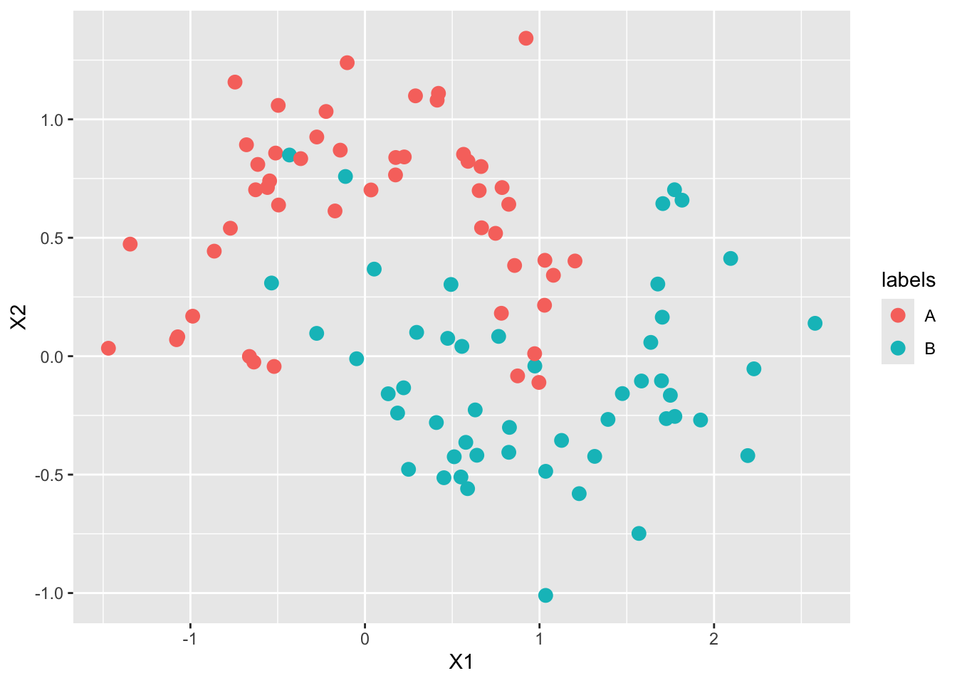
We can make this a bit more attractive:
data.frame(TRAINING_DATA$samples, labels=TRAINING_DATA$labels) %>%
  ggplot(aes(x=X1, y=X2, color=labels)) +
  geom_point(size=2) +
  ggtitle("Sample Realization of the Moons Dataset")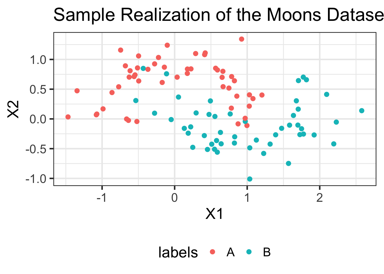
Much better!
Let’s try making a simple prediction at the point (0, 0):
knn(TRAINING_DATA$samples,
    cl=TRAINING_DATA$labels,
    test=data.frame(X1=0, X2=0), k=3)
[1] B
Levels: A B
Pause to Reflect
Does this match what you expect from the plot above? Why or why not? The following image might help:
library(ggforce)
data.frame(TRAINING_DATA$samples, labels=TRAINING_DATA$labels) %>%
  ggplot(aes(x=X1, y=X2, color=labels)) +
  geom_point() +
  ggtitle("Sample Realization of the Moons Dataset") +
  geom_circle(aes(x0=0, y0=0, r=0.2), linetype=2, color="red4")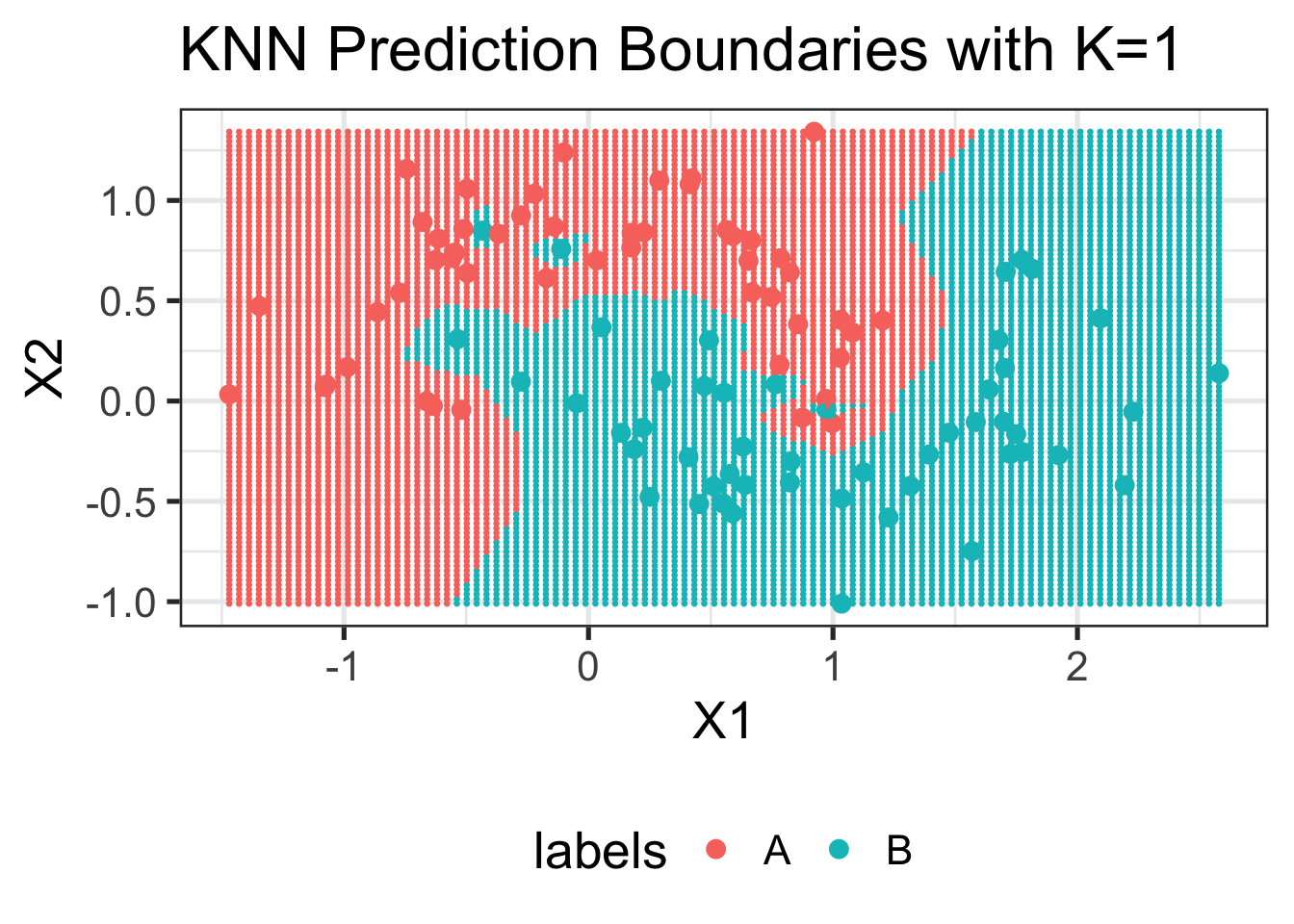
Why is R returning a factor response here? What does that tell us about the type of ML we are doing?
We can also visualize the output of KNN at every point in space:
visualize_knn_boundaries <- function(training_data, k=NULL){
    xrng <- c(min(training_data$samples[,1]), max(training_data$samples[,1]))
    yrng <- c(min(training_data$samples[,2]), max(training_data$samples[,2]))

    xtest <- seq(xrng[1], xrng[2], length.out=101)
    ytest <- seq(yrng[1], yrng[2], length.out=101)

    test_grid <- expand.grid(xtest, ytest)
    colnames(test_grid) <- c("X1", "X2")

    pred_labels = knn(training_data$samples,
                      cl=training_data$labels,
                      test_grid,
                      k=k)

  ggplot() +
  geom_point(data=data.frame(TRAINING_DATA$samples,
                             labels=TRAINING_DATA$labels),
             aes(x=X1, y=X2, color=labels),
             size=3) +
  geom_point(data=data.frame(test_grid, pred_labels=pred_labels),
             aes(x=X1, y=X2, color=pred_labels),
             size=0.5) +
  ggtitle(paste0("KNN Prediction Boundaries with K=", k))
}

visualize_knn_boundaries(TRAINING_DATA, k=1)
If we raise \(K\), we get smoother boundaries:
visualize_knn_boundaries(TRAINING_DATA, k=5)
And if we go all the way to \(K\) near to the size of the training data, we get very boring boundaries indeed:
visualize_knn_boundaries(TRAINING_DATA, k=NROW(TRAINING_DATA$samples)-1)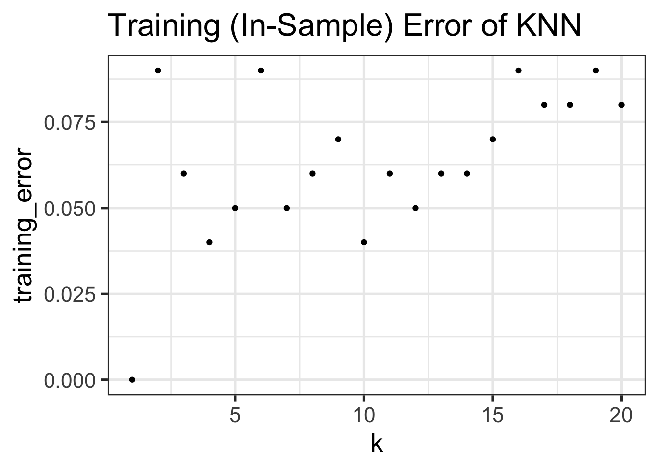
Pause to Reflect
What does this tell us about the complexity of KNN as a function of \(K\)?
In the terminology we introduced above, we see that increasing \(K\) decreases model complexity (wiggliness).
Let’s now see how training error differs as we change \(K\):
TEST_DATA <- make_moons()

TRAINING_ERRORS <- data.frame()
for(k in seq(1, 20)){
    pred_labels_train <- knn(TRAINING_DATA$samples, cl=TRAINING_DATA$labels, TRAINING_DATA$samples, k=k)
    true_labels_train <- TRAINING_DATA$labels
    err <- mean(pred_labels_train != true_labels_train)
    cat(paste0("At k = ", k, ", the training (in-sample) error of KNN is ", round(100 * err, 2), "%\n"))
    TRAINING_ERRORS <- rbind(TRAINING_ERRORS, data.frame(k=k, training_error=err))
}
At k = 1, the training (in-sample) error of KNN is 0%
At k = 2, the training (in-sample) error of KNN is 9%
At k = 3, the training (in-sample) error of KNN is 6%
At k = 4, the training (in-sample) error of KNN is 4%
At k = 5, the training (in-sample) error of KNN is 5%
At k = 6, the training (in-sample) error of KNN is 9%
At k = 7, the training (in-sample) error of KNN is 5%
At k = 8, the training (in-sample) error of KNN is 6%
At k = 9, the training (in-sample) error of KNN is 7%
At k = 10, the training (in-sample) error of KNN is 4%
At k = 11, the training (in-sample) error of KNN is 6%
At k = 12, the training (in-sample) error of KNN is 5%
At k = 13, the training (in-sample) error of KNN is 6%
At k = 14, the training (in-sample) error of KNN is 6%
At k = 15, the training (in-sample) error of KNN is 7%
At k = 16, the training (in-sample) error of KNN is 9%
At k = 17, the training (in-sample) error of KNN is 8%
At k = 18, the training (in-sample) error of KNN is 8%
At k = 19, the training (in-sample) error of KNN is 9%
At k = 20, the training (in-sample) error of KNN is 8%ggplot(TRAINING_ERRORS, aes(x=k, y=training_error)) +
geom_point() +
ggtitle("Training (In-Sample) Error of KNN")
Compare this to the test error:
TESTING_ERRORS <- data.frame()
for(k in seq(1, 20)){
    pred_labels_train <- knn(TRAINING_DATA$samples, cl=TRAINING_DATA$labels, TEST_DATA$samples, k=k)
    true_labels_train <- TEST_DATA$labels
    err <- mean(pred_labels_train != true_labels_train)
    cat(paste0("At k = ", k, ", the test (out-of-sample) error of KNN is ", round(100 * err, 2), "%\n"))
    TESTING_ERRORS <- rbind(TESTING_ERRORS, data.frame(k=k, test_error=err))
}
At k = 1, the test (out-of-sample) error of KNN is 9%
At k = 2, the test (out-of-sample) error of KNN is 10%
At k = 3, the test (out-of-sample) error of KNN is 8%
At k = 4, the test (out-of-sample) error of KNN is 6%
At k = 5, the test (out-of-sample) error of KNN is 8%
At k = 6, the test (out-of-sample) error of KNN is 7%
At k = 7, the test (out-of-sample) error of KNN is 7%
At k = 8, the test (out-of-sample) error of KNN is 6%
At k = 9, the test (out-of-sample) error of KNN is 5%
At k = 10, the test (out-of-sample) error of KNN is 5%
At k = 11, the test (out-of-sample) error of KNN is 5%
At k = 12, the test (out-of-sample) error of KNN is 5%
At k = 13, the test (out-of-sample) error of KNN is 5%
At k = 14, the test (out-of-sample) error of KNN is 5%
At k = 15, the test (out-of-sample) error of KNN is 5%
At k = 16, the test (out-of-sample) error of KNN is 6%
At k = 17, the test (out-of-sample) error of KNN is 5%
At k = 18, the test (out-of-sample) error of KNN is 5%
At k = 19, the test (out-of-sample) error of KNN is 5%
At k = 20, the test (out-of-sample) error of KNN is 6%ggplot(TESTING_ERRORS, aes(x=k, y=test_error)) +
geom_point() +
ggtitle("Test (Out-of-Sample) Error of KNN")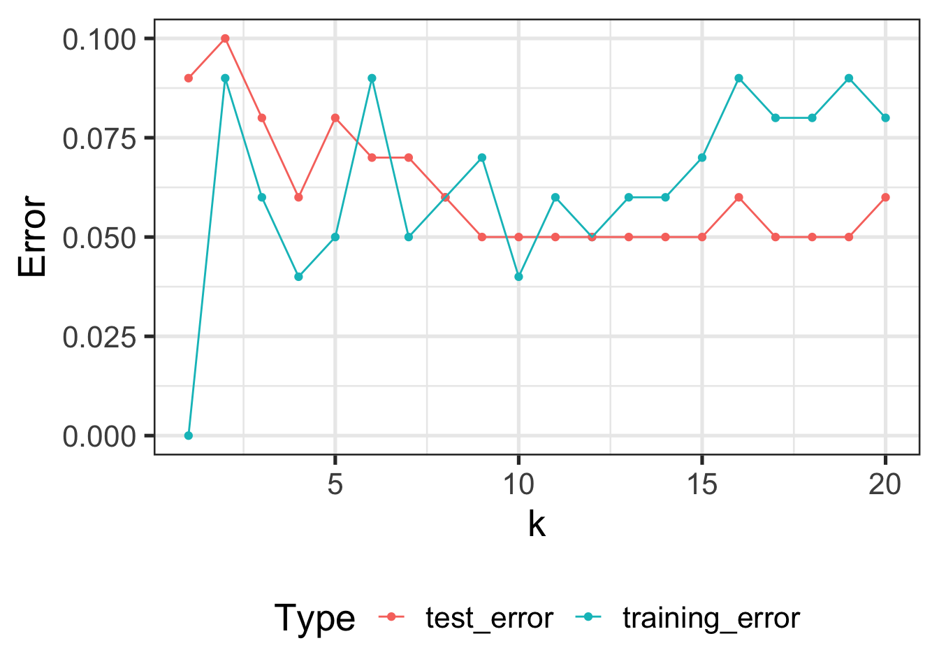
The difference between the two is clearer if we put them on the same figure:
ERRS <- inner_join(TRAINING_ERRORS, TESTING_ERRORS, by="k") |>
        pivot_longer(-k) |>
        rename(Error=value, Type=name)
ggplot(ERRS, aes(x=k, y=Error, color=Type)) +
  geom_point() + geom_line()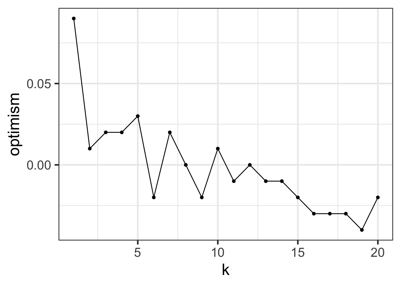
We notice a few things here:
- Training Error increases in \(K\)12, with 0 training error at \(K=1\). (Why?)
- Test Error is basically always higher than test error
- The best training error does not have the best test error
We can also look at the gap between training and test error: this is called generalization error or optimism:
inner_join(TRAINING_ERRORS, TESTING_ERRORS, by="k") |>
    mutate(optimism=test_error - training_error) |>
    ggplot(aes(x=k, y=optimism)) +
    geom_point() +
    geom_line()
Pause to Reflect
Consider the following questions:
- What is the relationship between optimism and model complexity
- What is the best value of \(K\) for this data set?
- How should we pick the best value of \(K\)?
- How might that change if we increase the number of training samples?
- How might that change if we increase the number of test samples?
Model Complexity (Redux)
Let us understand this using the tools of complexity we discussed above.
- For large \(K\), the model became quite simple, barely fit the training data, but did just as well on the training data as the test data (poorly on both). This is indicative of a small generalization gap and a low complexity model.
- For python \(K\), the model became rather complex, fit the training data well, but didn’t perform as well as we would like on the test data. This is indicative of a large generalization gap and a high complexity model.
In this case, we could see the complexity visually by looking at the decision boundaries (the lines separating predictions of class “A” from class “B”). This isn’t universally true13, but the intuition of “high complexity = more wiggles” is usually pretty good.
The classical story of ML and complexity is given by something like this:14

For now, you can interpret “risk” as “test error” and “empirical risk” as “training error”.
A more complex story of complexity
Recent research has suggested that the story is not quite so simple. Some methods exhibit a “single descent” curve

and some even have a “double descent” curve:

The story of these curves is still an active topic of research, but it’s pretty clear that very large and very deep neural networks exhibit something like a double descent curve. My own guess is that we’re not quite measuring ‘complexity’ correctly for these incredibly complex models and that the classical story holds if we go measure complexity in the right way, but this is far from a universally held belief.
So how do we measure complexity? For OLS, it seems to be proportional to \(p\), while for KNN it seems to be inverse to \(K\). In this class, we won’t really focus too much on the actual measurements. For most of the methods we study, it is usually pretty clear what drives complexity up or down, even if we can’t quite put a number on it.
Stability and Generalization
It turns out there is a deep connection between generalization and a suitable notion of “stability”. A model is said to be relatively stable if changes to an input point do not change the output predictions significantly.15
At an intuitive level, this makes sense: if the model is super sensitive to individual inputs, it must be very flexible and hence quite complex. (A very simple model cannot be sensitive to all of its inputs.)
We can apply this idea to understand some rules-of-thumb and informal practices you might have seen in previous statistics courses:
Regression leverage: Leverage measures how much a single data point can change regression coefficients. This is stability!
Removing outliers: we often define outliers as observations which have a major (and assumed corrupting) influence on our inferences. By removing outliers, we guarantee that the resulting inference is not too sensitive to any of the remaining data points. Here, the ‘pre-step’ of outlier removal increases stability (by changing sensitivity of those observations to zero) and hopefully makes our inferences more accurate (better generalization)
Use of robust statistics, e.g. medians instead of means. These explicitly control the stability of our process.
Perhaps most importantly: this justifies why the large \(n\) (big sample) limit seems to avoid overfitting. If our model is fit to many distinct data points, it can’t be too sensitive to any of them. At least, that’s the hope…
The sort of statistical models you have seen to date – so-called parametric models – have a ‘stabilizing’ effect. By reducing lots of data to only a few parameters, those parameters (and hence the model output) can’t depend too much on any individual input point.16 This ‘bottleneck’ in the parameter space seems to improve performance.
Other methods, like \(1\)-Nearest-Neighbor, become increasingly more complex as we get more data and do not benefit from this sort of ‘bottleneck’ effect.
At this point, you might think that stability and variance are closely related concepts - you are not wrong and we will explore the connection in more detail next week.
Key Terms and Concepts
- Supervised vs Unsupervised
- Regression vs Classification
- Training Error
- Test Error
- Generalization Gap
- Complexity
- Overfitting
- Stability
- \(K\)-Nearest Neighbors
- Decision Boundaries
Footnotes
There are some cultural differences that come from ML’s CS history vs Statistics’ “Science-Support” history: notably, ML folks think of (binary) classification while statisticians think of regression as the first task to teach.↩︎
You may recall the famous quip about the US and the UK: “Two countries, separated by a common language.”↩︎
You might still worry about the randomness of this comparison process: if we had a slightly different sample of our new data, would the better model still look better? You aren’t wrong to worry about this, but we have at a minimum made the problem much easier: now we are just comparing the means of two error distributions - classic \(t\)-test stuff - as opposed to comparing two (potentially complex) models.↩︎
Anecdotally, a Google Data Scientist once mentioned to me that they rarely bother doing \(p\)-value or significance calculations. At the scale of Google’s A/B testing on hundreds of billions of ad impressions, everything is statistically significant.↩︎
I’m being a bit sloppy here. This is more precisely the population test error, not the test set test error.↩︎
A mere \(32 = 1024^3 * 8 = 2^{38} = 274,877,906,944\) bits, giving \(2^{274877906944}=2^{2^{38}} = 2^{2^{2^{19}}}\) possible programs, but who’s counting?↩︎
-
Consider programs of the form:
if x in TRAINING DATA:
return corresponding y
else:
return SOME RANDOM FIXED VALUE
In training error, these models are all perfect, but depending on the choice of “else” value, they will have very different test errors. And it’s not at all hard to imagine that we can do much better than a single fixed value in the “else” branch.↩︎
The book High-Dimensional Statistics by Wainwright introduces these ideas beautifully, but they are unavoidably a bit technical.↩︎
I picked up this term from Ben Recht’s blog, but it is explored in more detail in this paper.↩︎
There are details here about how we measure similarity, but for now we will restrict our attention to simple Euclidean distance.↩︎
KNN is a non-parameteric method, but not all non-parametric methods require access to the training data at test time. We’ll cover some of those later in the course.↩︎
It is easier to understand this ‘in reverse’: as \(K \downarrow 1\), training error decreases to 0, so as \(K \uparrow n\), training error increases.↩︎
In OLS, the complexity doesn’t make the model ‘wigglier’ in a normal sense - it’s still linear after all - but you can think of it as the additional complexity of a 3D ‘map’ (i.e., a to-scale model) vs a standard 2D map.↩︎
Figures from HR Chapter 6, Generalization.↩︎
For details, see O. Bousquet and A. Elisseeff, Stability and Generalization in Journal of Machine Learning Research 2, pp.499-526.↩︎
Some regression textbooks advocate a rule that you have 30 data points for every variable in your model. This is essentially guaranteeing that the \(p/n\) ratio that controls the generalization of OLS (see above!) stays quite small.↩︎