STA 9750
  • Syllabus
  • Pre-Assignments
  • Labs
  • Mini Projects
  • Course Project
  • Additional Resources and Course Policies
  • Learning Objectives
  • Prior Offerings
    • Fall 2025
    • Spring 2025
    • Fall 2024

On this page

  • Software Checks
    • sf
    • gganimate
    • shiny
  • Spatial Data Manipulation
  • Getting Started with Shiny
  • Optional Enrichment: “Myth Busting and Apophenia in Data Visualization”
  • Edit this page
  • View source
  • Report an issue

STA 9750 Lecture #8 Pre-Class Assignment: Taking Plots to the Next Level

Due Date: 2026-04-21 (Tuesday) at 06:00pm (before Class Session #10)

Submission: CUNY Brightspace

This week, we will dive deeper into the world of data visualization, briefly introducing three important topics:

  • mapping;
  • animated visualizations; and
  • interactivity.

Before getting into the new stuff, let’s pause and consolidate everything we’ve done to date:

  1. If you did not finish our previous in class plotting activities, please do so now.

  2. Explore the R Graphics Gallery “Best Charts” collection. Pick one chart from this collection and evaluate it with a critical eye:

    1. Is it well styled?
    2. What story is it trying to tell?
    3. Does it tell that story effectively?
    4. Do you believe that story?
    5. How could it tell the story more effectively?

After doing that, we’re ready to move on to new material. First let’s make sure that you have all the necessary software installed.

Software Checks

This upcoming week, we will use several new R packages. These packages depend on additional software external to R; while this is not typically an issue, and R attempts to install these additional libraries “auto-magically” for you, issues do occasionally arise. In preparation for class, I recommend that you attempt to install these additional libraries so that you will be able to easily follow along in class.

In particular, there are three R packages you should install and confirm work as expected:

  1. sf - A library for working with geospatial data
  2. gganimate - A library for producing animated graphics.
  3. shiny - A library for interactive dashboard creation

I provide code to install and run a small example of each software below. If you can run all of these without issue, you should be good to go. (You do not need to understand this code just yet, but you are welcome to work through it.) If you have issues installing this software, please reach out for help on the course discussion board or in office hours.

sf

The sf library provides a unified interface for manipulating geospatial data. We will primarily use it for visualizing spatial data, i.e., maps.

sf depends on several other packages, so we will make sure these are all installed as needed:

ensure_package <- function(pkg){
    pkg <- as.character(substitute(pkg))
    options(repos = c(CRAN = "https://cloud.r-project.org"))
    if(!require(pkg, character.only=TRUE, quietly=TRUE)) install.packages(pkg)
    stopifnot(require(pkg, character.only=TRUE, quietly=TRUE))
}
ensure_package(sf)
Linking to GEOS 3.13.0, GDAL 3.8.5, PROJ 9.5.1; sf_use_s2() is TRUE

Once these packages have been installed, run the following code to confirm correct installation.

library(sf)
library(ggplot2)
system.file("shape/nc.shp", package = "sf") |>
    sf::st_read(quiet=TRUE) |>
    ggplot(aes(geometry=geometry, 
               fill=NAME)) + 
      geom_sf() + 
      guides(fill="none")

This should produce a multi-colored map of North Carolina.

gganimate

The gganimate package can be used to create animated graphics. To do so, it generates a series of png files using “standard” ggplot2 and then invokes an external library to combine those png files into a gif. The simplest tool for the png-to-gif transformation is called gifski, so we will try to install it first:

ensure_package <- function(pkg){
    pkg <- as.character(substitute(pkg))
    options(repos = c(CRAN = "https://cloud.r-project.org"))
    if(!require(pkg, character.only=TRUE, quietly=TRUE)) install.packages(pkg)
    stopifnot(require(pkg, character.only=TRUE, quietly=TRUE))
}
ensure_package(gifski)
ensure_package(gganimate)

Once installed, please run the following command to verify your installation was successful.

library(tidyverse)
library(gganimate)

readr::read_csv("https://michael-weylandt.com/STA9750/labs/ssa_babynames.csv.gz") |>
    filter(name %in% c("Mary", "Ellen", "Robert", "Michael")) |>
    summarize(n = sum(number), .by=c("year", "name")) |> 
    mutate(name=factor(name, 
                       levels = c("Robert", "Michael", "Mary", "Ellen"))) |>
    ggplot(aes(x=year, y=n, color=name)) + 
    geom_point() +
    geom_line() + 
    theme_bw() + 
    theme(legend.position='bottom') +
    xlab("Year") + 
    ylab("Number of Registered Births") + 
    scale_color_brewer(type="qual", palette=2, name="First Name")  + 
    transition_reveal(year) 

This should create a moving line plot showing the number of children born each year with certain names.

shiny

The following script will install shiny:

ensure_package <- function(pkg){
    pkg <- as.character(substitute(pkg))
    options(repos = c(CRAN = "https://cloud.r-project.org"))
    if(!require(pkg, character.only=TRUE, quietly=TRUE)) install.packages(pkg)
    stopifnot(require(pkg, character.only=TRUE, quietly=TRUE))
}
ensure_package(shiny)

Once shiny is installed, confirm that it works as desired by running the following code:

library(shiny)
shinyApp(
    ui = fluidPage(
      numericInput("n", "n", 10, min=3, max=30),
      plotOutput("plot")
    ),
    server = function(input, output) {
      output$plot <- renderPlot(plot(rnorm(input$n)) )
    }
  )

If this works, it will bring up a very simple window where you can enter a number and see that many random points plotted.

#| '!! shinylive warning !!': |
#|   shinylive does not work in self-contained HTML documents.
#|   Please set `embed-resources: false` in your metadata.
#| standalone: true
#| echo: false
#| viewerHeight: 420
library(shiny)
library(shinylive)
shinyApp(
    ui = fluidPage(
      numericInput("n", "n", 10, min=3, max=30),
      plotOutput("plot")
    ),
    server = function(input, output) {
      output$plot <- renderPlot(plot(rnorm(input$n)))
    }
  )

Note that this might take a while to load in the browser; the version that appears when you run the code locally should be rather quick.

Spatial Data Manipulation

Above, when testing sf, we created a map of North Carolina. Let’s now take a closer look at what the plotted data actually entailed:

nc <- system.file("shape/nc.shp", package = "sf") |>
    sf::st_read(quiet=TRUE)
nc
Simple feature collection with 100 features and 14 fields
Geometry type: MULTIPOLYGON
Dimension:     XY
Bounding box:  xmin: -84.32385 ymin: 33.88199 xmax: -75.45698 ymax: 36.58965
Geodetic CRS:  NAD27
First 10 features:
    AREA PERIMETER CNTY_ CNTY_ID        NAME  FIPS FIPSNO CRESS_ID BIR74 SID74
1  0.114     1.442  1825    1825        Ashe 37009  37009        5  1091     1
2  0.061     1.231  1827    1827   Alleghany 37005  37005        3   487     0
3  0.143     1.630  1828    1828       Surry 37171  37171       86  3188     5
4  0.070     2.968  1831    1831   Currituck 37053  37053       27   508     1
5  0.153     2.206  1832    1832 Northampton 37131  37131       66  1421     9
6  0.097     1.670  1833    1833    Hertford 37091  37091       46  1452     7
7  0.062     1.547  1834    1834      Camden 37029  37029       15   286     0
8  0.091     1.284  1835    1835       Gates 37073  37073       37   420     0
9  0.118     1.421  1836    1836      Warren 37185  37185       93   968     4
10 0.124     1.428  1837    1837      Stokes 37169  37169       85  1612     1
   NWBIR74 BIR79 SID79 NWBIR79                       geometry
1       10  1364     0      19 MULTIPOLYGON (((-81.47276 3...
2       10   542     3      12 MULTIPOLYGON (((-81.23989 3...
3      208  3616     6     260 MULTIPOLYGON (((-80.45634 3...
4      123   830     2     145 MULTIPOLYGON (((-76.00897 3...
5     1066  1606     3    1197 MULTIPOLYGON (((-77.21767 3...
6      954  1838     5    1237 MULTIPOLYGON (((-76.74506 3...
7      115   350     2     139 MULTIPOLYGON (((-76.00897 3...
8      254   594     2     371 MULTIPOLYGON (((-76.56251 3...
9      748  1190     2     844 MULTIPOLYGON (((-78.30876 3...
10     160  2038     5     176 MULTIPOLYGON (((-80.02567 3...

Here, nc is a sf object: this is a subclass (specialized version) of a data frame that includes spatial information. If we glimpse() the object, we see that most of our columns are as expected, but the geometry column is unlike anything we’ve seen so far:

library(tidyverse)
glimpse(nc)
Rows: 100
Columns: 15
$ AREA      <dbl> 0.114, 0.061, 0.143, 0.070, 0.153, 0.097, 0.062, 0.091, 0.11…
$ PERIMETER <dbl> 1.442, 1.231, 1.630, 2.968, 2.206, 1.670, 1.547, 1.284, 1.42…
$ CNTY_     <dbl> 1825, 1827, 1828, 1831, 1832, 1833, 1834, 1835, 1836, 1837, …
$ CNTY_ID   <dbl> 1825, 1827, 1828, 1831, 1832, 1833, 1834, 1835, 1836, 1837, …
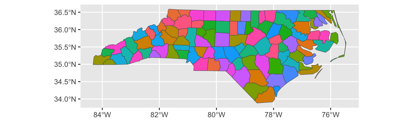
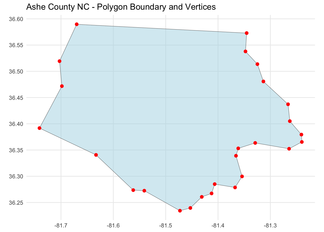
$ NAME      <chr> "Ashe", "Alleghany", "Surry", "Currituck", "Northampton", "H…
$ FIPS      <chr> "37009", "37005", "37171", "37053", "37131", "37091", "37029…
$ FIPSNO    <dbl> 37009, 37005, 37171, 37053, 37131, 37091, 37029, 37073, 3718…
$ CRESS_ID  <int> 5, 3, 86, 27, 66, 46, 15, 37, 93, 85, 17, 79, 39, 73, 91, 42…
$ BIR74     <dbl> 1091, 487, 3188, 508, 1421, 1452, 286, 420, 968, 1612, 1035,…
$ SID74     <dbl> 1, 0, 5, 1, 9, 7, 0, 0, 4, 1, 2, 16, 4, 4, 4, 18, 3, 4, 1, 1…
$ NWBIR74   <dbl> 10, 10, 208, 123, 1066, 954, 115, 254, 748, 160, 550, 1243, …
$ BIR79     <dbl> 1364, 542, 3616, 830, 1606, 1838, 350, 594, 1190, 2038, 1253…
$ SID79     <dbl> 0, 3, 6, 2, 3, 5, 2, 2, 2, 5, 2, 5, 4, 4, 6, 17, 4, 7, 1, 0,…
$ NWBIR79   <dbl> 19, 12, 260, 145, 1197, 1237, 139, 371, 844, 176, 597, 1369,…
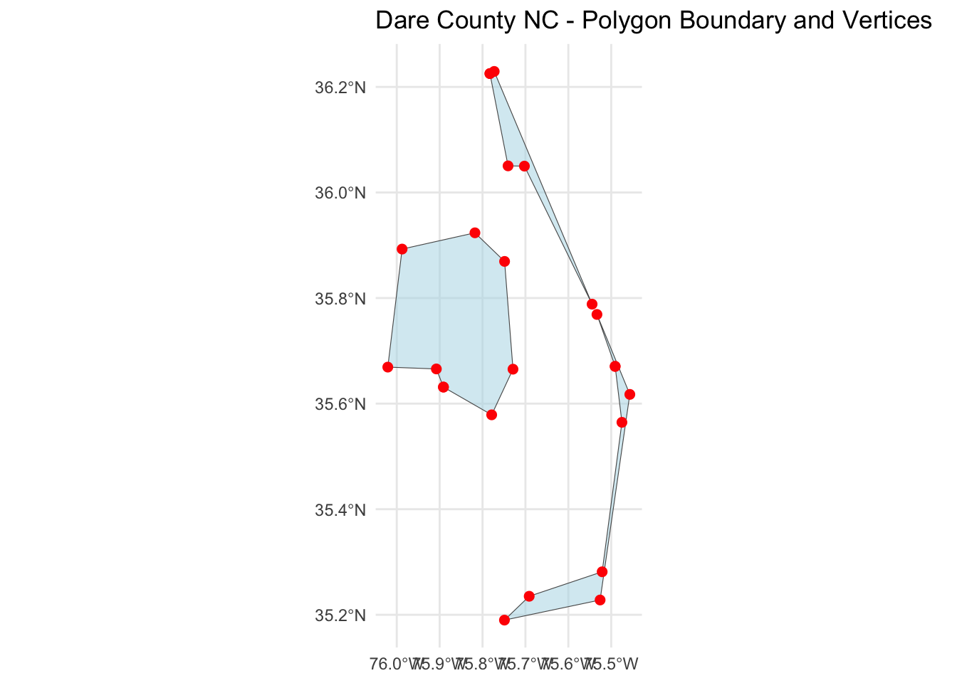
$ geometry  <MULTIPOLYGON [°]> MULTIPOLYGON (((-81.47276 3..., MULTIPOLYGON ((…

Here the geometry column is of type MULTIPOLYGON and if we look a bit closer at what that means, we see that each cell (so each single ‘data point’) looks something like this:

MULTIPOLYGON (((-81.47276 36.23436, -81.54084 36.27251, -81.56198 36.27359, -81.63306 36.34069, -81.74107 36.39178, -81.69828 36.47178, -81.7028 36.51934, -81.67 36.58965, -81.3453 36.57286, -81.34754 36.53791, -81.32478 36.51368, -81.31332 36.4807, -81.26624 36.43721, -81.26284 36.40504, -81.24069 36.37942, -81.23989 36.36536, -81.26424 36.35241, -81.32899 36.3635, -81.36137 36.35316, -81.36569 36.33905, -81.35413 36.29972, -81.36745 36.2787, -81.40639 36.28505, -81.41233 36.26729, -81.43104 36.26072, -81.45289 36.23959, -81.47276 36.23436)))

This is a list of GPS coordinates which can be traced out to give the shape of a polygon. In this particular case, the first row of the nc object is Ashe County, NC and the multipolygon is structured as:

As you see, this forms a closed shape with linear sides, i.e., a polygon. (Look back at that list of GPS coordinates above: it starts and ends in the same place.)

So why is this called a multipolygon? Well, not all geographic regions are true contiguous polygons. Dare County, NC contains some of NC’s famous Outer Banks islands.

As you can see, this isn’t a super-high resolution boundary file, but it does pick up on the existence of several islands. Because this geographic unit is divided into several polygons, it is indeed a multipolygon.

You’re probably starting to think that spatial data can be quite complicated - and you’re right! Programmatically dealing with geospatial data can require highly sophisticated GIS (“Geographic Information System”) tools, but we can cover the easy 80% of spatial data manipulation using R’s sf package.

sf or “Simple Features for R” integrates the simple features GIS paradigm into an R tidyverse framework. We’ll run through some basic examples here to help get you started.

To make our intro a bit more concrete, let’s bring it home to NYC. We’ll load up three different spatial data sets:

  1. The NYC subway lines:
library(sf)
subway_lines <- st_read("https://data.ny.gov/resource/s692-irgq.geojson", 
                        quiet=TRUE)
  1. The NYC subway stations:
subway_stations <- st_read("https://data.ny.gov/resource/39hk-dx4f.geojson", 
                           quiet=TRUE) |>
  select(-borough) # We're going to use borough as an example later so drop
  1. NYC borough boundaries and populations
library(tidycensus)
nyc_tracts <- get_acs(
  geography = "tract",
  variables = "B01003_001", 
  state = "NY",
  county = c("New York", "Kings", "Queens", "Bronx", "Richmond"),
  geometry = TRUE,
  year = 2024) |>
  mutate(borough = case_when(
    str_detect(NAME, "Queens County") ~ "Queens", 
    str_detect(NAME, "Kings County") ~ "Brooklyn", 
    str_detect(NAME, "Bronx County") ~ "Bronx", 
    str_detect(NAME, "Richmond County") ~ "Staten Island", 
    str_detect(NAME, "New York County") ~ "Manhattan",
    .unmatched="error"
  )) |>
  rename(population = estimate) |>
  select(-GEOID, -variable, -moe) |>
  st_transform(crs=4326) # We'll talk about this in class
Getting data from the 2020-2024 5-year ACS
Warning: • You have not set a Census API key. Users without a key are limited to 500
queries per day and may experience performance limitations.
ℹ For best results, get a Census API key at
http://api.census.gov/data/key_signup.html and then supply the key to the
`census_api_key()` function to use it throughout your tidycensus session.
This warning is displayed once per session.

Let’s compare these three data sets:

  1. nyc_tracts has a MULTIPOLYGON geometry, as we would expect for NYC’s Census Tracts.

    glimpse(nyc_tracts)
    Rows: 2,327
    Columns: 4
    $ NAME       <chr> "Census Tract 376; Bronx County; New York", "Census Tract 2…
    $ population <dbl> 2115, 4490, 4194, 6071, 5023, 2949, 2433, 2964, 4942, 7738,…
    $ borough    <chr> "Bronx", "Bronx", "Bronx", "Bronx", "Bronx", "Bronx", "Bron…
    $ geometry   <MULTIPOLYGON [°]> MULTIPOLYGON (((-73.87038 4..., MULTIPOLYGON (…
  2. NYC’s Subway Stations have a POINT geometry type since they exist at a single point in space, not as a region.1

    glimpse(subway_stations)
    Rows: 496
    Columns: 18
    $ station_id            <chr> "1", "2", "3", "4", "5", "6", "7", "8", "9", "10…
    $ north_direction_label <chr> "Last Stop", "Astoria", "Astoria", "Astoria", "A…
    $ line                  <chr> "Astoria", "Astoria", "Astoria", "Astoria", "Ast…
    $ daytime_routes        <chr> "N W", "N W", "N W", "N W", "N W", "N W", "N R W…
    $ complex_id            <chr> "1", "2", "3", "4", "5", "6", "613", "8", "9", "…
    $ division              <chr> "BMT", "BMT", "BMT", "BMT", "BMT", "BMT", "BMT",…
    $ ada_southbound        <chr> "0", "1", "0", "0", "0", "0", "0", "0", "1", "0"…
    $ gtfs_stop_id          <chr> "R01", "R03", "R04", "R05", "R06", "R08", "R11",…
    $ structure             <chr> "Elevated", "Elevated", "Elevated", "Elevated", …
    $ ada_notes             <chr> NA, NA, NA, NA, NA, NA, NA, NA, NA, "Uptown only…
    $ stop_name             <chr> "Astoria-Ditmars Blvd", "Astoria Blvd", "30 Av",…
    $ gtfs_longitude        <chr> "-73.912034", "-73.917843", "-73.921479", "-73.9…
    $ ada_northbound        <chr> "0", "1", "0", "0", "0", "0", "0", "0", "1", "1"…
    $ ada                   <chr> "0", "1", "0", "0", "0", "0", "0", "0", "1", "2"…
    $ south_direction_label <chr> "Manhattan", "Manhattan", "Manhattan", "Manhatta…
    $ cbd                   <chr> "false", "false", "false", "false", "false", "fa…
    $ gtfs_latitude         <chr> "40.775036", "40.770258", "40.766779", "40.76182…
    $ geometry              <POINT [°]> POINT (-73.91203 40.77504), POINT (-73.917…
  3. Finally, the subway lines have type MULTILINESTRING. This is a bit of a mouthful, but it captures the essence of how we would expect subway lines to be: one-dimensional paths traced on a 2D background.

    subway_lines
    Simple feature collection with 29 features and 4 fields
    Geometry type: MULTILINESTRING
    Dimension:     XY
    Bounding box:  xmin: -74.25271 ymin: 40.51221 xmax: -73.75446 ymax: 40.90373
    Geodetic CRS:  WGS 84
    First 10 features:
       objectid            service_name service     shape_stlength
    1         5    Broadway / 7AV Local       1  77623.93076359815
    2         4        8 Avenue Express       A 101293.08009556108
    3         3    14 St-Canarsie Local       L  54130.28254204164
    4         2 Franklin Avenue Shuttle      SF   7098.21908922379
    5         1   Nassau Street Express       J  70656.68490562918
    6        11      Lexington Av Local       6  79571.48821306424
    7        10       42 Street Shuttle      ST  2285.504908819597
    8         9        6 Avenue Express       B 127602.11278784153
    9         8    Lexington Av Express       4 106032.53413854787
    10        7        Broadway Express       Q  96999.90734425026
                             geometry
    1  MULTILINESTRING ((-73.98594...
    2  MULTILINESTRING ((-73.94368...
    3  MULTILINESTRING ((-74.00342...
    4  MULTILINESTRING ((-73.95576...
    5  MULTILINESTRING ((-74.00382...
    6  MULTILINESTRING ((-74.00482...
    7  MULTILINESTRING ((-73.97919...
    8  MULTILINESTRING ((-73.96132...
    9  MULTILINESTRING ((-73.93294...
    10 MULTILINESTRING ((-73.98115...

So we have three types of data: point (stations), linear (subway lines), and areal (census tracts). The complexity of GIS work comes from combining these. First, let’s plot them. In each case, all we have to do is use the geom_sf() function from ggplot2 with the geometry aesthetic and R will handle it properly for us:2

nyc_tracts |> 
  ggplot(aes(geometry=geometry)) + 
  geom_sf() + 
  theme_bw() + 
  ggtitle("NYC Census Tracts [Areal geom_sf]")

vs.

subway_stations |> 
  ggplot(aes(geometry=geometry)) + 
  geom_sf() + 
  theme_bw() + 
  ggtitle("NYC Subway Stations [Point geom_sf]")

and

subway_lines |> 
  ggplot(aes(geometry=geometry)) + 
  geom_sf() + 
  theme_bw() + 
  ggtitle("NYC Subway Lines [Linear geom_sf]")

We can even superimpose these:

ggplot(mapping=aes(geometry = geometry)) + 
  geom_sf(data=nyc_tracts) + 
  geom_sf(data=subway_stations, col="red4") + 
  geom_sf(data=subway_lines, col="green3", alpha=0.8) +
  theme_bw()  + 
  ggtitle("NYC Subway System")

Note that here, instead of setting the data for the whole plot in the initial ggplot() call as we typically do, we have passed different data sets to each layer of the plot.

So let’s do some basic manipulation. First, we might want to aggregate tracts to boroughs and get borough-level populations:

nyc_tracts |> 
  group_by(borough) |> 
  summarize(population = sum(population))
Simple feature collection with 5 features and 2 fields
Geometry type: GEOMETRY
Dimension:     XY
Bounding box:  xmin: -74.25563 ymin: 40.4961 xmax: -73.70036 ymax: 40.91771
Geodetic CRS:  WGS 84
# A tibble: 5 × 3
  borough       population                                              geometry
  <chr>              <dbl>                                        <GEOMETRY [°]>
1 Bronx            1404779 MULTIPOLYGON (((-73.78765 40.85973, -73.78671 40.858…
2 Brooklyn         2631580 POLYGON ((-73.86702 40.68683, -73.86728 40.68774, -7…
3 Manhattan        1629477 MULTIPOLYGON (((-74.0422 40.69997, -74.039 40.69762,…
4 Queens           2323052 POLYGON ((-73.85307 40.80011, -73.85463 40.79972, -7…
5 Staten Island     494956 MULTIPOLYGON (((-74.16004 40.5276, -74.15698 40.5289…

We see here that we summed the population as we might expect, but what happened to the geometry column? Because this was an sf and not a “regular” data.frame, the spatial nature persisted across summarization. Here, we see that the geometry column is essentially the union of all the tracts in that borough:

nyc_tracts |> 
  group_by(borough) |> 
  summarize(population = sum(population)) |>
  ggplot(aes(geometry=geometry)) + 
  geom_sf()

Pretty nifty. Our other dplyr operations work as we might expect:

nyc_tracts |> 
  group_by(borough) |> 
  slice_max(population) |>
  ggplot(aes(geometry=geometry, fill=borough)) + 
  geom_sf() + 
  theme(legend.position="bottom") + 
  ggtitle("Most Populous Tracts in Each Borough")

Not terribly attractive, but it does what we’d expect.

Things get more interesting when we want to combine different bits of geometry. For example, suppose we want to ask “how many subway stations are in each borough?” (Poor Staten Island…) To answer this, we want to do a ‘join’, but it’s not quite one of the equality joins we used from normal dplyr.

We need a spatial join, which is implement with the sf::st_join() function. And instead of using a join_by(x == y) type specification, we need to use one of the relevant logical predicates listed on the help page. For us, the default st_intersects seems to work just fine:

library(gt)
st_join(subway_stations, nyc_tracts) |>
  group_by(borough) |> 
  count() |> 
  arrange(desc(n)) |> 
  gt(id="tbl_subway1") |> 
  cols_hide("geometry") |> 
  cols_label(borough = md("**Borough**"), 
             n="Number of Subway Stations") |>
  grand_summary_rows(columns=n, 
                     fns=list("Total" ~ sum(.)))
Borough Number of Subway Stations
Brooklyn 169
Manhattan 153
Queens 83
Bronx 70
Staten Island 21
Total — 496

This is perhaps a bit fishy - why are there 21 stations in SI which (famously) does not have a subway. We should always start by seeing if our join went off, but things look good here. We have 496 rows, which matches the 496 rows in subway_stations. It turns out this is just a good-old “data not being what the label makes us think” problem:

st_join(subway_stations, nyc_tracts) |> 
  filter(borough == "Staten Island") |>
  gt() |>
  cols_hide(everything()) |> 
  cols_unhide(c(stop_name, line, division, borough)) |>
  cols_merge(c(line, division)) |>
  cols_label(stop_name = "Stop Name", 
             line="Line", 
             borough="Borough")
Line Stop Name Borough
Staten Island SIR St George Staten Island
Staten Island SIR Tompkinsville Staten Island
Staten Island SIR Stapleton Staten Island
Staten Island SIR Clifton Staten Island
Staten Island SIR Grasmere Staten Island
Staten Island SIR Old Town Staten Island
Staten Island SIR Dongan Hills Staten Island
Staten Island SIR Jefferson Av Staten Island
Staten Island SIR Grant City Staten Island
Staten Island SIR New Dorp Staten Island
Staten Island SIR Oakwood Heights Staten Island
Staten Island SIR Bay Terrace Staten Island
Staten Island SIR Great Kills Staten Island
Staten Island SIR Eltingville Staten Island
Staten Island SIR Annadale Staten Island
Staten Island SIR Huguenot Staten Island
Staten Island SIR Prince's Bay Staten Island
Staten Island SIR Pleasant Plains Staten Island
Staten Island SIR Richmond Valley Staten Island
Staten Island SIR Tottenville Staten Island
Staten Island SIR Arthur Kill Staten Island

So it seems the Staten Island Railroad is listed as a subway on the official MTA Subway Stations listing. Ain’t life grand?

There is much more that can be said about spatial data, but these are the basic tools and all that we have time for now. If you have questions about using spatial techniques in your course project, please ask!

Getting Started with Shiny

This week, we will also explore various technologies for interactive data visualization. These can be divided into two broad categories:

  • Server Based: When the user makes a change to a plot, it is sent to a server where the new plot is rendered and returned to the user.
  • Browser Based: When the user makes a change to a plot, the new plot is created in the browser and re-rendered ‘on site’. (This is the strategy I have used through some of these notes, where you are able to type R code and run it directly in your browser.)

Generally, server-based approaches are more flexible and a bit easier to implement, while browser-based approaches are more responsive and scalable. Since the browser work is done locally on the user’s computer (or phone or tablet), they are also cheaper and safer to run as there’s no need to have a server constantly responding to user input.

This week, we will explore a bit of each modality, though entire courses (and indeed entire careers) have been spent on both.

In the R ecosystem, the tool of choice for building server-based3 web applications is shiny.4 For this pre-assignment, work through Lessons 1 and 2 of the “Shiny Basics” web tutorial. (You do not need to do the “Next Steps” in Lesson 3, but you are of course welcome to.)

After finishing these activities, complete the Weekly Pre-Assignment Quiz on Brightspace.

Optional Enrichment: “Myth Busting and Apophenia in Data Visualization”

For some optional extra enrichment, watch Prof. Di Cook’s lecture “Myth busting and apophenia in data visualisation: is what you see really there?”. As we discussed in class, plots are an excellent way to explore data, but we always want to be careful that what we think find truly exists. For purely numeric summaries, we can often avoid (or at least minimize the frequency) of self-delusion with classical \(p\)-value-type techniques, but these are not so easily applied to visualization.

Prof. Cook discusses relationships between effective statistical visualization and effective statistical practice.

Footnotes

  1. Of course, the stations are not actually true points (in the sense of geometry) and have an extent and a shape, but we treat them as points for this exercise.↩︎

  2. You might notice that the census provided tract shapes include some water parts of NYC so we’re not actually getting the expected East River between Manhattan/Bronx and Brooklyn/Queens. NYC Planning provides a shoreline clipped shapefile but then we’d have to match things up with the census data, so we’re not going to worry about the water for now.↩︎

  3. There is an effort to run shiny fully in browser (avoiding the need for a web server). It is still a work-in-progress, but you can try it out on the r-shinylive website, with a full gallery of examples here.↩︎

  4. If you are more of a Python person, you can also check out the Python versions of shiny and shinylive.↩︎

  • Edit this page
  • View source
  • Report an issue