| Date | Time | Details |
|---|---|---|
| 2026-03-22 | 11:59pm ET | Mini-Project Peer Feedback #01 Due |
| 2026-03-26 | 6:00pm ET | Mid-Semester Check-In Slides Due |
| 2026-04-02 | 11:59pm ET | Mid-Semester Teammate Peer Evaluations Due |
| 2026-04-02 | NA | Classes Cancelled (Spring Break – Week 1) |
| 2026-04-03 | 11:59pm ET | Mini-Project #02 Due |
| 2026-04-09 | NA | Classes Cancelled (Spring Break – Week 2) |
| 2026-04-12 | 11:59pm ET | Mini-Project Peer Feedback #02 Due |
| 2026-04-16 | 6:00pm ET | Pre-Assignment #09 Due |
Software Tools for Data Analysis
STA 9750
Michael Weylandt
Week 7 – Thursday 2026-03-19
Last Updated: 2026-03-20
Special Visitor
Prof. Ann Brandwein is joining us today

Advisor for MS Stat and MS QMM. If you don’t already know Prof. B, you should!
Under CUNY Procedures, untenured faculty (like me!) are observed and evaluated once a semester.
You don’t need to do anything different.
- Prof. Brandwein will be assigned to a breakout room. (Be nice 😀!)
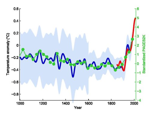
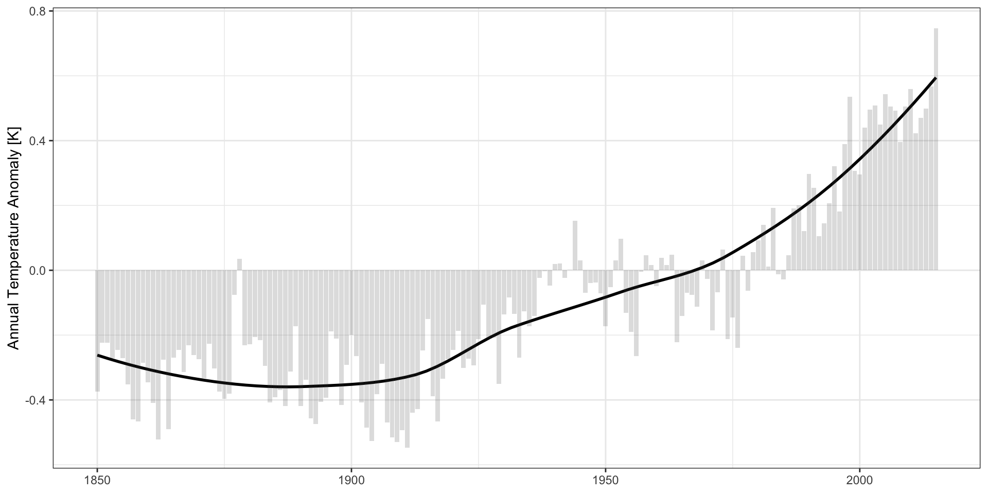
Temperature Anomaly
Mann, Bradley, & Hughes. Geophysical Research Letters 26(6). 1999. (via Wikipedia)
Aside: Oak Ridge
Calutron Girls
Via Wikipedia:

Why Visualization?
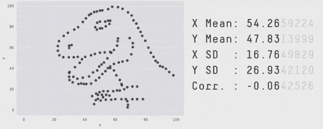
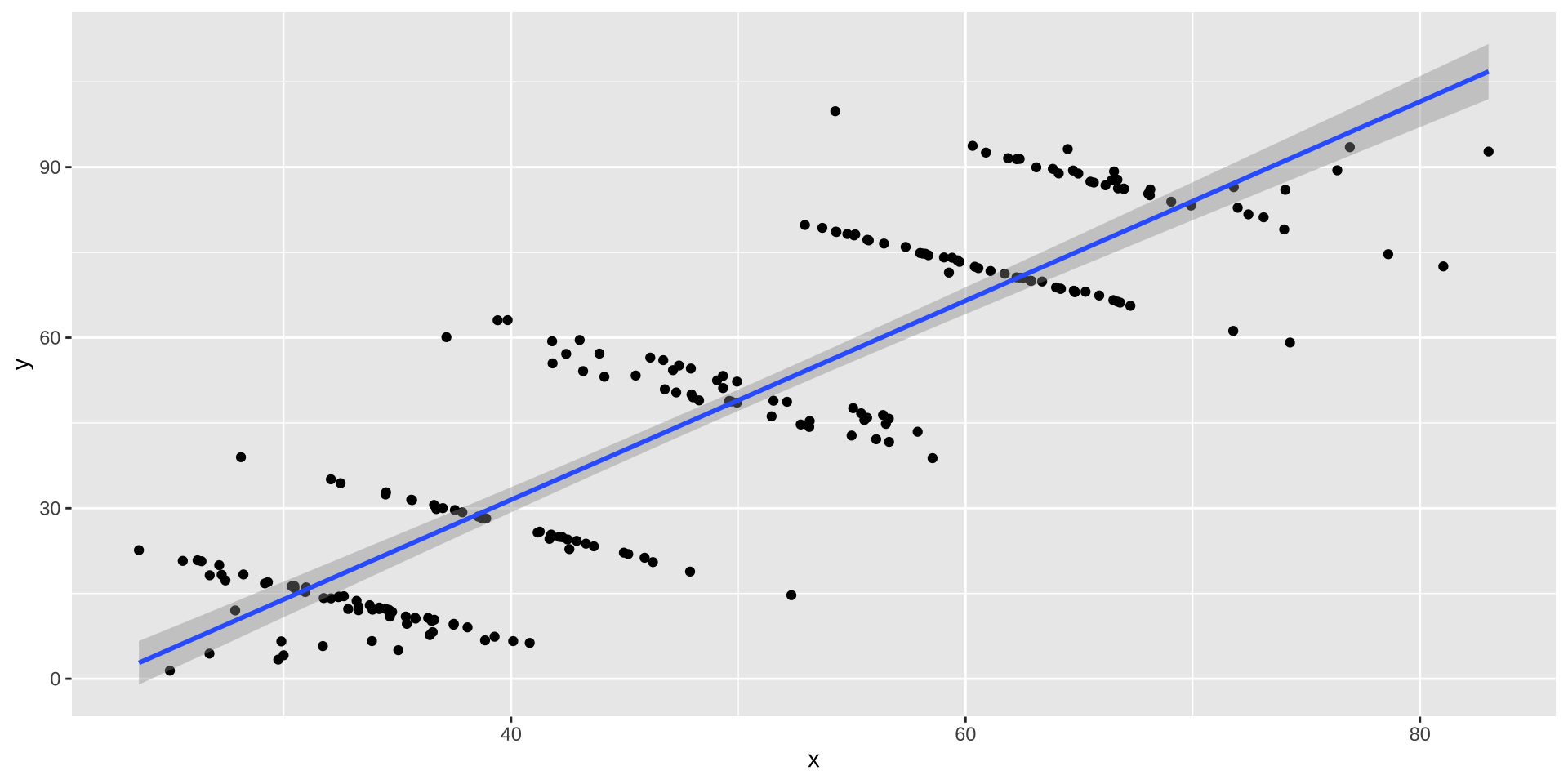
Same \(\mu_X, \mu_Y, \sigma_X, \sigma_Y, \rho_{XY}, \beta_{Y|X}, \dots\) - OLS can’t distinguish
Why Visualization?
Modeling and visualizing are not sequential:
- Build a model, where does it fail?
- See a pattern, does it hold up in a model / test?
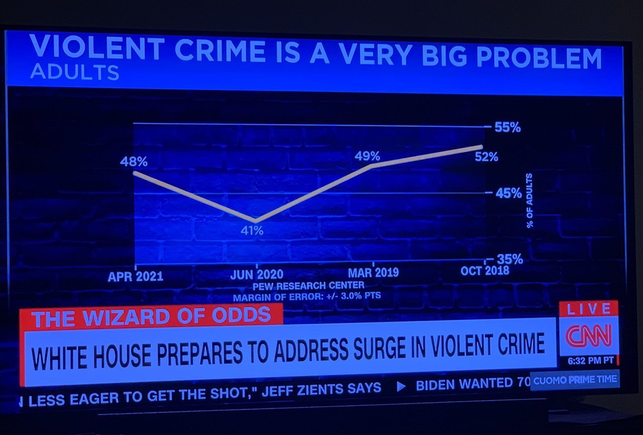
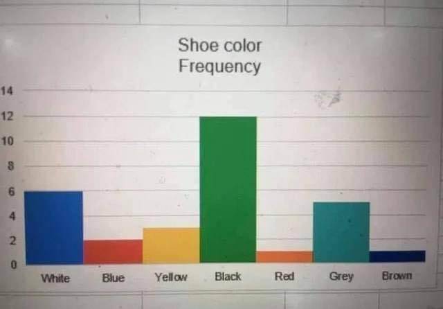
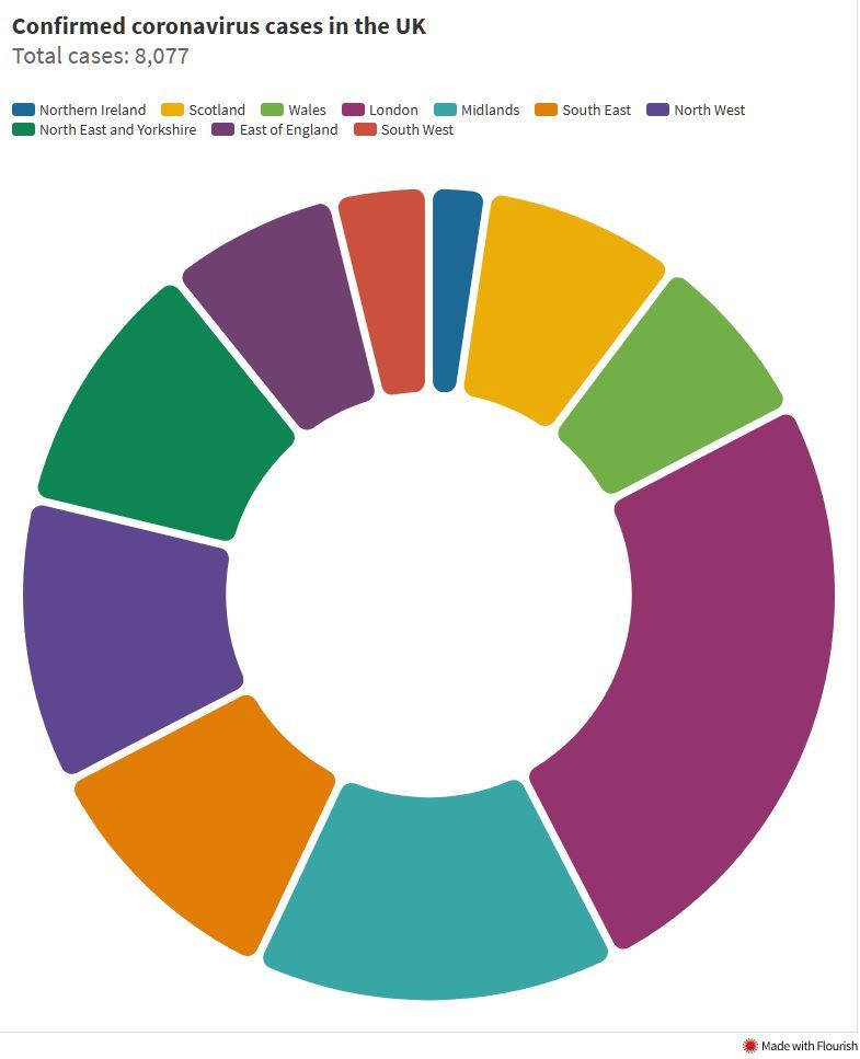
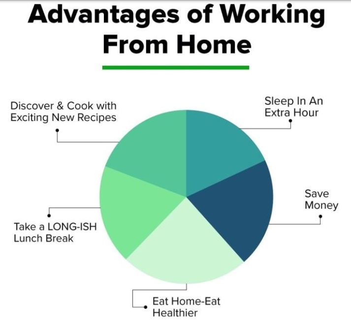
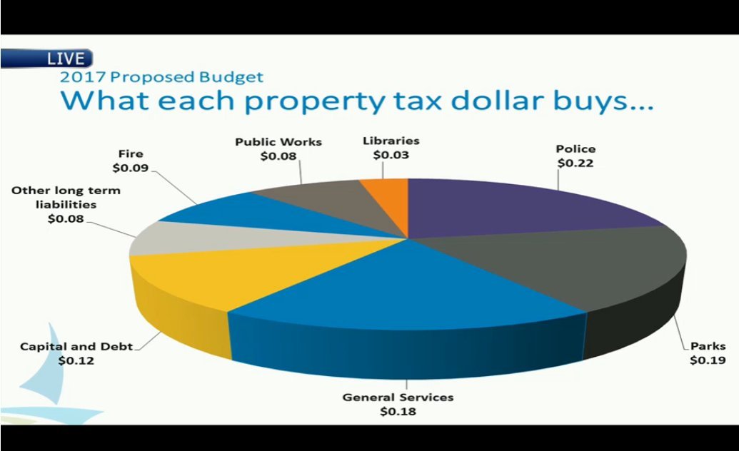
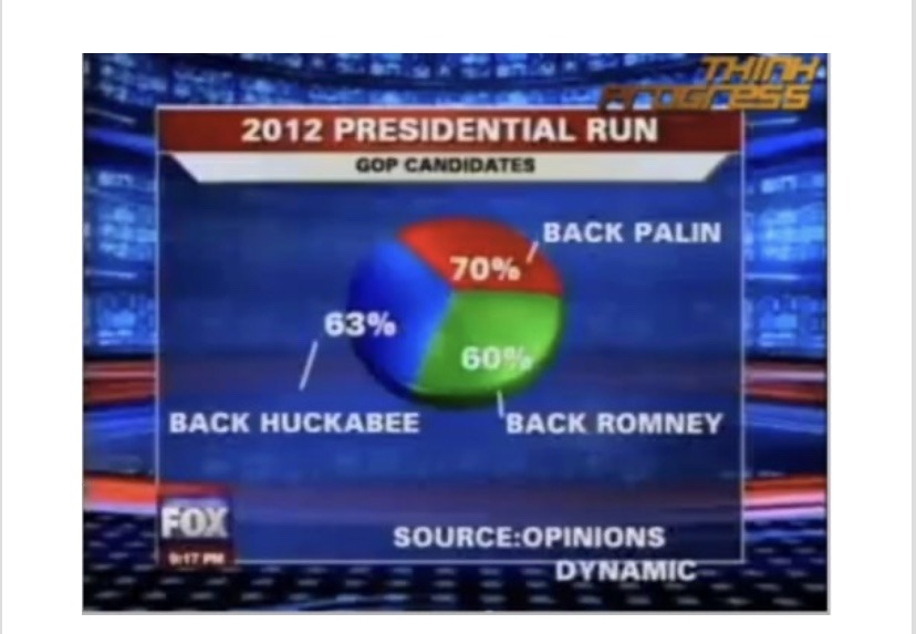
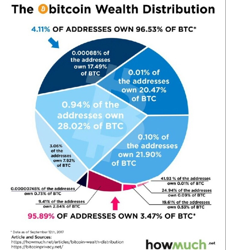
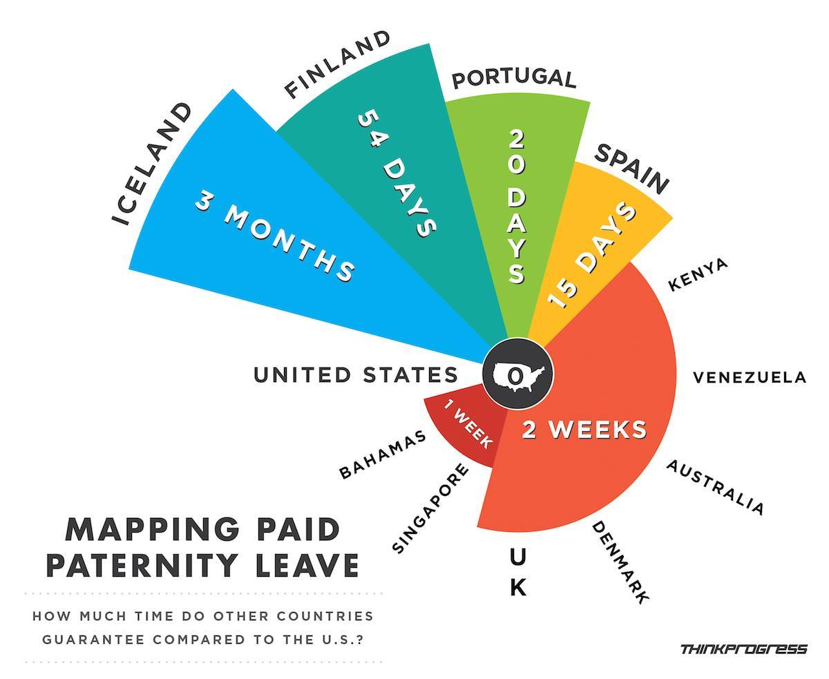
Spot the Problem!
Examples from Viz.WTF:
Spot the Problem!
Examples from Viz.WTF:
Spot the Problem!
Examples from Viz.WTF:
Spot the Problem!
Examples from Viz.WTF:
Spot the Problem!
Examples from Viz.WTF:
Spot the Problem!
Examples from Viz.WTF:
Spot the Problem!
Examples from Viz.WTF:
Spot the Problem!
Examples from Viz.WTF:
Spot the Problem!
Examples from Viz.WTF:
Spot the Problem!
Examples from Viz.WTF:
Spot the Problem!
Examples from Viz.WTF:
Spot the Problem!
Examples from Viz.WTF:
Spot the Problem!
Examples from Viz.WTF:
Spot the Problem!
Examples from Viz.WTF:
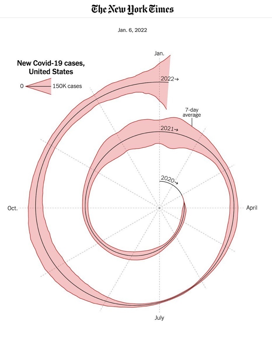
Spot the Problem!
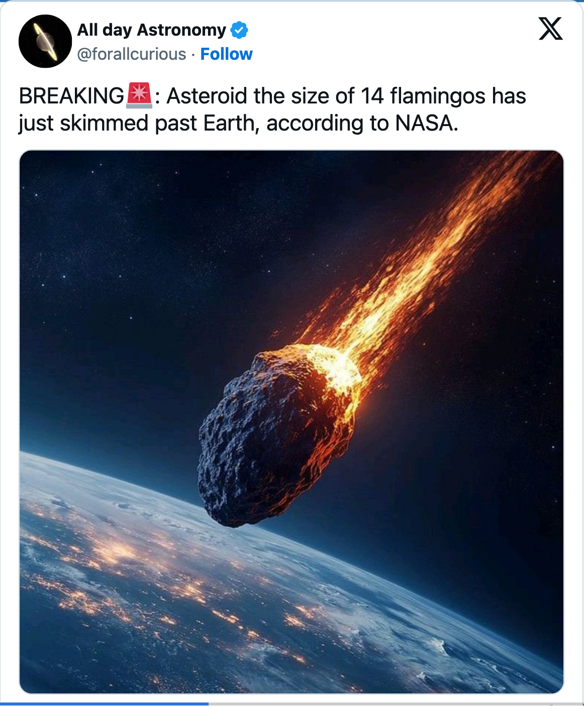
BREAKING🚨: Asteroid the size of 14 flamingos has just skimmed past Earth, according to NASA. pic.twitter.com/vfUTk2OAvG
— All day Astronomy (@forallcurious) March 5, 2026
Spot the Problem!
From dadtawrapper.de:
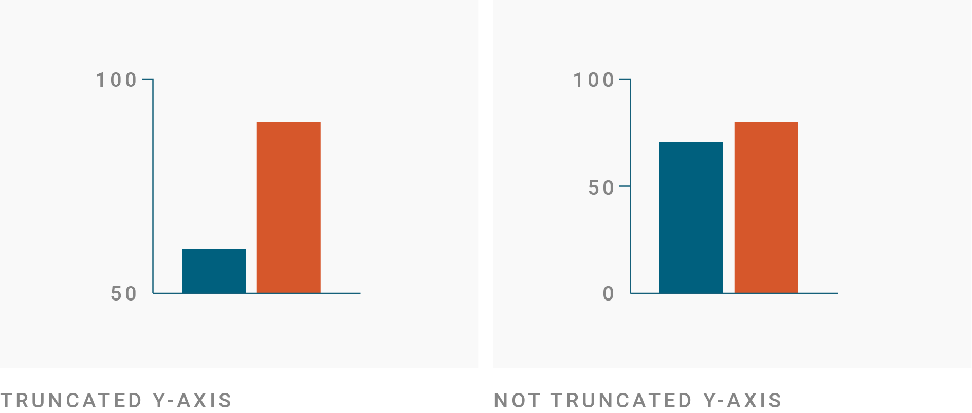
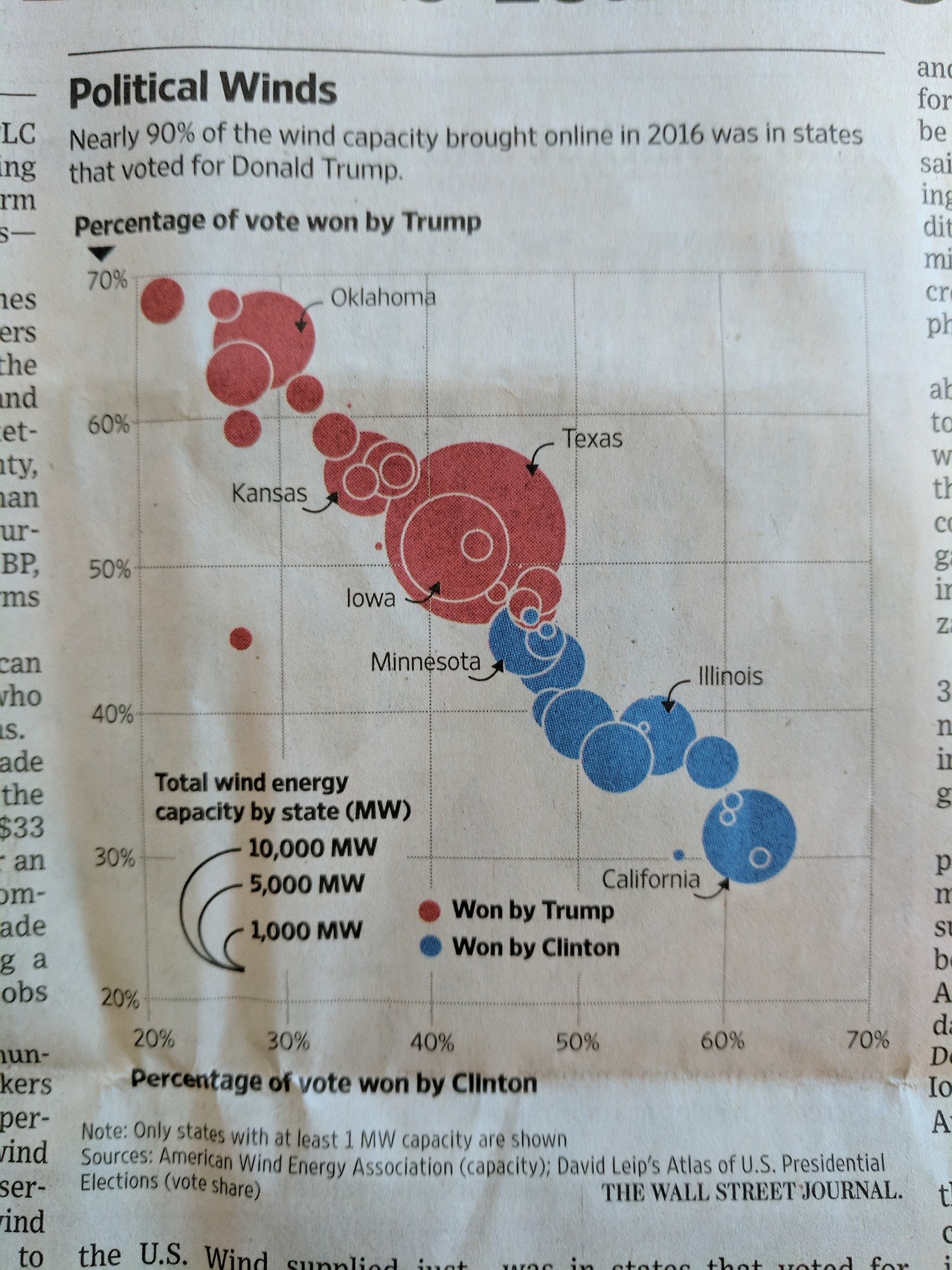
Zero-Based Axes?
CDIAC Data:
Zero-Based Axes?
CDIAC Data:

Zero-Based Axes?
CDIAC Data:
Zero-Based Axes?
CDIAC Data:

Practical Advice: use the natural scale of the problem
ggplot2 - Worked Example
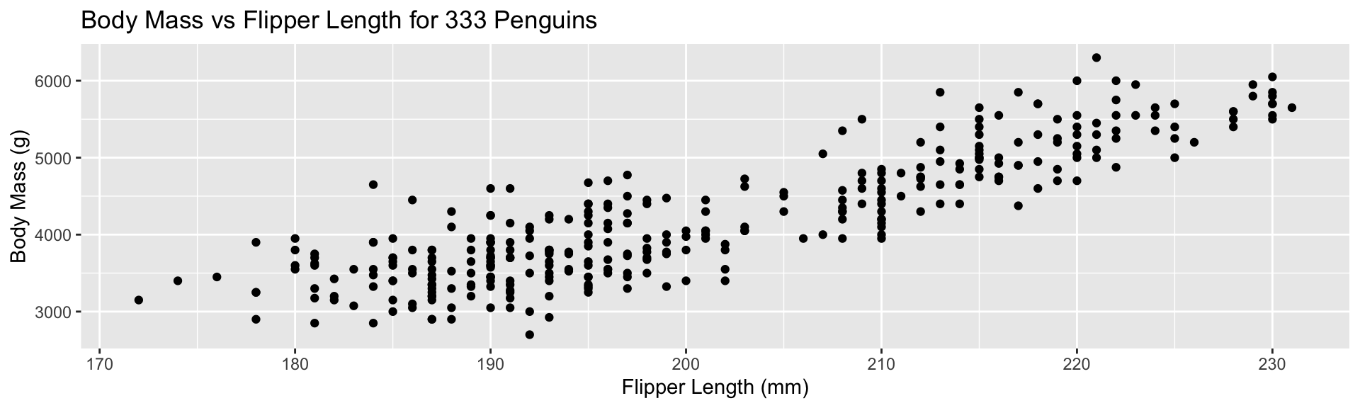
Let’s plot the penguins data. To avoid warnings, use a no-NA version:

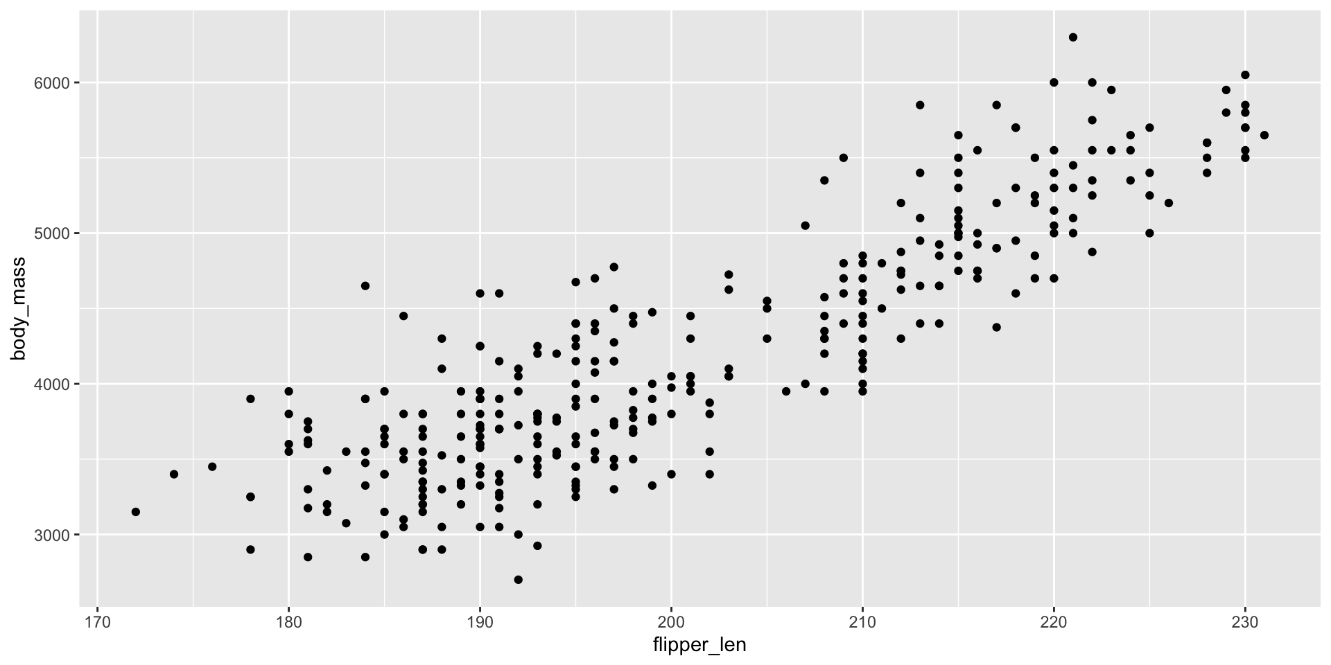
ggplot2 - Worked Example
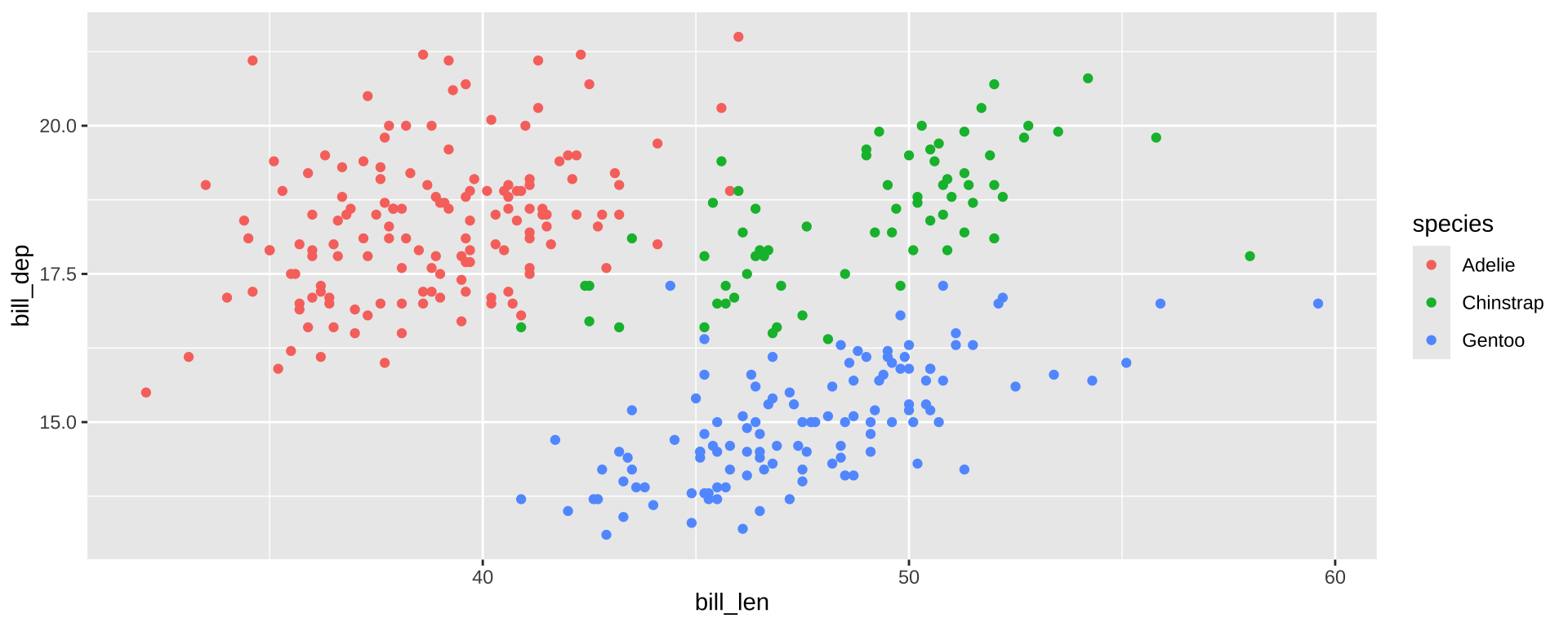
Need to map specific variables to aspects of plots: aes mapping
ggplot2 - Worked Example
Add a geom_ to draw plot elements
ggplot2 - Worked Example
Replace default labels:
ggplot2 - Worked Example
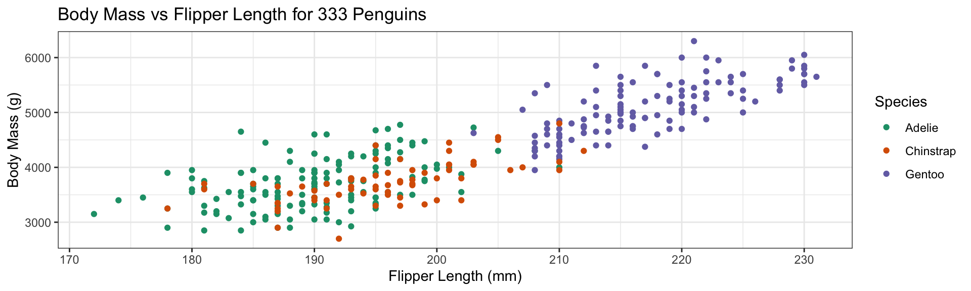
Add color aesthetic
- Additional aesthetic (
color) inherited bygeom_point - Automatic identification of categorical (factor) data
ggplot2 - Worked Example
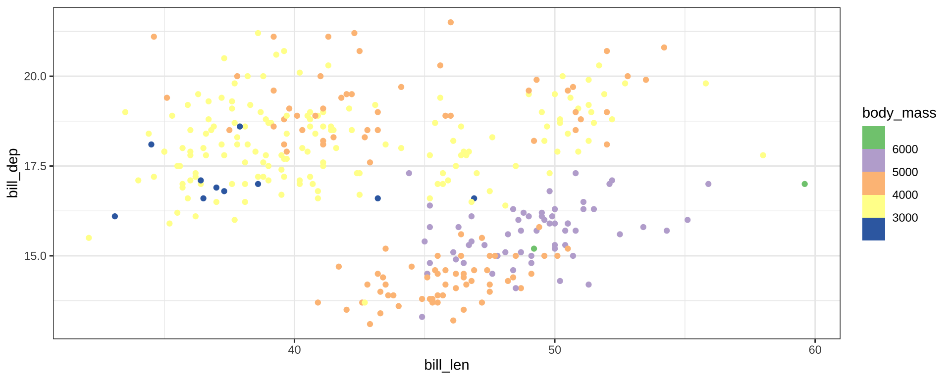
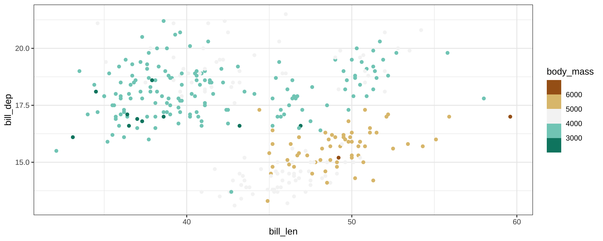
Replace default color scale:
- Override default color scale with
scale_color_brewer - Colors taken from work of Cynthia Brewer (PSU)
- Using a
qualitative palette here because no order to species
ggplot2 - Worked Example
Change theme for non-data elements:
- Default
theme_grey() - Replace by
theme_bw()(Black & White) - Many more themes available
ggplot2 - Worked Example
Override default aesthetic to change shape of points:
- Override default
shapeaesthetic - Provide directly to
geom_point, not viaaessince not data dependent - See ?
scale_shape_discretefor table of values
ggplot2 - Worked Example
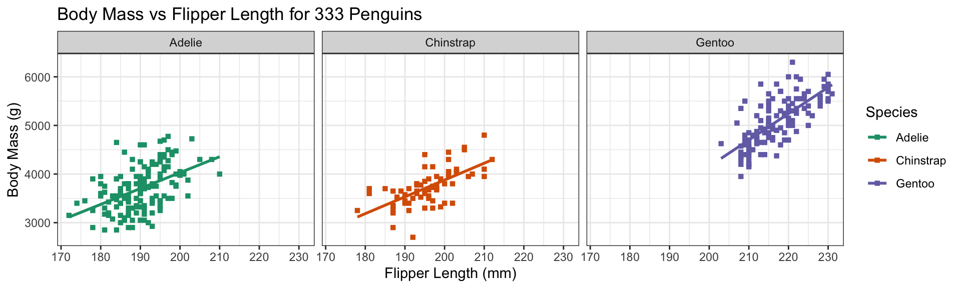
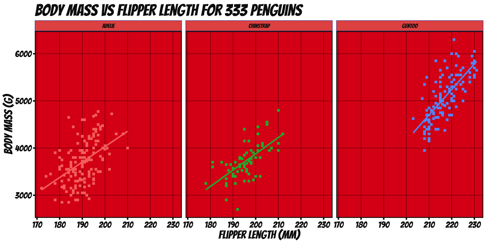
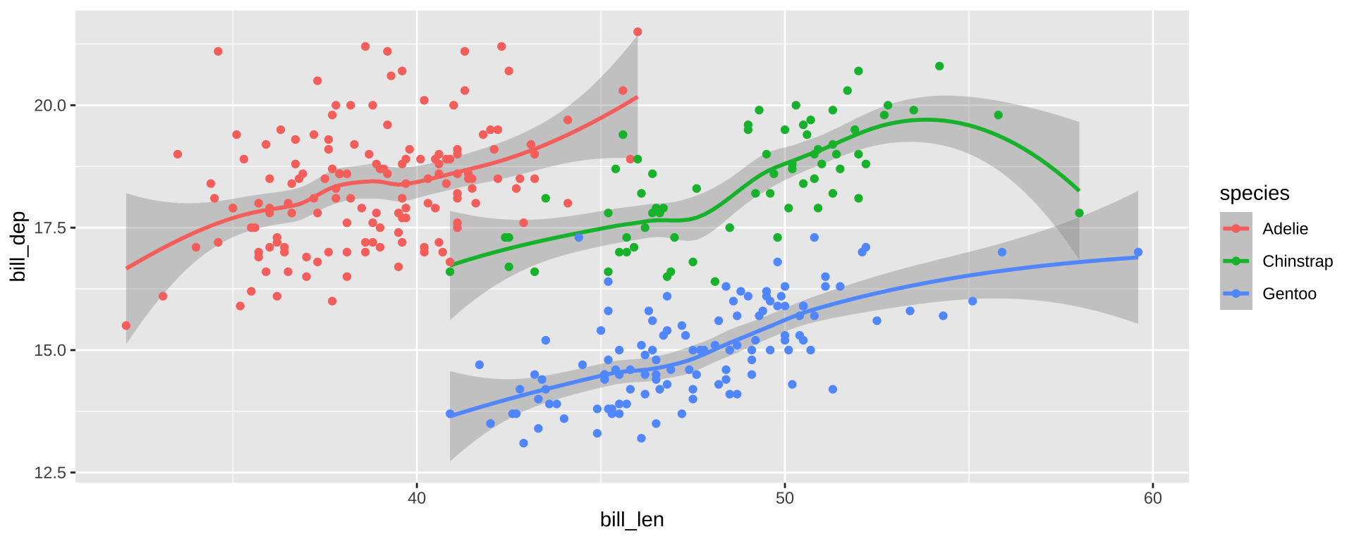
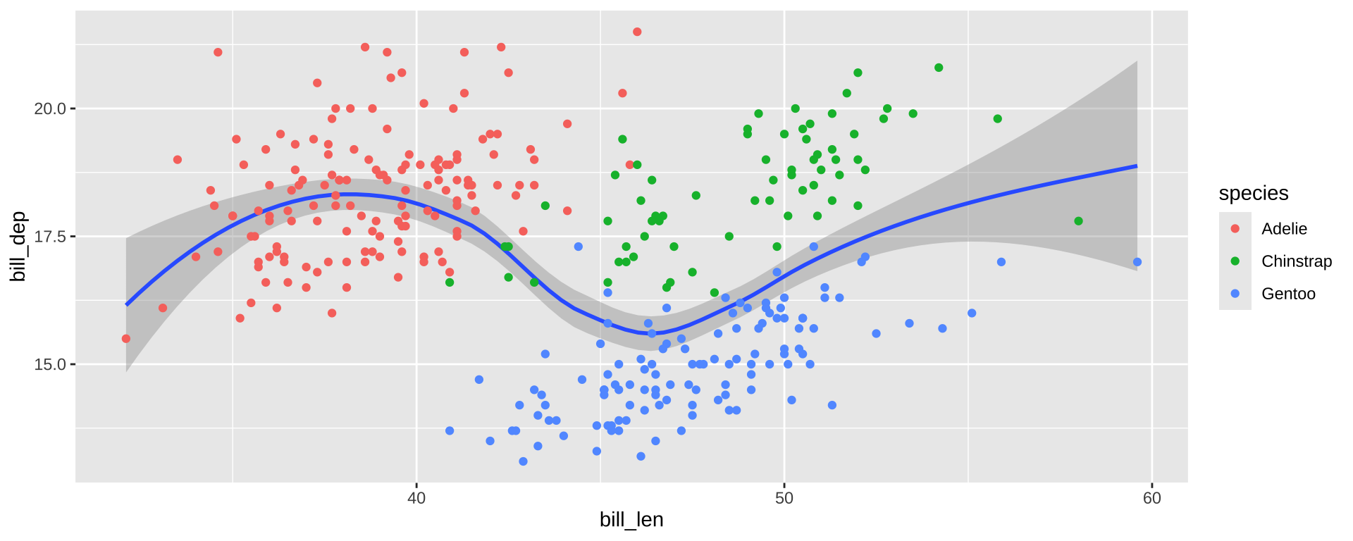
Add trend lines with stat_smooth:
ggplot(penguins_ok,
       aes(x=flipper_len, y=body_mass, color=species)) +
       geom_point(shape=15) +
       stat_smooth(method="lm", se=FALSE) +
       xlab("Flipper Length (mm)") + ylab("Body Mass (g)") +
       ggtitle("Body Mass vs Flipper Length for 333 Penguins") +
       scale_color_brewer(name="Species", type="qual", palette=2) +
       theme_bw()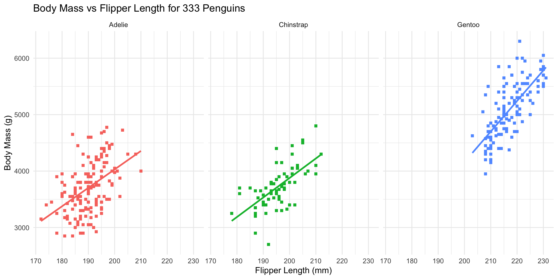
stat_s implement transformationsstat_smoothmarks a trend- Specify use of OLS (
lm= linear model) + disable SE shading
ggplot2 - Worked Example
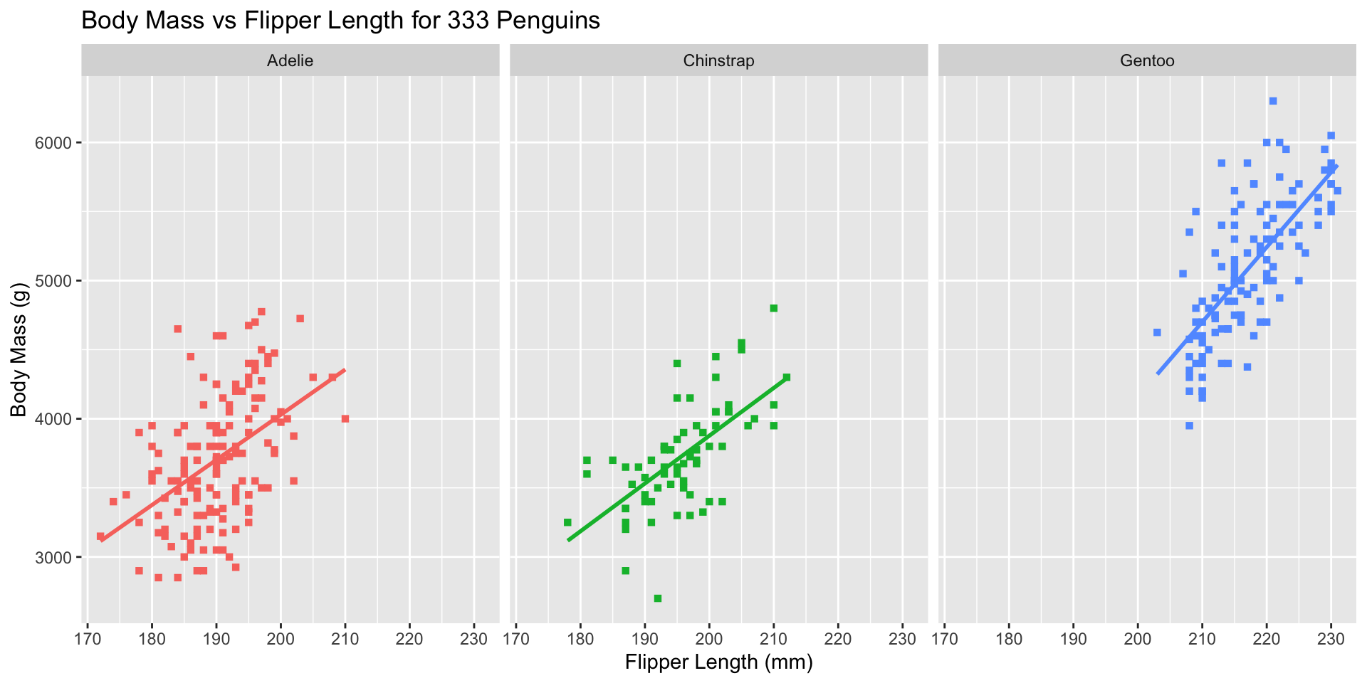
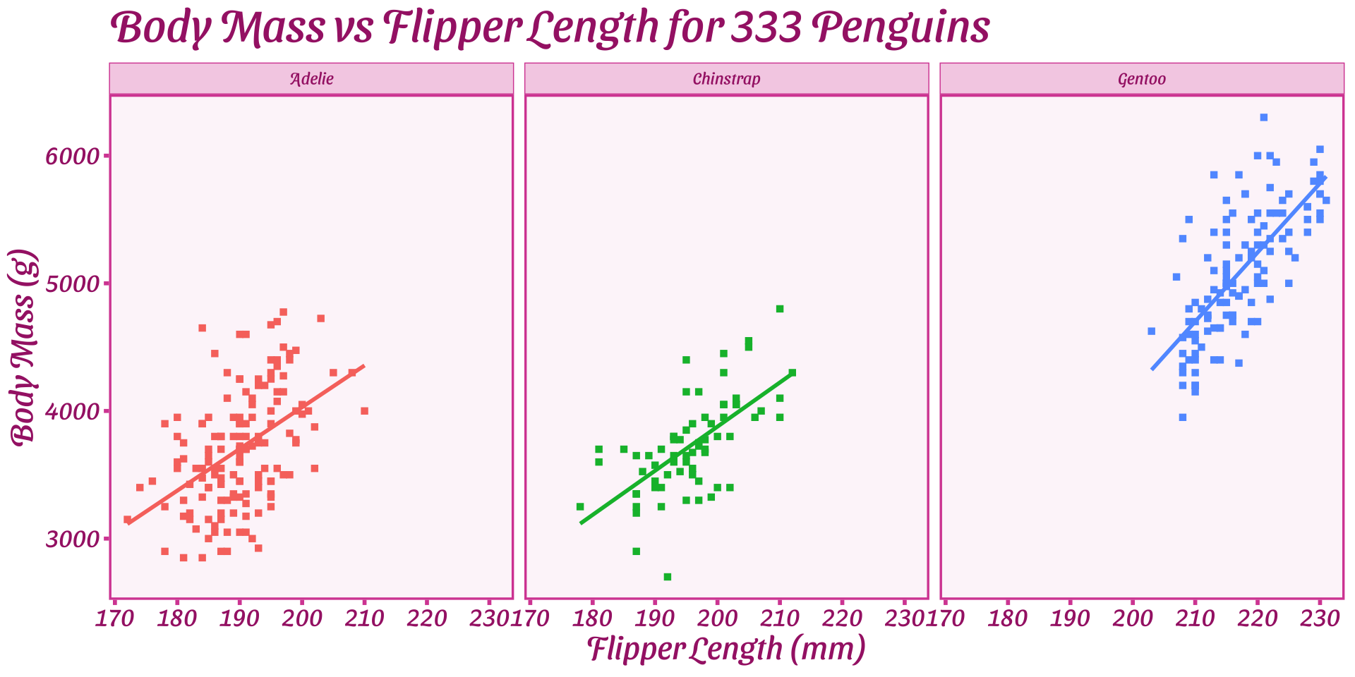
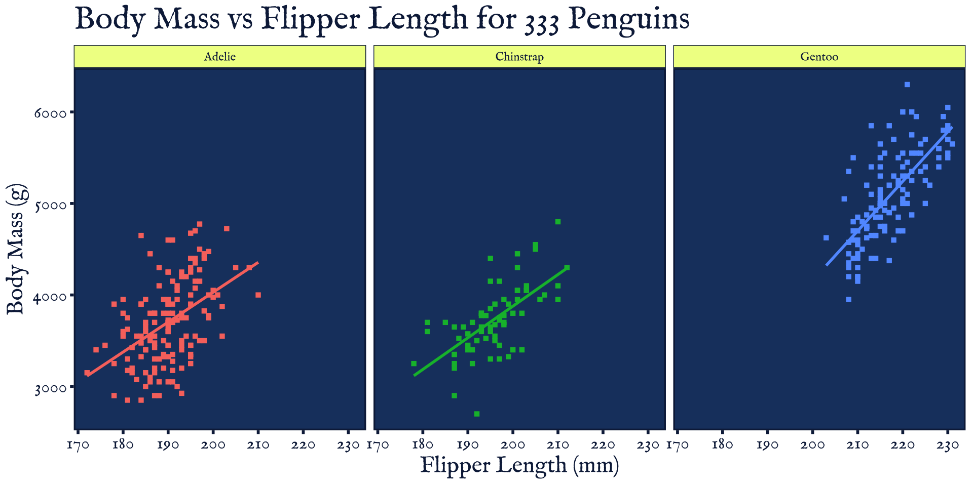
Break data into subplots (“facets”) to avoid over-plotting:
ggplot(penguins_ok,
       aes(x=flipper_len, y=body_mass, color=species)) +
       geom_point(shape=15) + stat_smooth(method="lm", se=FALSE) +
       xlab("Flipper Length (mm)") + ylab("Body Mass (g)") +
       ggtitle("Body Mass vs Flipper Length for 333 Penguins") +
       scale_color_brewer(name="Species", type="qual", palette=2) +
       theme_bw() + facet_wrap(~species)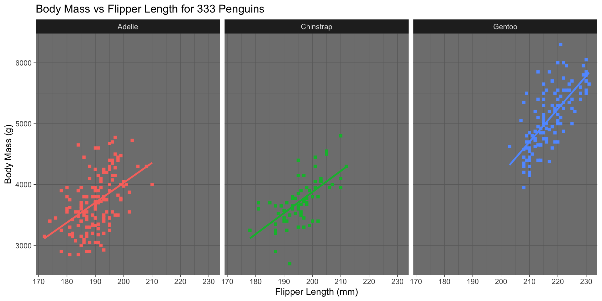
facet_wrap(split by one grouping) orfacet_grid(show all pairs of groups)group_byof plotting- Called “small multiples”
ggplot2 - Worked Example
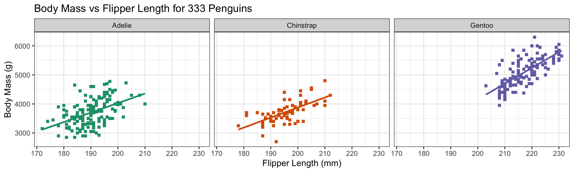
Remove redundant legend:
ggplot(penguins_ok,
       aes(x=flipper_len, y=body_mass, color=species)) +
       geom_point(shape=15) + stat_smooth(method="lm", se=FALSE) +
       xlab("Flipper Length (mm)") + ylab("Body Mass (g)") +
       ggtitle("Body Mass vs Flipper Length for 333 Penguins") +
       scale_color_brewer(name="Species", type="qual", palette=2) +
       theme_bw() + facet_wrap(~species) +
       guides(color="none")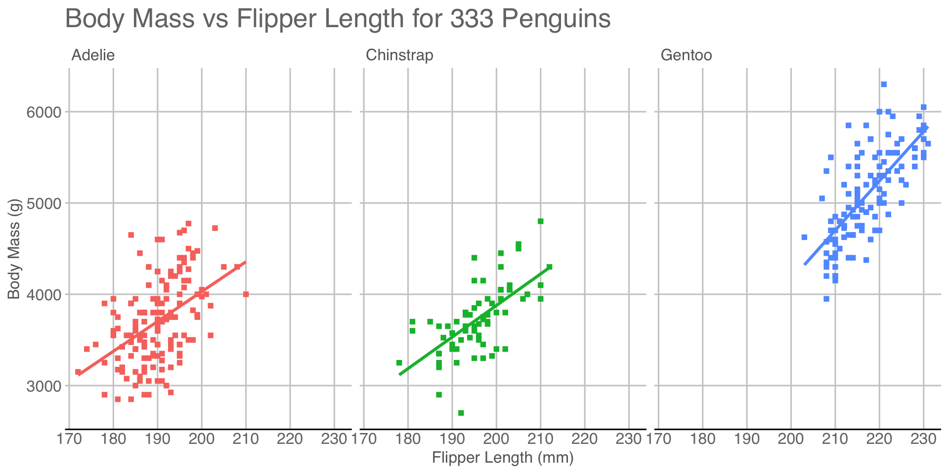
guidescontrols legends (also viascale_*)- Here redundant with facet labels
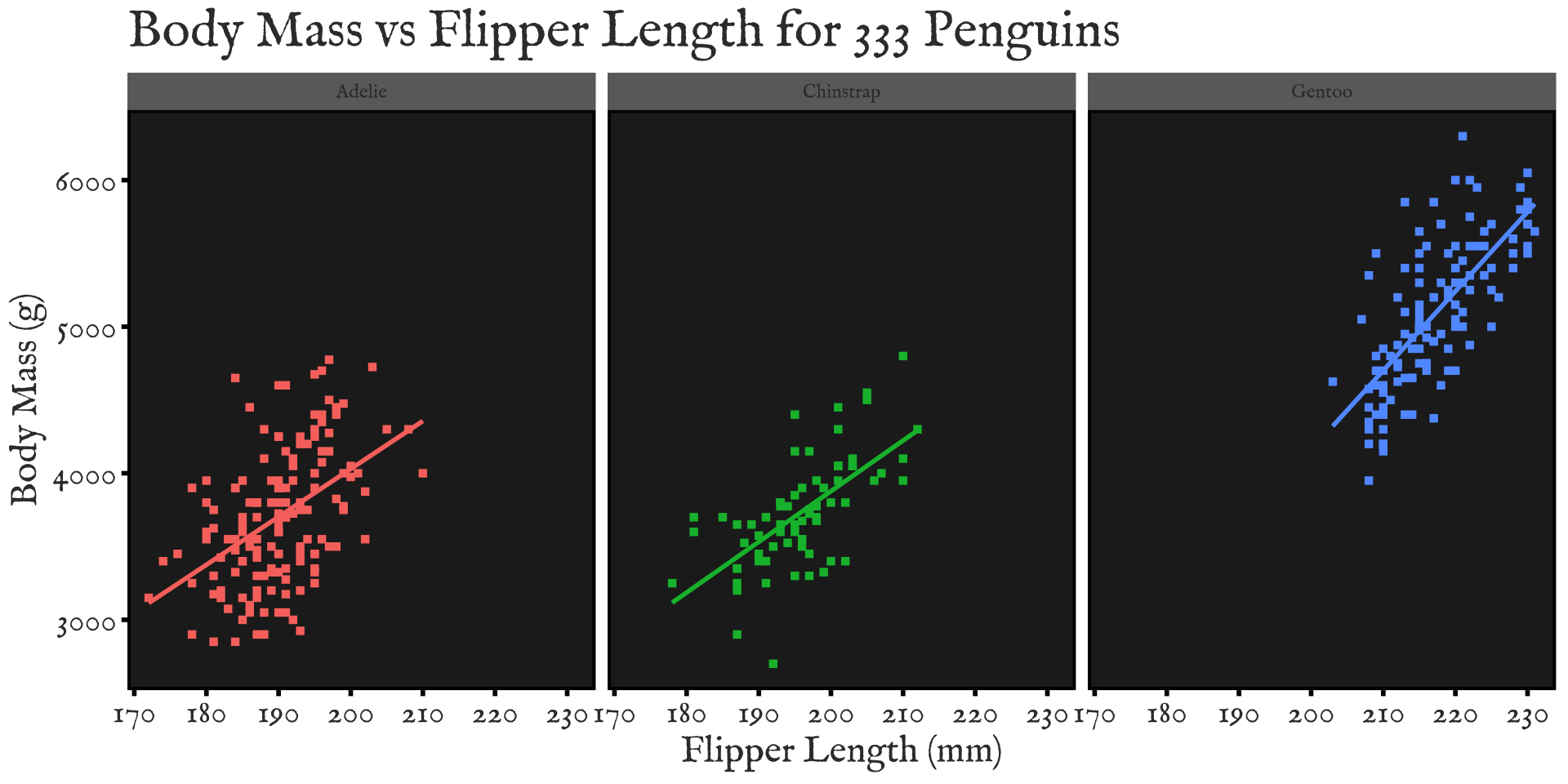
Custom Themes
Default theme (theme_grey())
Custom Themes
Black-and-White theme (ggplot2::theme_bw()) - MW’s favorite
Custom Themes
Minimal theme (ggplot2::theme_minimal())
Custom Themes
Light theme (ggplot2::theme_light())

Custom Themes
Dark theme (ggplot2::theme_dark())
Custom Themes
Old-school MS Excel theme (ggthemes::theme_excel())
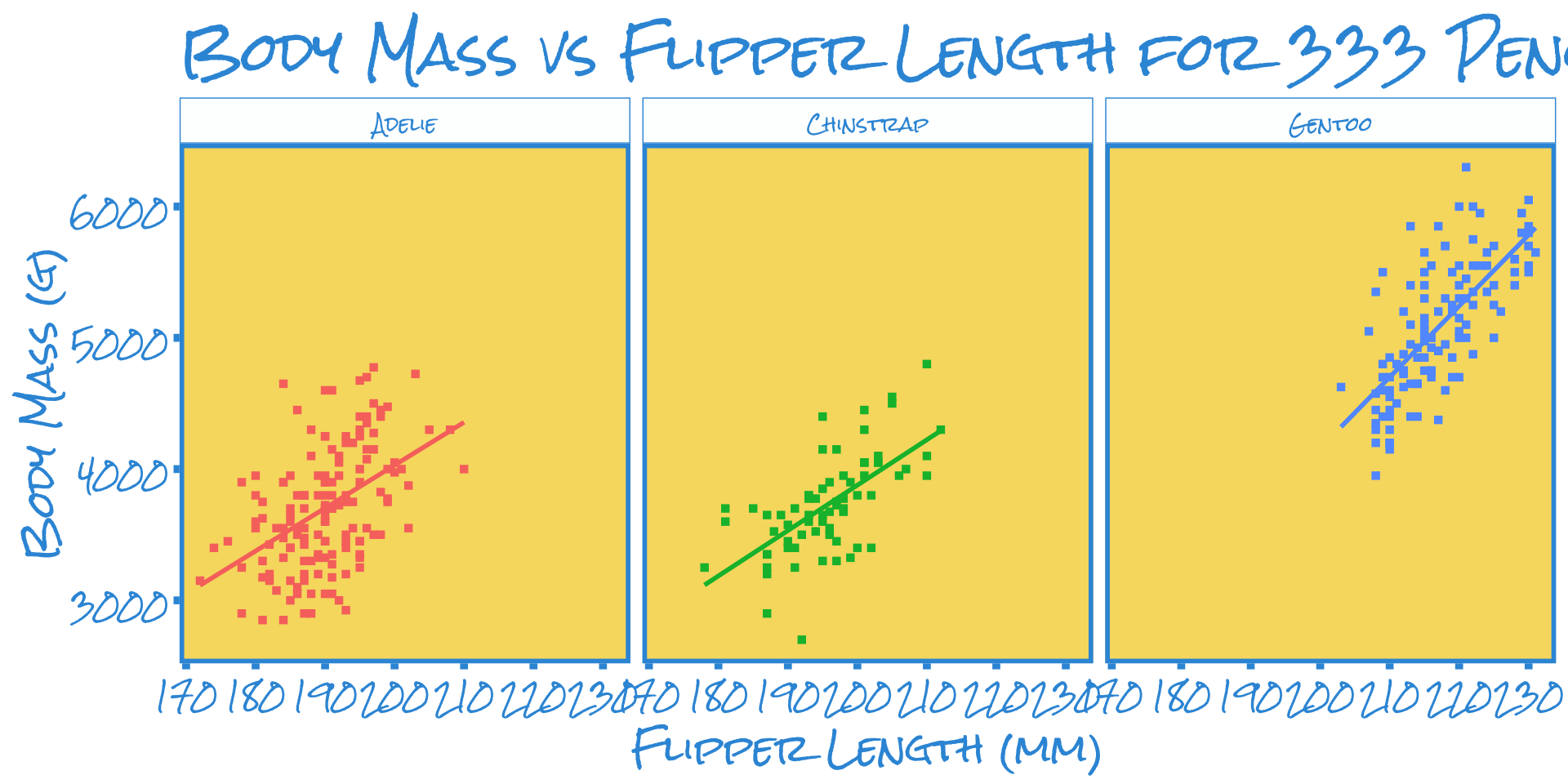
Custom Themes
Google Docs theme (ggthemes::theme_gdocs())
Custom Themes
Economist theme (ggthemes::theme_economist())
Custom Themes
Wall St Journal theme (ggthemes::theme_wsj())

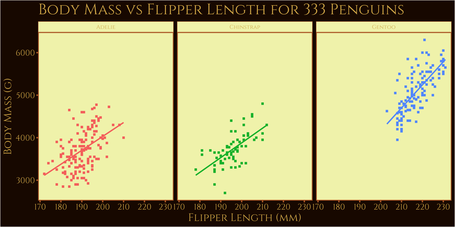
Custom Themes
Edward Tufte theme (ggthemes::theme_tufte())
Custom Themes
Barbie theme (ThemePark::theme_barbie())
Custom Themes
Oppenheimer theme (ThemePark::theme_oppenheimer())
Custom Themes
Simpsons theme (ThemePark::theme_simpsons())
Custom Themes
Spiderman theme (ThemePark::theme_spiderman())
Custom Themes
Game of Thrones theme (ThemePark::theme_gameofthrones())
Custom Themes
Avatar theme (ThemePark::theme_avatar())
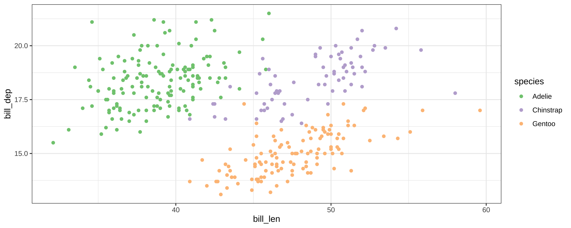
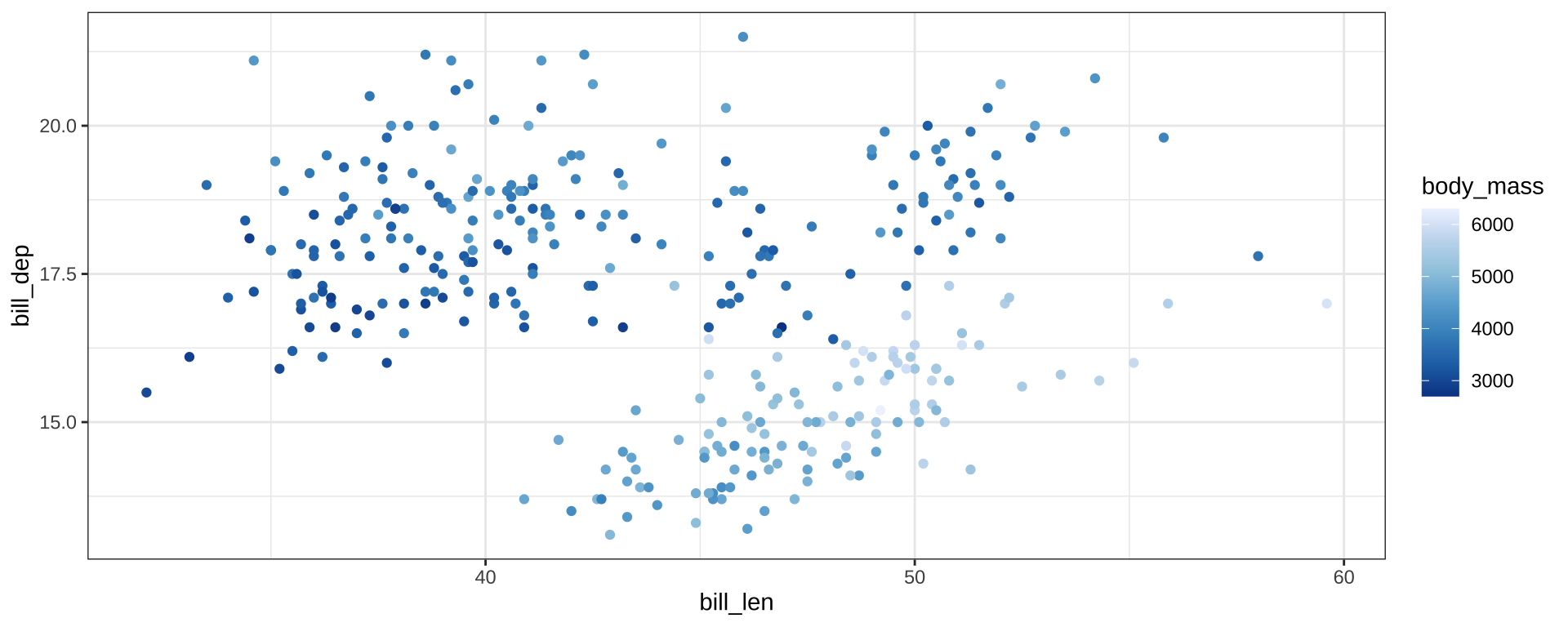
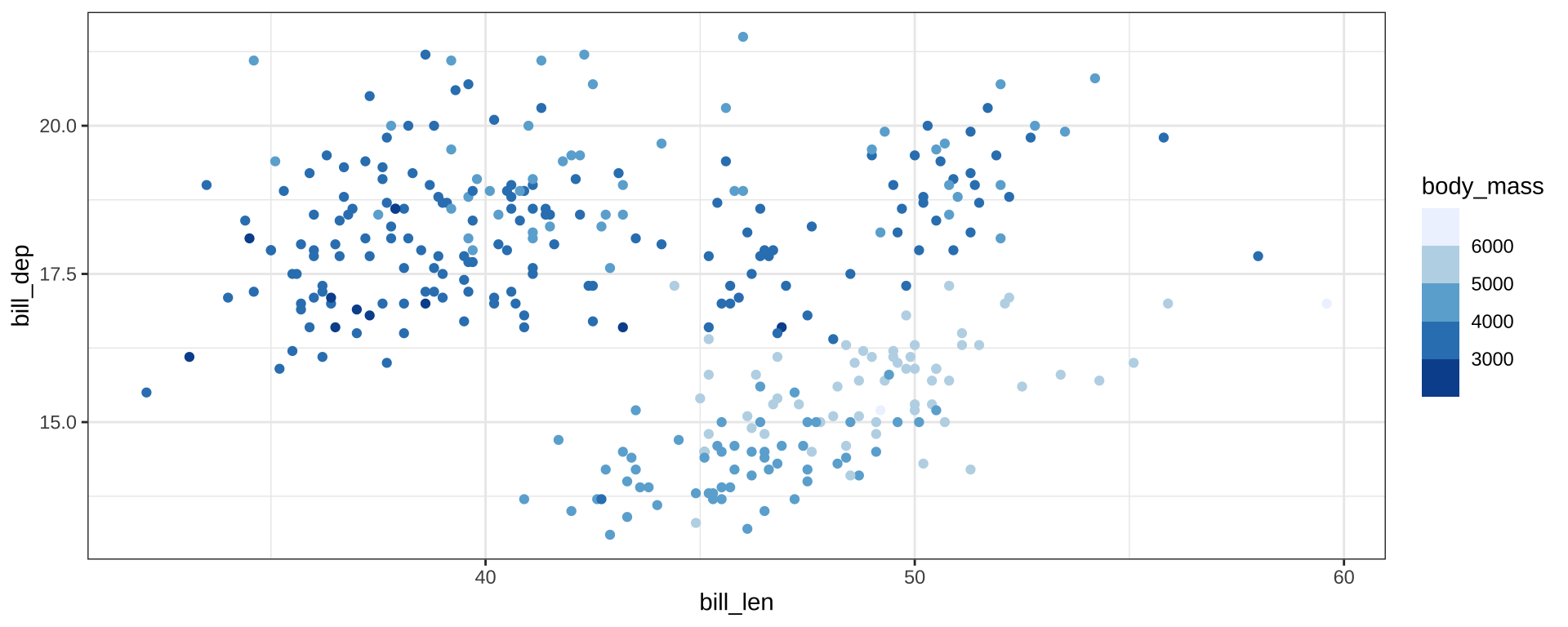
Color Palettes
scale_color_brewer() for discrete scales

Color Palettes
scale_color_distiller() for continuous scales

Color Palettes
scale_color_fermenter() for binned scales

Color Palettes
Color Palettes

Color Palettes

“Hard-coding” Colors
scale_color_identity will take color names from a column:
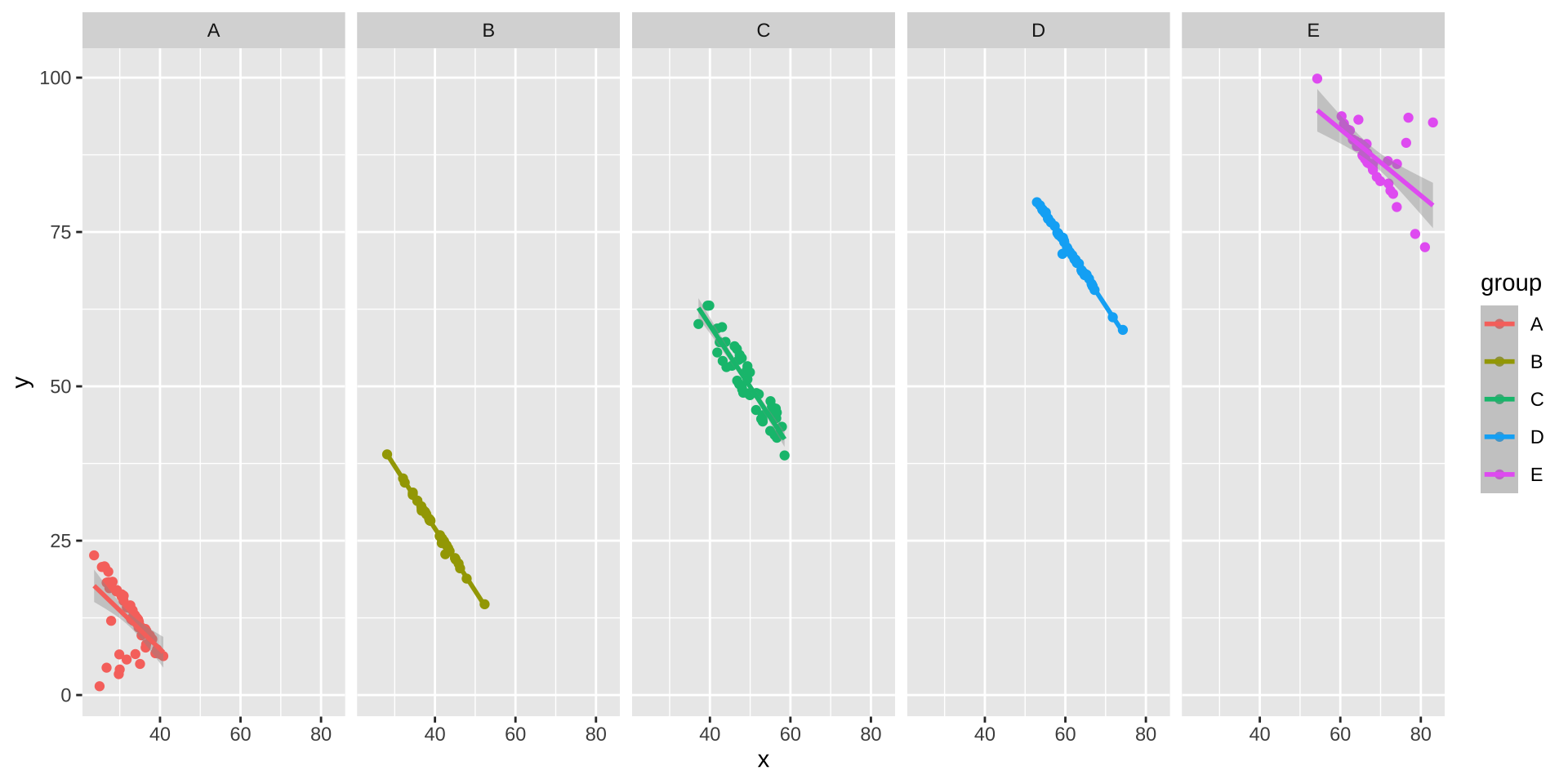
Simpson’s Paradox
Data Visualization can be used to find counterintuitive trends in data:

Simpson’s Paradox
Overall trend does not need to match trend within groups
ggplot(simpsons_paradox, aes(x=x, y=y, color=group)) +
    geom_point() + stat_smooth(method="lm") + facet_grid(~group)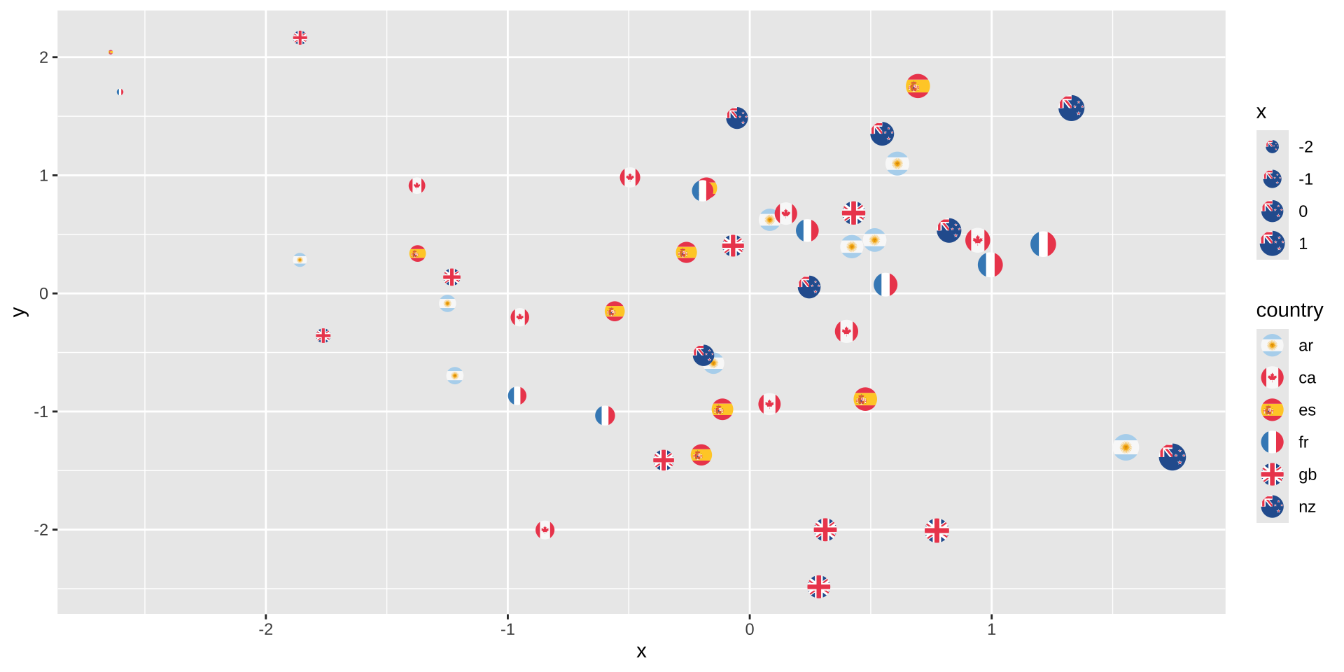
Modeling: ANCOVA or Mixed-Effects Regression
Red State Blue State
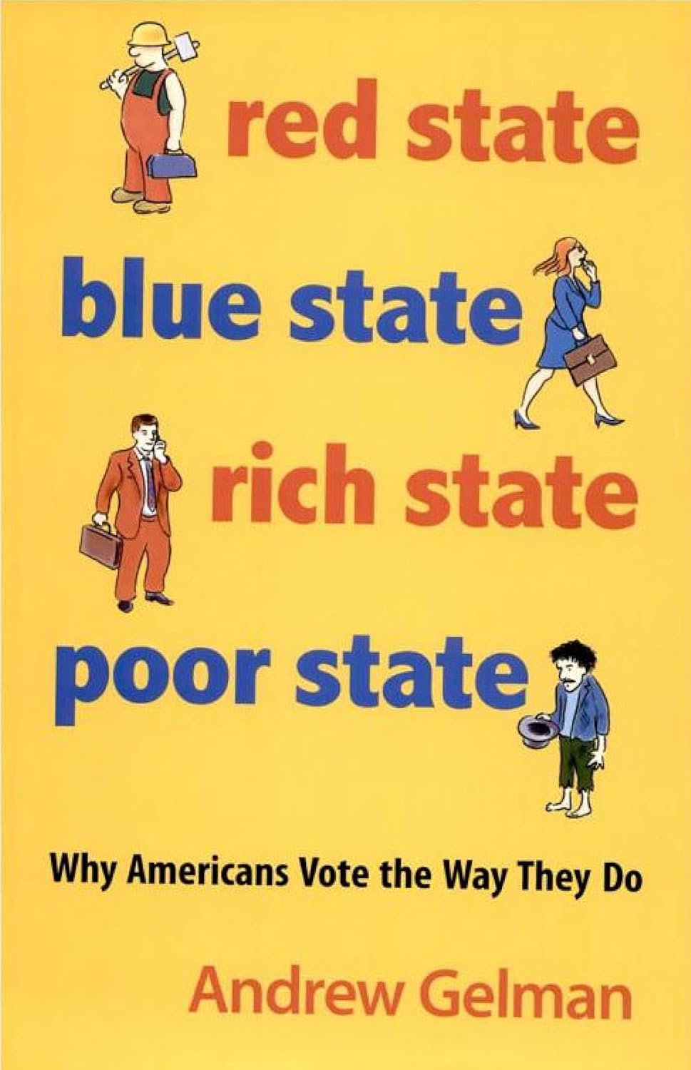
Red State Blue State
Figure from Gelman et al, Q.J.Poli.Sci. 2007.
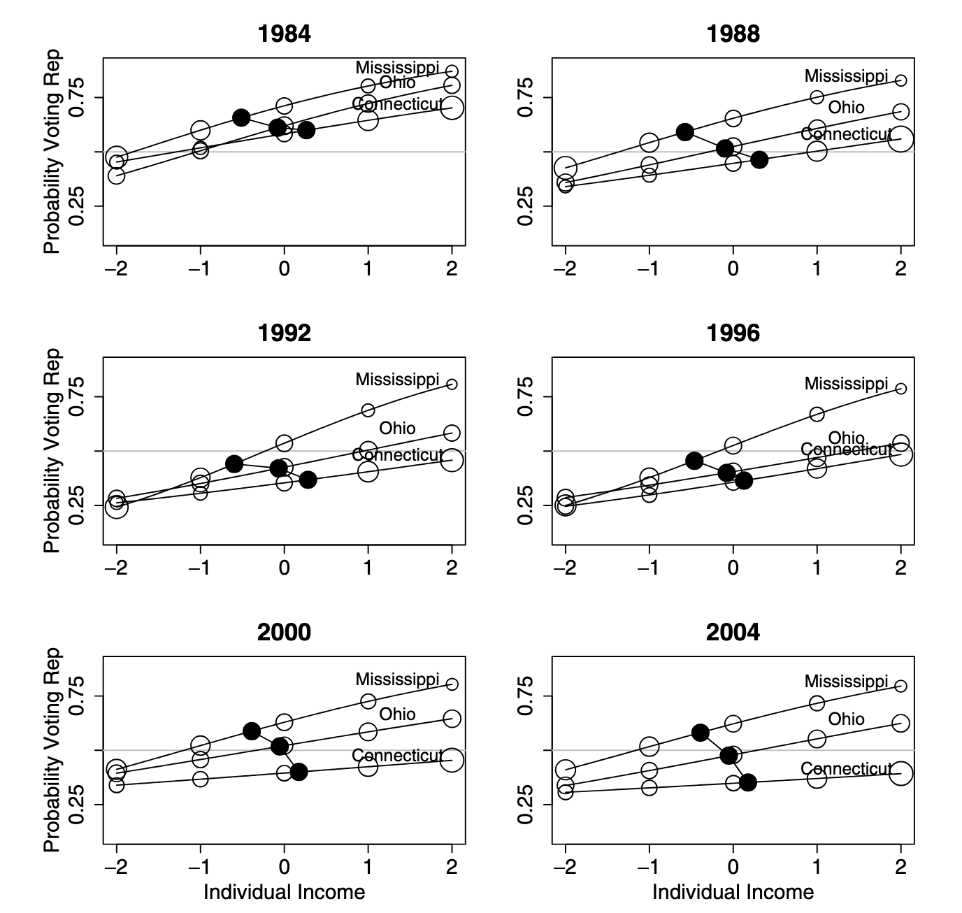
For more, see this presentation.
Mini-Project #02
Rare issues downloading BLS-ATUS data files (especially on Windows)
- Hopefully addressed already
- My code only downloads files once
- If files are corrupted, please delete and try again
- Post on Piazza for help debugging
![]()
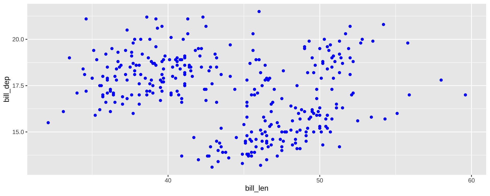
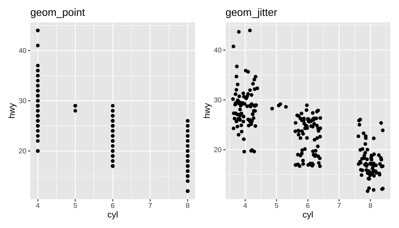
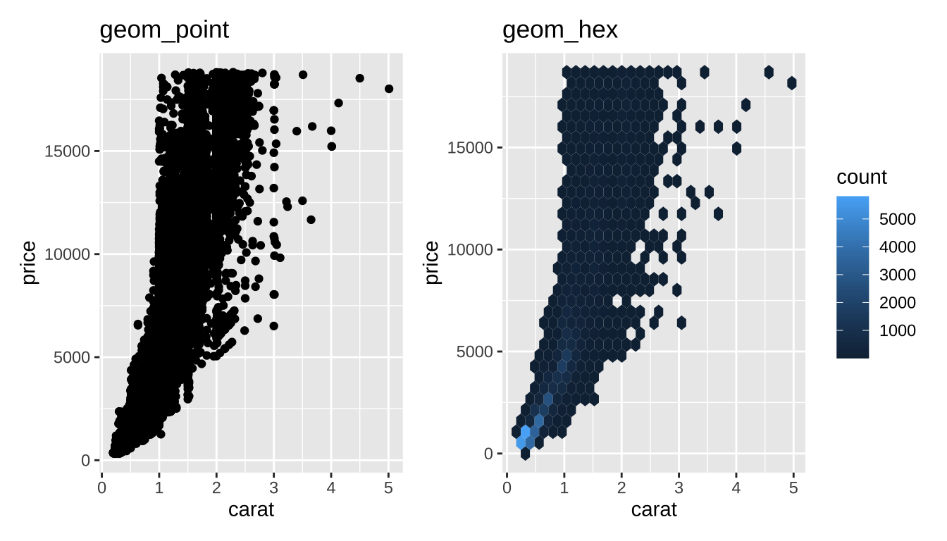
Overplotting
Jitter: add a bit of random noise so points don’t step on each other
Hexagonal Binning
Little “heatmaps” of counts. Hexagons to avoid weird rounding artifacts
Inside vs. Outside aes()
aes maps data to values. Outside of aes, set constant value
Inside vs. Outside aes()
aes maps data to values. Outside of aes, set constant value

Global vs geom_ specific aes()
- Elements set in
ggplot()apply to entire plot - Elements set in specific
geomapply there only- Override globals
Global vs geom_ specific aes()
- Elements set in
ggplot()apply to entire plot - Elements set in specific
geomapply there only- Override globals
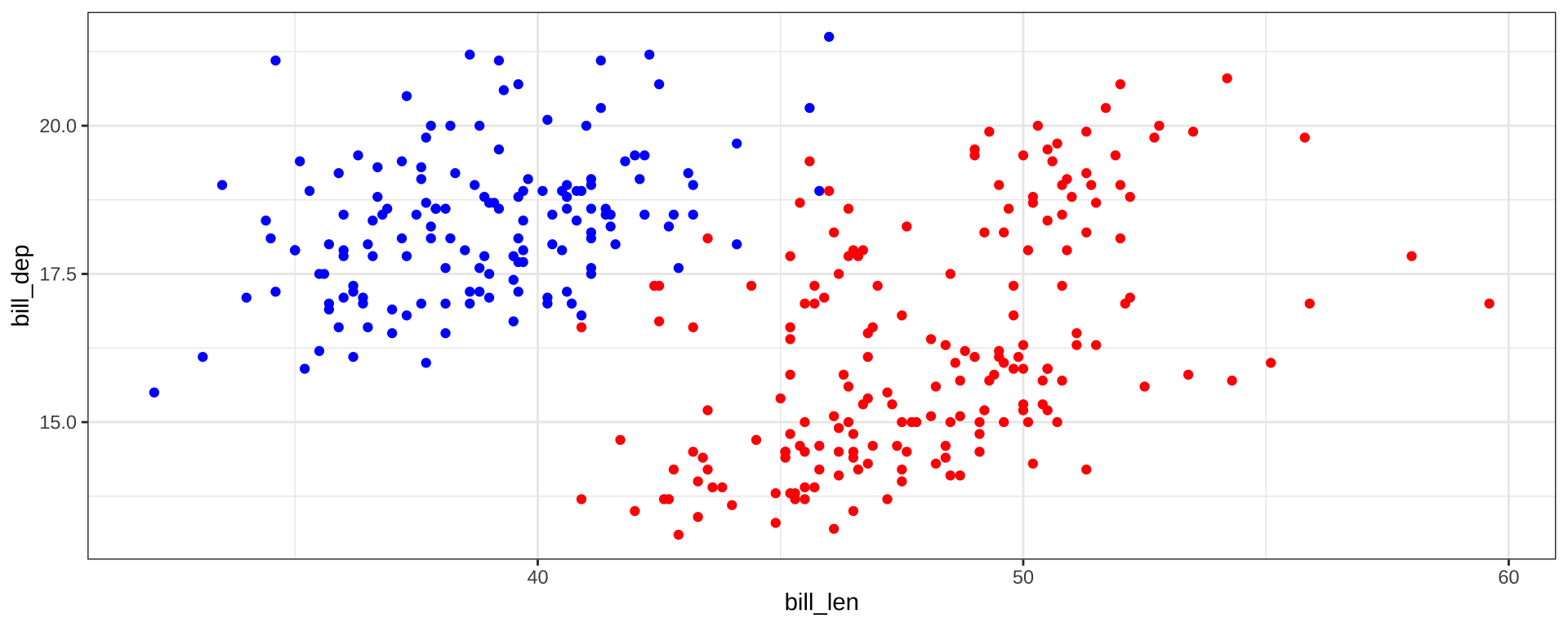
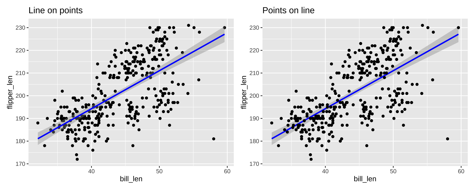
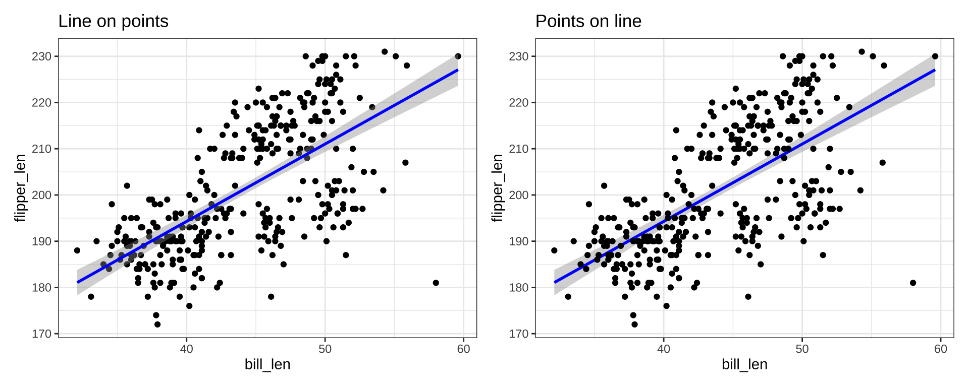
Order of Layers
Order of layers technically matters, but the effect is small
p1 <- ggplot(penguins_ok, aes(x=bill_len, y=flipper_len)) +
        geom_point(color="black") +
        stat_smooth(color="blue", method="lm") + ggtitle("Line on points")
p2 <- ggplot(penguins_ok, aes(x=bill_len, y=flipper_len)) +
        stat_smooth(color="blue", method="lm") +
        geom_point(color="black") + ggtitle("Points on line")
p1 + p2
Order of Layers
Order matters more with theme. Adding a theme_*() will override any theme() customization you did:
Titles and Captions
ggplot() +
    labs(title="Title", subtitle="Subtitle", caption="Caption",
         tag="Tag", alt="Alt-Text", alt_insight="Alt-Insight")
+ggtitle("text") is just shorthand for +labs(title="text")
Embedding Images
See the ggimage or ggflags package for images as “points”:
if(!require("ggflags", quiet=TRUE)){
    devtools::install_github("jimjam-slam/ggflags");
}
library(ggflags)
d <- data.frame(x=rnorm(50), y=rnorm(50),
                country=sample(c("ar","fr", "nz", "gb", "es", "ca"), 50, TRUE),
                stringsAsFactors = FALSE)
ggplot(d, aes(x=x, y=y, country=country, size=x)) +
  geom_flag() + scale_country()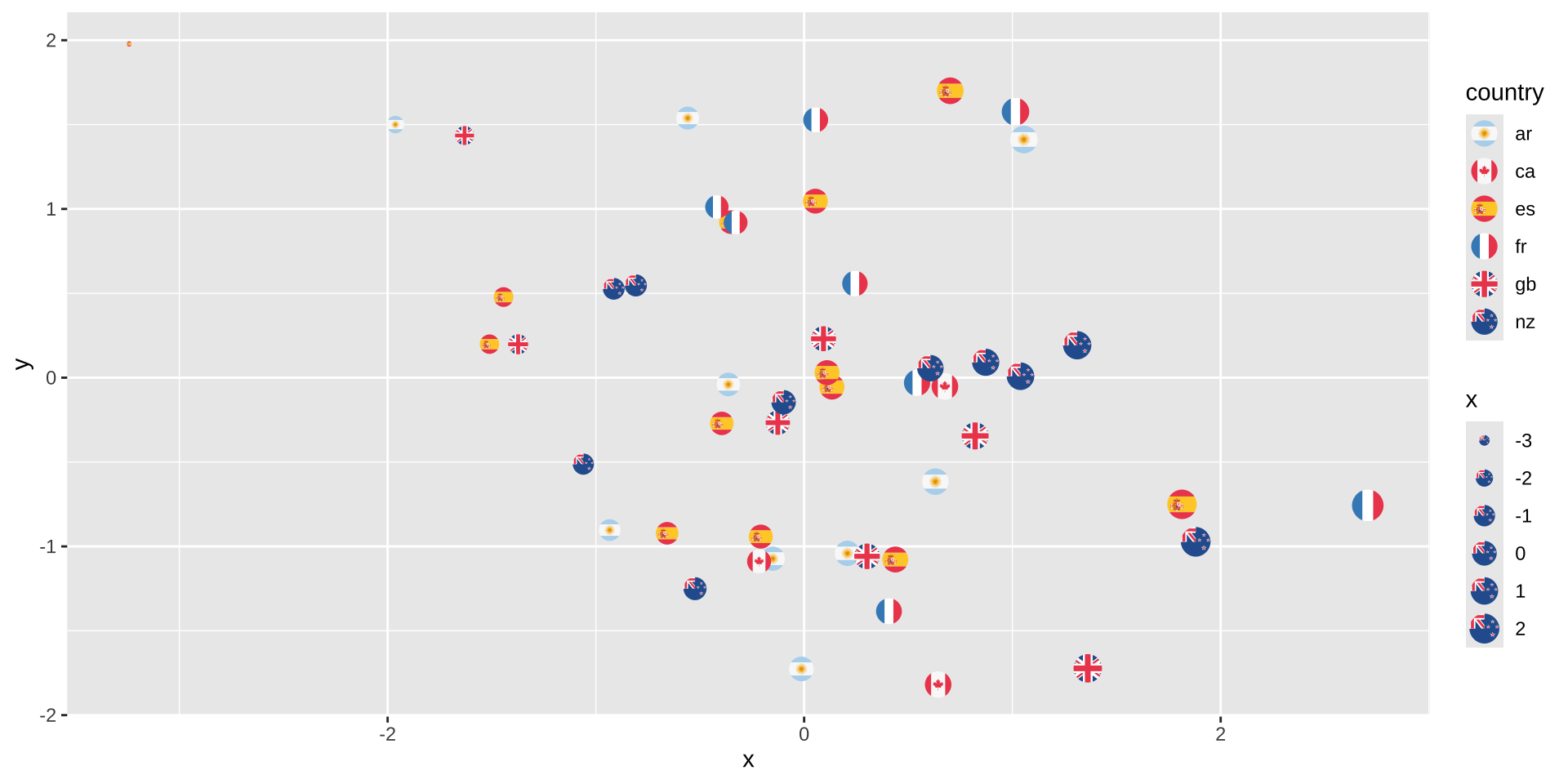
Embedding Images
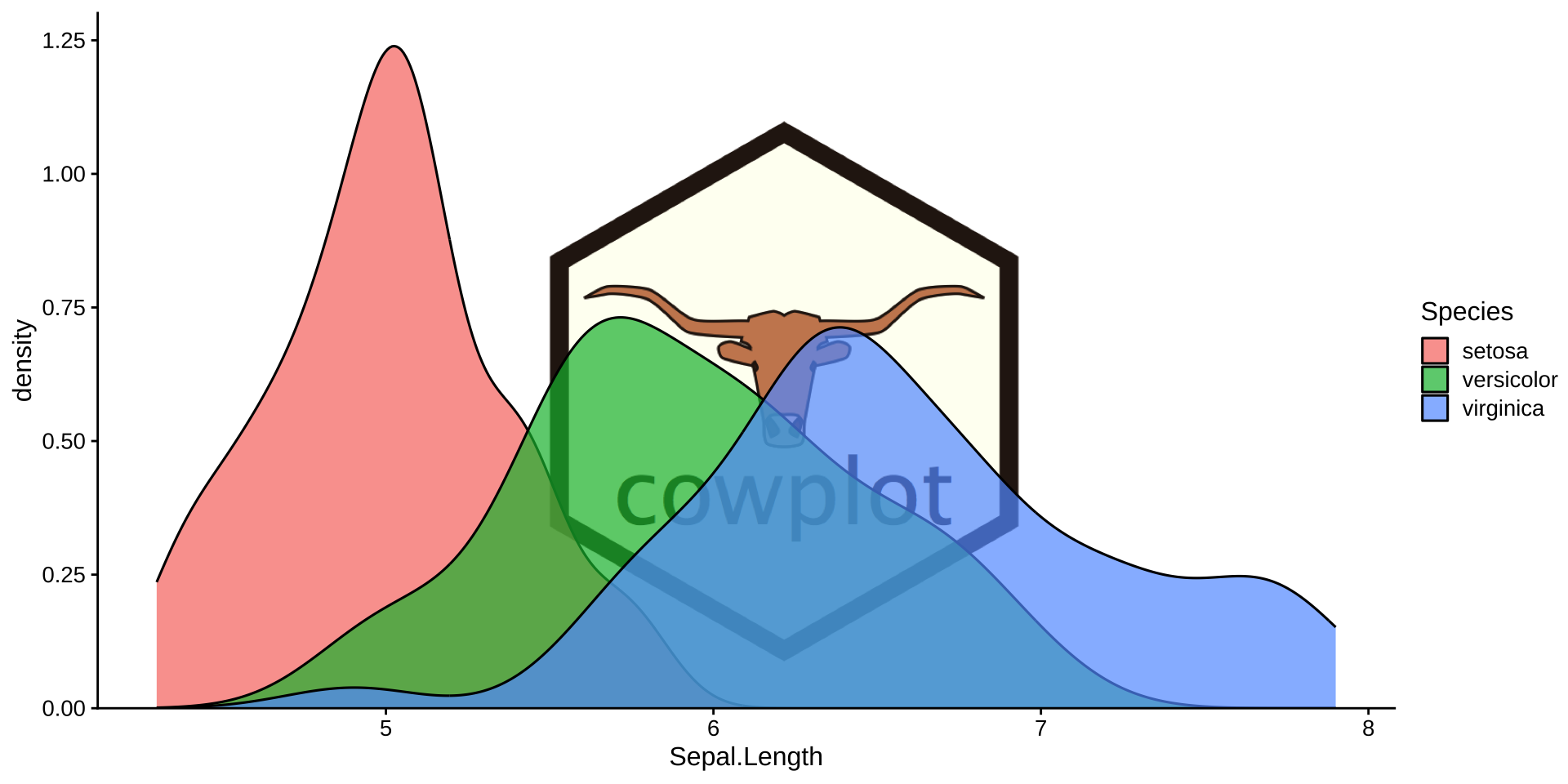
See cowplot::draw_image() for image background:
library(cowplot)
p <- ggplot(iris, aes(x = Sepal.Length, fill = Species)) +
  geom_density(alpha = 0.7) +
  scale_y_continuous(expand = expansion(mult = c(0, 0.05))) +
  theme_half_open(12)

logo_file <- system.file("extdata", "logo.png", package = "cowplot")
ggdraw() +
  draw_image(
    logo_file, scale = .7
  ) +
  draw_plot(p)