library(tidyverse)
library(glue)
library(readxl)
library(httr2)
load_atus_data <- function(file_base = c("resp", "rost", "act")){
if(!dir.exists(file.path("data", "mp02"))){
dir.create(file.path("data", "mp02"), showWarnings=FALSE, recursive=TRUE)
}
file_base <- match.arg(file_base)
file_name_out <- file.path("data",
"mp02",
glue("atus{file_base}_0324.dat"))
if(!file.exists(file_name_out)){
url_end <- glue("atus{file_base}-0324.zip")
temp_zip <- tempfile(fileext=".zip")
temp_dir <- tools::file_path_sans_ext(temp_zip)
request("https://www.bls.gov") |>
req_url_path("tus", "datafiles", url_end) |>
req_headers(`User-Agent` = "Mozilla/5.0 (Macintosh; Intel Mac OS X 10.15; rv:149.0) Gecko/20100101 Firefox/149.0") |>
req_perform(temp_zip)
unzip(temp_zip, exdir = temp_dir)
temp_file <- file.path(temp_dir, basename(file_name_out))
file.copy(temp_file, file_name_out)
}
file <- read_csv(file_name_out,
show_col_types = FALSE)
switch(file_base,
resp=file |>
rename(survey_weight = TUFNWGTP,
time_alone = TRTALONE,
survey_year = TUYEAR),
rost=file |>
mutate(sex = case_match(TESEX, 1 ~ "M", 2 ~ "F")),
act =file |>
mutate(activity_n_of_day = TUACTIVITY_N,
time_spent_min = TUACTDUR24,
start_time = TUSTARTTIM,
stop_time = TUSTOPTIME,
level1_code = paste0(TRTIER1P, "0000"),
level2_code = paste0(TRTIER2P, "00"),
level3_code = TRCODEP)
) |>
rename(participant_id = TUCASEID) |>
select(matches("[:lower:]",
ignore.case=FALSE))
}
load_atus_activities <- function(){
if(!dir.exists(file.path("data", "mp02"))){
dir.create(file.path("data", "mp02"), showWarnings=FALSE, recursive=TRUE)
}
dest_file <- file.path("data",
"mp02",
"atus_activity_codes.csv")
if(!file.exists(dest_file)){
download.file("https://michael-weylandt.com/STA9750/mini/atus_activity_codes.csv",
quiet=TRUE,
destfile=dest_file,
mode="wb")
}
read_csv(dest_file, show_col_types = FALSE)
}STA 9750 Mini-Project #02: How Do You Do ‘You Do You’?
\[\newcommand{\P}{\mathbb{P}} \newcommand{\E}{\mathbb{E}} \newcommand{\R}{\mathbb{R}}\]
Due Dates
- Released to Students: 2026-03-13
- Initial Submission: 2026-04-03 11:59pm ET on GitHub and Brightspace
-
Peer Feedback:
- Peer Feedback Assigned: 2026-04-06 on GitHub
- Peer Feedback Due: 2026-04-12 11:59pm ET on GitHub
Estimated Time to Complete: 13-15 Hours
Estimated Time for Peer Feedback: 1 Hour
Introduction
Welcome to Mini-Project #02! In this mini-project, we will explore data from the American Time Use Survey (ATUS). ATUS is a joint effort of the US Bureau of Labor Statistics and the US Census Bureau, which attempts to characterize how Americans spend their time. Like most government data products, ATUS data is released in two forms:
- Summary Data: these are large-sample statistical aggregates that use advanced survey weighting methods to get the most accurate estimates from small data sizes. These are not statements about individuals, per se, but estimates about subpopulations of interest. (E.g., middle aged men spend 5 hours a week on lawn care) These results are the highest-quality and most accurate estimates available, but-as a consumer-you can only get the answers the census bureau makes available to you.
- Public Use Microdata: these are ‘raw data’ from a representative subset of respondents. Because microdata are taken from a subset of the full survey data, they are less accurate (smaller samples, higher variance) but they allow analysts to ask their own questions of the data.
In this mini-project, we will explore ATUS microdata from the past 20 years. You will see how other Americans spend their time and compare your findings with your own time usage patterns. Your will use your findings to estimate the total amount of unpaid labor in the US.
In this mini-project, you will:
- Practice use of
dplyrfor combining and manipulating data from distinct sources - Practice use of
ggplot2to create compelling statistical visualizations. Note that this assignment only requires “basic”ggplot2visualizations like scatterplots or line graphs; Mini-Project #03 will require more complex visualization. - Practice summarizing complex analytical pipelines for non-technical audiences.
As with Mini-Project #01, a major portion of your grade is based on the communication and writing elements of this mini-project, so make sure to budget sufficient time for the writing process. Code without context has little practical value - you are always writing and conveying your analysis to a specific target audience.
Student Responsibilities
Recall our basic analytic workflow and table of student responsibilities:
- Data Ingest and Cleaning: Given a data source, read it into
Rand transform it to a reasonably useful and standardized (‘tidy’) format. - Data Combination and Alignment: Combine multiple data sources to enable insights not possible from a single source.
- Descriptive Statistical Analysis: Take a data table and compute informative summary statistics from both the entire population and relevant subgroups
- Data Visualization: Generate insightful data visualizations to spur insights not attainable from point statistics
- Inferential Statistical Analysis and Modeling: Develop relevant predictive models and statistical analyses to generate insights about the underlying population and not simply the data at hand.
In this course, our primary focus is on the first four stages: you will take other courses that develop analytical and modeling techniques for a variety of data types. As we progress through the course, you will eventually be responsible for the first four steps. Specifically, you are responsible for the following stages of each mini-project:
| Ingest and Cleaning | Combination and Alignment | Descriptive Statistical Analysis | Visualization | |
|---|---|---|---|---|
| Mini-Project #01 | ✓ | |||
| Mini-Project #02 | ✓ | ✓ | ½ | |
| Mini-Project #03 | ½ | ✓ | ✓ | ✓ |
| Mini-Project #04 | ✓ | ✓ | ✓ | ✓ |
In this mini-project, you are mainly responsible for data alignment and basic statistical analyses. While not the main focus of this mini-project, you are also expected to provide basic data visualizations to support your findings; the grading rubric, below, emphasizes the dplyr tools used in this project, but reports without any visualization will be penalized severely. Note that data visualization will play a larger role in Mini-Project #03.
As before, I will provide code to automatically download and read in the data used for this project. Also note that, as compared with Mini-Project #01, I am providing less ‘scaffolding’ for tabular display and EDA: students are more responsible for directing their own analyses.
Rubric
STA 9750 Mini-Projects are evaluated using peer grading with meta-review by the course staff (GTAs and the instructor). The following basic rubric will be used for all mini-projects:
| Course Element | Excellent (9-10) | Great (7-8) | Good (5-6) | Adequate (3-4) | Needs Improvement (1-2) |
|---|---|---|---|---|---|
| Written Communication | Report is very well-written and flows naturally. Motivation for key steps is clearly explained to reader without excessive detail. Key findings are highlighted and appropriately given sufficient context, including reference to related work where appropriate. | Report has no grammatical or writing issues.1 Writing is accessible and flows naturally. Key findings are highlighted and clearly explained, but lack suitable motivation and context. | Report has no grammatical or writing issues. Key findings are present but insufficiently highlighted or unclearly explained. | Writing is intelligible, but has some grammatical errors. Key findings are difficult to discern. | Report exhibits significant weakness in written communication. Key points are nearly impossible to identify. |
| Project Skeleton | Code completes all instructor-provided tasks correctly. Responses to open-ended tasks are especially insightful and creative. | Code completes all instructor-provided tasks satisfactorily. Responses to open-ended tasks are insightful, creative, and do not have any minor flaws. | Response to one instructor provided task is skipped, incorrect, or otherwise incomplete. Responses to open-ended tasks are solid and without serious flaws. | Responses to two instructor provided tasks are skipped, incorrect, or otherwise incomplete. Responses to open-ended tasks are acceptable, but have at least one serious flaw. | Response to three or more instructor provided tasks are skipped, incorrect, or otherwise incomplete. Responses to open-ended tasks are seriously lacking. |
| Tables & Document Presentation | Tables go beyond standard publication-quality formatting, using advanced features like color formatting, interactivity, or embedded visualization. | Tables are well-formatted, with publication-quality selection of data to present, formatting of table contents (e.g., significant figures) and column names. | Tables are well-formatted, but still have room for improvement in one of these categories: subsetting and selection of data to present, formatting of table contents (e.g., significant figures), column names. | Tables lack significant ‘polish’ and need improvement in substance (filtering and down-selecting of presented data) or style. Document is difficult to read due to distracting formatting choices. | Unfiltered ‘data dump’ instead of curated table. Document is illegible at points. |
| Data Visualization | Figures go beyond standard publication-quality formatting, using advanced features like animation, interactivity, or advanced plot types implemented in ggplot2 extension packages. |
Figures are ‘publication-quality,’ with suitable axis labels, well-chosen structure, attractive color schemes, titles, subtitles, and captions, etc. | Figures are above ‘exploratory-quality’ and reflect a moderate degree of polish, but do not reach full ‘publication-quality’ in one-to-two ways. | Figures are above ‘exploratory-quality’ and reflect a moderate degree of polish, but do not reach full ‘publication-quality’ in three or more distinct ways. | Figures are suitable to support claims made, but are ‘exploratory-quality,’ reflecting zero-to-minimal effort to customize and ‘polish’ beyond ggplot2 defaults. |
| Exploratory Data Analysis | Deep and ‘story-telling’ EDA identifying non-obvious patterns that are then used to drive further analysis in support of the project. All patterns and irregularities are noted and well characterized, demonstrating mastery and deep understanding of all data sets used. | Meaningful ‘story-telling’ EDA identifying non-obvious patterns in the data. Major and pinor patterns and irregularities are noted and well characterized at a level sufficient to achieve the goals of the analysis. EDA demonstrates clear understanding of all data sets used. | Extensive EDA that thoroughly explores the data, but lacks narrative and does not deliver a meaningful ‘story’ to the reader. Obvious patterns or irregularities noted and well characterized, but more subtle structure may be overlooked or not fully discussed. EDA demonstrates competence and basic understanding of the data sets used. | Solid EDA that identifies major structure to the data, but does not fully explore all relevant structure. Obvious patterns or irregularities ignored or missed. EDA demonstrates familiarity with high-level structure of the data sets used. | Minimal EDA, covering only standard summary statistics, and providing limited insight into data patterns or irregularities. EDA fails to demonstrate familiarity with even the most basic properties of the data sets being analyzed. |
Code Quality |
Code is (near) flawless. Intent is clear throughout and all code is efficient, clear, and fully idiomatic. Code passes all |
Comments give context and structure of the analysis, not simply defining functions used in a particular line. Intent is clear throughout, but code can be minorly improved in certain sections. |
Code has well-chosen variable names and basic comments. Intent is generally clear, though some sections may be messy and code may have serious clarity or efficiency issues. |
Code executes properly, but is difficult to read. Intent is generally clear and code is messy or inefficient. |
Code fails to execute properly. |
| Data Preparation | Data import is fully-automated and efficient, taking care to only download from web-sources if not available locally. All data cleaning steps are fully-automated and robustly implemented, yielding a clean data set that can be widely used. | Data is imported and prepared effectively, in an automated fashion with minimal hard-coding of URLs and file paths. Data cleaning is fully-automated and sufficient to address all issues relevant to the analysis at plan. | Data is imported and prepared effectively, though source and destination file names are hard-coded. Data cleaning is rather manual and hard-codes most transformations. | Data is imported in a manner likely to have errors. Data cleaning is insufficient and fails to address clear problems. | Data is hard-coded and not imported from an external source. |
| Analysis and Findings | Analysis demonstrates uncommon insight and quality, providing unexpected and subtle insights. | Analysis is clear and convincing, leaving essentially no doubts about correctness. | Analysis clearly appears to be correct and passes the “sniff test” for all findings, but a detailed review notes some questions remain unanswered. | Analysis is not clearly flawed at any point and is likely to be within the right order of magnitude for all findings. | Analysis is clearly incorrect in at least one major finding, reporting clearly implausible results that are likely off by an order of magnitude or more. |
Note that the “Excellent” category for most elements applies only to truly exceptional “above-and-beyond” work. Most student submissions will likely fall in the “Good” to “Great” range.
At this point, you are responsible for (elementary) data visualization and will be graded on that aspect of the rubric, as well as the sections on which you were assessed in the previous mini-project.
Note that, because I am still providing code to download the data, load it into R, and prepare it for analysis, all reports submitted using my code will receive an automatic 10/10 for the ‘Data Preparation’ element of the rubric. Additionally, reports completing all tasks described under Data Integration and Exploration below should receive a 10/10 for the ‘Exploratory Data Analysis’ rubric element.
Taken together, you are only really responsible for these portions of the rubric in this assignment:
- Written Communication
- Project Skeleton
- Tables & Document Presentation
- Data Visualization
- Code Quality
- Analysis and Findings
Reports completing all key steps outlined below essentially start with 20 free points.
For this mini-project, no more than 6 total points of extra credit can be be awarded. Opportunities for extra credit exist for students who go above and beyond the instructor-provided scaffolding. Specific opportunities for extra credit can be found below.
Students pursuing careers in data analytics are strongly encouraged to go beyond the strict ambit of the mini-projects to
- further refine their skills;
- learn additional techniques that can be used in the final course project; and
- develop a more impressive professional portfolio.
Because students are encouraged to use STA 9750 mini-projects as the basis for a professional portfolio, the basic skeleton of each project will be released under a fairly permissive usage license. Take advantage of it!
Submission Instructions
After completing the analysis, write up your findings, showing all of your code, using a dynamic quarto document and post it to your course repository. The qmd file should be named mp02.qmd (lower case!) so the rendered document can be found at docs/mp02.html in the student’s repository and will be served at the URL:2
https://YOUR_GITHUB_ID.github.io/STA9750-2026-SPRING/mp02.html
You can use the helper function mp_start available at in the Course Helper Functions to create a file with the appropriate name and some meta-data already included. Do so by running the following command at the R Console:
source("https://michael-weylandt.com/STA9750/load_helpers.R"); mp_start(N=02)
After completing this mini-project, upload your rendered output and necessary ancillary files to GitHub to make sure your site works. The mp_submission_ready function in the Course Helper Functions can perform some of these checks automatically. You can run this function by running the following commands at the R Console:
source("https://michael-weylandt.com/STA9750/load_helpers.R"); mp_submission_ready(N=02)
Once you confirm this website works (substituting YOUR_GITHUB_ID for the actual GitHub username provided to the professor in MP#00 of course), open a GitHub issue on the instructor’s repository to submit your completed work.
The easiest way to do so is by use of the mp_submission_create function in the Course Helper Functions, which can be used by running the following command at the R Console:
source("https://michael-weylandt.com/STA9750/load_helpers.R"); mp_submission_create(N=02)
Alternatively, if you wish to submit manually, open a new issue at
https://github.com/michaelweylandt/STA9750-2026-SPRING/issues/new.
Title the issue STA 9750 YOUR_GITHUB_ID MiniProject #02 and fill in the following text for the issue:
Hi @michaelweylandt!

I've uploaded my work for MiniProject #**02** - check it out!

<https://YOUR_GITHUB_ID.github.io/STA9750-2026-SPRING/mp02.html>
At various points before and after the submission deadline, the instructor will run some automated checks to ensure your submission has all necessary components. Please respond to any issues raised in a timely fashion as failing to address them may lead to a lower set of scores when graded.
Additionally, a PDF export of this report should be submitted on Brightspace. To create a PDF from the uploaded report, simply use your browser’s ‘Print to PDF’ functionality.
NB: The analysis outline below specifies key tasks you need to perform within your write up. Your peer evaluators will check that you complete these. You are encouraged to do extra analysis, but the bolded Tasks are mandatory.
NB: Your final submission should look like a report, not simply a list of facts answering questions. Add introductions, conclusions, and your own commentary. You should be practicing both raw coding skills and written communication in all mini-projects. There is little value in data points stated without context or motivation.
Mini-Project #02: How Do You Do ‘You Do You’?
Data Acquisition
For this project, we will use the 2003-2024 aggregate microdata files, published at https://www.bls.gov/tus/data/datafiles-0324.htm. These combine data in a standard format from the past 21 years of ATUS.
We will use the following tables:
- The ATUS Activity Data File which contains (self-reported) time spent on various activities from over 250,000 Americans over a 20 year period.3
- The ATUS Respondent File which contains demographic information for the survey respondents.
- The ATUS Roster File which includes additional demographic information on who was present for various activities. E.g., if a mother of two responded to ATUS, the respondent file will contain her demographics, while the roster file will also contain information on the age of her children if they were present for any activities she performed during the reporting period. This is probably the least important file and you might not use it often, but I’m making it available if you want it.
- An instructor-provided CSV that can be used to map ATUS activity codes to actual activities.4
The following code snippets will download the relevant files into a data/mp02 directory in your STA9750-2026-SPRING folder for use:
Task 1: Data Acquisition
Using the code above, acquire the relevant ATUS files. Copy the code into your Quarto document and make sure it runs successfully.
Do Not
git add Data Files
Make sure that git is set to ignore data files, such as the one created above. Check the git pane in RStudio and make sure that the files created in data/mp02 do not appear. (If you set up your .gitignore file correctly in MP#00, it should already be ignored.) If it is appearing, you may need to edit your .gitignore file.
Removing a large data file from git is possible, but difficult. Don’t get into a bad state!
Data Cleaning and Preparation
Use the two functions above to create four data frames suitable for your analyses: three of these will be created using the load_atus_data function with different inputs and one with the load_atus_activities function.
After each data frame has been read into R, use the baseline type and distribution checks described in the previous assignment to confirm that you understand the types of all columns in the four tables and that they will be suitable for your analyses.
As part of this analysis, review the various tables and begin to map out how they fit together and will be used for your analysis; see below for one possible way to visualize and explore data of this format.
Before proceeding, you will want to consider how you will want to join these data files together. In this case, there are sometimes several possible ways to join together a pair of tables. This mental checklist will help you maximize the probability that you’re using the correct join for your analysis.5
What two pieces of information am I looking to connect? Answer(s): two columns from different tables. (If the columns are already in the same table, you don’t need a join.)
What is the common feature(s) I can use to join together these two tables? Answer(s): one or more columns that have corresponding values in each table. It is not required for the columns to have the same name or the exact same set of values in both tables. (If there is not a natural pair of combining columns, you might need to introduce a third table to your analyis.)
-
Join type:
- Do I want to guarantee use all of the rows from Table 1, filling in with missing values if no corresponding row is found in Table 2?
- Do I want to guarantee use all of the rows from Table 2, filling in with missing values if no corresponding row is found in Table 1?
If “yes/yes”, you probably want a
full_join; if “yes/no”, you probably want aleft_join; if “no/yes”, you probably want aright_join; if “no/no”, you probably want aninner_join. -
Construct a potential join:
JOIN_TYPE(TABLE_1_NAME,
          TABLE_2_NAME,
          join_by(TABLE_1_KEY_COLUMN == TABLE_2_KEY_COLUMN))
Here, replace all values with the answers from your questions above. (We are not considering non-equality joins here.)
Run your join and make sure you get no “many-to-many” or “many-to-one” warnings.
Embed your join into your full analysis
For example, if we want to answer the question “Who played guitar in which bands?” using the band_members and band_instruments tables in the dplyr package, the join-design flowchart would go something like this:
I want to connect the
playscolumn fromband_instrumentsto thebandcolumn ofband_members.The common feature (“key”) connecting the
band_instrumentsandband_memberstable is thenamecolumn, which has the same name and consistent values in both tables.-
- I am fine dropping rows from the
band_instrumentstable if I am unable to determine what band someone was a part of. - I am fine dropping rows from the
band_memberstable if I am unable to determine what instrument someone played.
These suggest I want to use an
inner_join. - I am fine dropping rows from the
-
My candidate join is:
library(dplyr)
inner_join(band_members,
           band_instruments,
           join_by(name == name))
# A tibble: 2 × 3 name band plays <chr> <chr> <chr> 1 John Beatles guitar 2 Paul Beatles bass This runs without any warnings or other danger signs, so I’m good to proceed.
-
I can use this join to find one guitarist in my data set with a known band:
library(dplyr)
inner_join(band_members,
           band_instruments,
           join_by(name == name)) |>
    filter(plays == "guitar")
# A tibble: 1 × 3 name band plays <chr> <chr> <chr> 1 John Beatles guitarso the one row in our result is John (Lennon) playing guitar in the Beatles. Sadly, our datasets were incomplete and we lost track of Keith Richards, guitarist in the Rolling Stones.
Task 2: Practice Joining Data Files
Work through the join-design flowchart for the following questions based on the ATUS data:
-
How many total hours were recorded on sleeping-type activities?
Hint: Make sure you identify the correct “level” of task precision to construct your join.
How many female participants reported spending no time alone in 2003?
Note: You do not need to actually include your answers to these questions in your submission. You will demonstrate knowledge of proper joining strategies in the EDA questions and your final deliverable.
When dealing with complex datasets, it is important to be able to interpret and make use of the documentation to interpret complex data representations. For surveys like ATUS, where the respondent gives an interview, the survey administrator will “code” the qualitative responses into quantitative values: e.g., after asking the respondent their gender, which can elicit a wide range of responses (“male”, “man”, “guy”, etc.), the response will be encoded as a simple 1 or 2 using pre-defined rules. This simplified representation is easier to work with than free-text responses. When working with data in R, it is typically easier to use a (standardized) set of string values (e.g., “male” and “female” or “man” and “woman”), rather than an uninterpretable numeric value.
Task 3: Adding Additional Demographic Variables
You will need to add a few more demographic variables to the data frames generated by load_atus_data to complete your analysis. Specifically, modify load_atus_data to additionally report the following information:
How many children under the age of 18 live in the respondent’s home?
-
Is the respondent married?
Instructor Correction: This official variable for this question is not in the files I prepared for you; it can be found in the
atuscpsfile. You may either extend my download code above to support thecpsfile as well OR develop a reasonable proxy for this question based on some combination of- whether the person spent any time with their spouse; and ii) spouse employment info (if the spouse has a job or is retired, that implies they exist). This may miss a small number of cases-e.g., a couple where the spouse never had a job, so isn’t retired, but also spent no time with the respondent during the survey period-but I hope the effect is reasonably marginal. Apologies for any confusion.
If you want to use the CPS file, which has lots of other interesting info as described here, make the following changes to my code above:
                                                             # Add CPS
load_atus_data <- function(file_base = c("resp", "rost", "act", "cps")){
...
switch(file_base,
       # Add CPS
       # Add more processing here if useful
       cps =file,
       # Continue as before
       resp=...
What is the respondent’s employment status (employed, unemployed, retired, etc.)?
Location of activity
-
Is the respondent enrolled in a college or university (not high school)?
Hint: This will require use of at least two ATUS variables which will need to be combined using Boolean operators.
Use the ATUS Data Dictionary to identify appropriate variables and to determine a suitable mapping from numeric codes to interpretable values, e.g., recoding the TESEX variable from 1/2 to “M”/“F”. You will want to use the case_match function to implement these transformations.
Note that some of these variables are present in multiple files and can be incorporated in the data set in multiple ways.
Note: You do not need to have a copy of “my” load_atus_data and your modified load_atus_data function. Just include the final version in your submission.
Data Integration and Initial Exploration
Survey Weighting
When working with microdata, you rarely want to use ‘raw’ averages from the sampled subjects to estimate population averages. Because survey respondent distributions rarely match the actual population distributions (e.g., because younger people are less likely to respond to phone polls than senior citizens), weighted averages are used to adjust the sample to match the demographics of the population.
For example, if a survey has 100 men and 200 women reply, but we want to make an inference about the US population as a whole (50% male and 50% female), we will want to upweight the men vs the women so we have “in effect” 200 men and 200 women, matching the 50/50 split of the population. In particular, we would use code like:
data.frame(gender = rep(c("M", "F"), times=c(100, 200)),
           income = rnorm(300, mean=50000, sd=10000)) |>
    summarize(avg_income = weighted.mean(income,
                                         w=if_else(gender=="M", 2, 1)))
avg_income
1 50201.13This is not too hard to do with a single simple feature like gender, but these
calculations can become quite complex when trying to match on a variety of demographic attributes (income bracket, gender, race, age, state, urban/rural, education level, etc.). Thankfully, the Census Bureau provides us with a set of pre-computed weights that we can use. These are used to adjust ATUS to broader estimates of US demographics like the decadal census and the Current Population Survey (CPS).
These are represented by the TUFNWGTP variable, which I have renamed as survey_weight. If we want to know how much time the average American spent alone every year, we might do something like:
load_atus_data("resp") |>
    summarize(avg_time_alone = weighted.mean(time_alone, survey_weight))
where we would find that the average American spent about 5 hours (298 minutes) alone per day over the previous two decades. If we want to break this out further by year, we might do something like:
load_atus_data("resp") |>
    group_by(survey_year) |>
    summarize(avg_time_alone = weighted.mean(time_alone, survey_weight)) |>
    mutate(point_color = if_else(survey_year == 2020, "red", "black")) |>
    ggplot(aes(x=survey_year,
               y=avg_time_alone,
               color=point_color)) +
        theme_bw() +
        xlab("ATUS Survey Year") +
        ylab("Average Time Spent Alone [Minutes]") +
        scale_y_continuous(sec.axis=sec_axis(~ . / 60,
                                             name="Average Time Spent Alone [Hours]")) +
        geom_point() +
        geom_path() +
        scale_color_identity() +
        ggtitle("ATUS Population-Weighted Estimates of Average Time Spent Alone",
                "2020 Estimates (Red) are Unreliable") +
        labs(caption="Estimates Created Using 2003-2024 Public Use Microdata Samples")
We see here an increasing trend in time spent alone, with the post-2020 period leading to significant increases in time spent alone, perhaps indicative of broader trends of social isolation.6
Note that we can use the same weighting variable here and, because the Census Bureau has done the hard work of developing survey weights for us, the switch from whole-sample to per-year weights does not require adjustments to our code beyond the obvious group_by.
Appendix J of the ATUS User’s Guide gives some more worked examples of how these weights can be used, but note that some of the variable names might differ from what we find in the combined year file. The 2003-2024 ATUS Codebook is your best reference for the data used in this analysis.
Exploratory Questions
As in the previous mini-project, we are going to structure our EDA around several sets of exploratory questions. This time, I am providing three sets of questions to be answered in different formats: inline values, tables, plots.
Task 4: Exploratory Questions - Inline Values
Answer the following questions: report your answers using Quarto’s inline code functionality to place the values in a sentence; that is, you should answer in complete sentences, written as normal text with inline code for computed values.
How many different respondents have answered an ATUS survey since 2003?
Americans enjoy watching a variety of sports. How many different sports does ATUS ask about watching as a “Level 3” task?
-
Approximately what percent of Americans are retired?
Hint: You will first want to create a new variable for retirement status; after creating this variable, use a weighted version of the “mean of Boolean” trick to answer this question.
On average, how many hours do Americans sleep per night?
On average, how many hours do Americans with one or more children in the home spend taking care of their children (all activities including healthcare and involvement in their children’s education)?
See the previous mini-project for advice on formatting your responses.
Task 5: Exploratory Questions - Table Answers
Answer the following questions: each of these questions can be answered with a table of just a few rows. Use the gt package, introduced in the previous MP, or a similar package to to present your results in an attractive ‘publication-quality’ format, not just a “raw” R output.
Do retired persons spend more time on lawn-care than people who have full-time employment?
How does the amount of time spent on social and recreational activities typically compare for married and unmarried people?
-
Where do high-earning Americans spend the majority of their time?
You may define “high-earning” however you see fit.
What are the most common activities reported by Americans when on a bus, train, subway, boat, or ferry?
-
How much time per day do Americans spend on your four favorite activities and how does this vary by age group?
Hint: The
cutfunction can be used to ‘bin’ a continuous variable. This is useful when trying to break a continuous variable into ‘buckets’ for display in a table. E.g.,library(gt) penguins |> mutate(body_mass = cut(body_mass/1000, breaks=6, dig.lab=3)) |> group_by(species, body_mass, .drop=FALSE) |> count() |> ungroup() |> drop_na() |> pivot_wider(names_from=body_mass, values_from=n) |> gt(id="tab_penguin_cut_example") |> # ID argument not required cols_label(species="Species 🐧") |> tab_spanner(columns=2:7, "Body Mass (kg)") |> tab_header(title="Distribution of Penguin Body Mass by Species") |> tab_source_note(md( "Data originally published in by K.B. Gorman, T.D. Williams, and W. R. Fraser in 'Ecological Sexual Dimorphism and Environmental Variability within a Community of Antarctic Penguins (Genus *Pyogscelis*). *PLoS One* 9(3): e90081. <https://doi.org/10.1371/journal.pone.0090081>. Later popularized via the `R` package [`palmerpenguins`](https://allisonhorst.github.io/palmerpenguins/)"))Distribution of Penguin Body Mass by Species Species 🐧 Body Mass (kg)(2.7,3.3] (3.3,3.9] (3.9,4.5] (4.5,5.1] (5.1,5.7] (5.7,6.3] Adelie 32 74 38 7 0 0 Chinstrap 8 40 18 2 0 0 Gentoo 0 0 17 51 43 12 Data originally published in by K.B. Gorman, T.D. Williams, and W. R. Fraser in ’Ecological Sexual Dimorphism and Environmental Variability within a Community of Antarctic Penguins (Genus Pyogscelis). PLoS One 9(3): e90081. https://doi.org/10.1371/journal.pone.0090081. Later popularized via the Rpackagepalmerpenguins
See the previous mini-project for advice on formatting your responses.
Task 6: Exploratory Questions - Graph Answers
Answer the following questions: for each query, produce both i) an appropriate ‘publication-quality’ plot that answers the question; and ii) a sentence or two interpreting the plot. Note that the text needs to guide the reader through the answer: it is not enough to simple ‘point to’ the plot and expect it to be self-describing.
E.g., if the question were “What is the largest species in the penguins data?”, you might produce a plot like:
penguins |>
    select(-island, -sex, -year) |>
    mutate(body_mass = body_mass / 1000) |>
    group_by(species) |>
    summarize(across(where(is.numeric), \(x) mean(x, na.rm=TRUE))) |>
    pivot_longer(-species,
                 names_to="measure",
                 values_to="species_mean") |>
    mutate(measure = recode_values(measure,
        "bill_dep" ~ "Bill Depth (mm)",
        "bill_len" ~ "Bill Length (mm)",
        "body_mass" ~ "Body Mass (kg)",
        "flipper_len" ~ "Flipper Length (mm)")) |>
    mutate(measure = factor(measure),
           measure = fct_relevel(measure, "Body Mass (kg)")) |>
    ggplot(aes(x=measure,
               y=species_mean,
               fill=species)) +
    geom_col(position="dodge") +
    facet_wrap(~measure, scales="free", nrow=1) +
    theme_minimal() +
    xlab(NULL) +
    ylab("Species Mean") +
    theme(legend.position="bottom",
          axis.text.x=element_blank(),
          strip.text=element_text(size=rel(1))) +
    scale_fill_brewer(type="qual",
                      palette=2,
                      name="Species")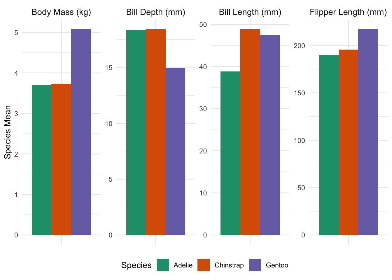
and include text to the effect of “By mass, Gentoo penguins are the largest species studied, weighing almost 1.5 kg more than Adelie or Chinstrap penguins on average; despite this, Gentoo bills are typically a bit smaller than other species on multiple dimensions, and Gentoo flipper lengths are broadly in line. This suggests that the extra mass of Gentoo penguins may be an artifact of a larger average torso, but that the other extremities do not scale accordingly.” This sentence directly answers the simplest interpretation of the question (largest by mass), but it also uses some other data to give a fuller context. Additionally, while the plot can be used to give precise figures, the text gives rough figures (“roughly 1.5 kg”, “a bit smaller”, “broadly in line”) for the qualitative comparisons.
How does the amount of time spent on household activities change as Americans age?
-
A major perk of working in education is the freedom to spend summers how you wish. What are the most popular activities for Americans employed in education during the summer months (June, July, and August)?
Hint: There are several variables that can be used to access the occupation of the respondent. Make sure to pick one that gives you enough detail to focus your analysis to people on a “school year schedule”, but you do not need to be 100% accurate here.
It is often remarked that “education is a privilege wasted on the young”. Among respondents who report being enrolled in a higher-education program, how does the amount of time allocated to various educational activities (attending class, doing homework, studying, etc.) vary by age? Does it seem to be true that older students dedicate more time to their education?
-
A “bump plot” is an effective way to display ranking (ordinal) data and to show how it changes over time. Use a bump plot to show how the relative interest in different sports changes as a function of either age or income (your choice).
Hint: Because bump plots require a discretized \(x\)-axis, the
cutfunction may again be your friend here. -
“Middle-child syndrome” can be explained, at least in part, by the idea that parents have less time to spend per child when they have multiple children.
E.g., a couple with their first child may be able to spend 6 hours per day on child care while maintaining their full-time jobs. After their second child is born, the parents may be able to find some extra time in their schedules and devote 8 hours per day to child care, or approximately four hours per child. Consequently, the second child reports getting 33% less parental attention than their holder sibling.
How does the amount of time parents spend per child change as family size increases?
As with the other exploratory questions, some of these are intentionally a bit open-ended and can be answered in several different equally valid ways.
Final Deliverable: Market Research on Time Use Patterns in Target Demographics
You are the product manager for a start-up hoping to launch a new time-tracking app. Unlike regular calendar apps, your product will allow users to compare how they spend their time against other demographically-similar users (e.g., “Congratulations! You spent 3 more hours exercising this week than other users like you!”), with an intent of using gamification to help instill healthy time-use habits.
In order to design the user interface of this new app, the graphics design team has asked you to prepare estimates of ‘typical’ time use for representative users in your target demographics. For each of these sample users, you need to do the following:
-
Identify typical demographic parameters for your sample users. Depending on the sample user and target demographic, different demographic parameters or different ranges may be more appropriate. (I.e., an 18 year-old high-school senior and a 25-year new college graduate just settling into their first job may only be seven years apart, but they are in very distinct ‘life stages’. Conversely, a 38 year-old suburban father of two and a 45 year-old suburban father of two are pretty comparable.)
One of your example users may be a woman who is 23 years, 5 months, and 6 days old, but you won’t have very many respondents in your data set who are the exact same age, so you might define her comparable population to be women 22 to 26. If you’re defining her peer group as “young women fresh out of college”, you might filter for women age 22 to 26 who have a college degree but are not currently enrolled in an educational program.
Identify key activities for your target demographic. These should be activities that are significant time usage and things that your target demo is likely to want to maximize. E.g., college students might sleep more than middle-aged men, but middle-aged men are likely to care more about getting enough sleep. Similarly, time spent on exercise is likely far less than time at work for most employed individuals, but your users are more likely to want to prioritize exercise.
Identify a ‘target level’ and ‘typical level’ of time spent by your target demographic on each activity. For the typical level, compute ‘low’, ‘medium’, and ‘high’ values; for the target level, use your best judgement to define a level.
Determine what fraction of people in your target demographic actually hit the target level of time spent on the key activities.
Task 7: Time Use Categories for Target Demographics
Write up your findings for the product team. Make sure to define your target demographic, the key activities you identified, and give the various time levels. You can use tables or graphs (or a blend of each) to best communicate your finding.
Your target demographics are:
- “Stay-at-home” dads.
- College undergraduates.
- A demographic of your choosing. (This can be a demographic group you identify with or one you simple select out of thin air.)
AI Usage Statement
At the end of your report, you must include a description of the extent to which you used Generative AI tools to complete the mini-project. This should be a one paragraph section clearly deliniated using a collapsable Quarto “Callout Note”. Failure to include an AI disclosure will result in an automatic 25% penalty.
E.g.,
AI Usage Statement
No Generative AI tools were used to complete this mini-project.
or
AI Usage Statement
GitHub Co-Pilot Pro was used via RStudio integration while completing this project. No other generative AI tools were used.
or
AI Usage Statement
ChatGPT was used to help write the code in this project, but all non-code text was generated without the use of any Generative AI tools. Additionally, ChatGPT was used to provide additional background information on the topic and to brainstorm ideas for the final open-ended prompt.
Recall that Generative AI may not be used to write or edit any non-code text in this course.
These blocks should be created using the following syntax:
::: {.callout-note title="AI Usage Statement" collapse="true"}

Your text goes here.

:::
Make sure to use this specific type of callout (.callout-note), title, and collapse="true" setting.
Please contact the instructor if you have any questions about appropriate AI usage in this course.
Extra Credit Opportunities
There are optional Extra Credit Opportunities where extra points can be awarded for specific additional tasks in this mini-project. The amount of the extra credit is typically not proportional to the work required to complete these tasks, but I provide these for students who want to dive deeper into this project and develop additional data analysis skills not covered in the main part of this mini-project.
For this mini-project, no more than 6 total points of extra credit may be awarded. Even with extra credit, your grade on this mini-project cannot exceed 80 points total.
Extra Credit Opportunity #01: Relationship Diagram
Possible Extra Credit: Up to 2 Points
After completing Task 01, examine the structure of your data sets and create a suitable data relationship diagram. An data relationship diagram is a visual representation of:
- The data tables available for an analysis
- The columns (names and types) present in each table
- The possible
joinstructures that can be used to combine these tables.
Generate a suitable visualization and include it in your final submission. Tools like https://dbdiagram.io or Canva can be useful for creating this visualization, but you may ultimately use whatever tool is most convenient for you (even a photo of an on-paper sketch). In determining the amount of extra credit awarded, peer evaluators will look at both the aesthetics of the visualization and the accuracy of the depicted relationships.
Note that this data is not ‘fully normalized’ so there may be cross-table relationships between one or more columns, particularly when connecting a ‘wide’ and ‘long’ data set. Note also that some of the join keys are a bit more complex than typical of a standard database set up so you may wish to annotate when a relationship more complex than simple quality is required.
Extra Credit Opportunity #02: Ring Visualizations
Possible Extra Credit: Up to 4 Points
After completing Task 07, your engineering team has now started working on the visual components of the user interface (UI). Using ggplot2 and extension packages, mock up a possible UI based on the Apple Watch “Activity Rings”. Display your mock-up showing time use target and typical values for your demographic (Target Demographic 3), as well as your own time use over the previous week. Use this visualization to compare how you “should have” spent your time to how you have actually spent your time.7
This must be an easy-to-read visual / graphical display, not a table. Note that here you are optimizing for a blend of beauty and easy legibility, not “statistical clarity” or “informational efficiency”, so you can explore different types of graphics than we have used in class. Make sure to choose a “modern” color scheme, font choice, etc.
Up to four points of extra credit may be awarded for visualizations that are particularly artful, effective, or otherwise impressive. “Standard” statistical visualizations (i.e., a generic ggplot2 bar chart) will not be given extra credit.
This work ©2026 by Michael Weylandt is licensed under a Creative Commons BY-NC-SA 4.0 license. 
Footnotes
This the level of “ChatGPT-level” prose, without obvious flaws but lacking the style and elegance associated with true quality writing.↩︎
Throughout this section, replace
YOUR_GITHUB_IDwith your GitHub ID from Mini-Project #00. Note that the automated course infrastructure will be looking for precise formatting, so follow these instructions closely.↩︎Note that the survey collects daily activities for a single day per respondent; this is not 250,000 Americans all of whom were tracked for 20 years.↩︎
This data was extracted from ATUS Lexicon files at https://www.bls.gov/tus/lexicons.htm but the code necessary to convert these files to a usable format was fragile and well-beyond the scope of this course, so I’m providing the cleaned-up data directly.↩︎
This process isn’t fool-proof, but it should cover most use-cases.↩︎
ATUS cautions against using 2020 data and the usual weights, providing an alternative weight variable
TU20FWGTfor 2020 data that also weights by date to ensure the “peak social isolation” period of March 18 - May 9 is represented. You can ignore this subtlety, but I’m flagging it here in case pandemic-effect questions are of interest.↩︎If you don’t want to reveal your actual time use patterns or if your Target Demographic 3 is a group to which you don’t belong, feel free to use made-up values here. No one is actually monitoring how you spend your time outside of class.↩︎